

Your island does not have to match your cabinets. In most kitchens, it shouldn’t.
The question most people ask is what color their island should be. The question that resolves the decision is what role the island is playing in the room.
Get the role right, and the color follows. Choose the color first, and you spend the next five years looking at something that almost works.
The 25 ideas below are organized by approach, not by color preference. Find the framework that fits your kitchen before you open a paint chip.
Should Your Island Be a Different Color from Your Cabinets?
In most kitchens, yes. When the island repeats the dominant cabinet color exactly, the eye reads it as part of the perimeter wall run. It disappears.
A different color, a different material, or a different depth of the same tone gives the island its own presence. The reasoning matters more than the rule.
The exception is very small kitchens, roughly those under 150 square feet. High contrast between the island and the cabinets creates noise rather than definition in compact spaces.
In those rooms, a slight tone variation within the same color family works better than a full contrast.
The Three Approaches: How to Think Before You Choose a Color?
Before you pick a color, decide what job the island is doing.
There are three distinct approaches to a two-tone cabinet and island design. They produce very different results. Most homeowners try to use all three at once, and that’s where kitchens go wrong.
The Island as Hero
The island is the room’s dominant visual statement, and the perimeter cabinets exist to support it.
This works when the island is large enough to anchor the space. Typically four feet long or more. The perimeter cabinets need to be genuinely neutral: warm white, light gray, cream.
Not two tones themselves. The island carries the color, and the surroundings simply give it room.
The Island as Support
The island reinforces one of the two cabinet tones without repeating it exactly.
A darker shade of the upper cabinet color on the island creates visual cohesion without monotony. So does a lighter shade of the lower cabinet color. Either way, the room reads as layered rather than split.
The Island as Bridge
The island introduces a third neutral tone that connects two contrasting cabinet colors.
This works specifically when the perimeter cabinet tones are of high contrast. Think black and white, or navy and cream. The island sits in the middle ground. A warm, greige island between black lowers and white uppers connects the two tones.
The room stops reading as divided. In practice, this is the approach I reach for most when homeowners are pulled in two directions at once.
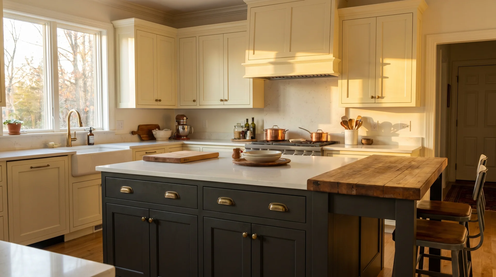
Classic Contrast: White or Cream Cabinets with a Dark Island
White or cream perimeter cabinets are the most common starting point for a two-tone kitchen.
They are forgiving, and they age well. They give a dark island room to read as a deliberate design choice rather than an accident.
Each idea includes a specific paint reference and the execution requirement that matters most in a real kitchen.
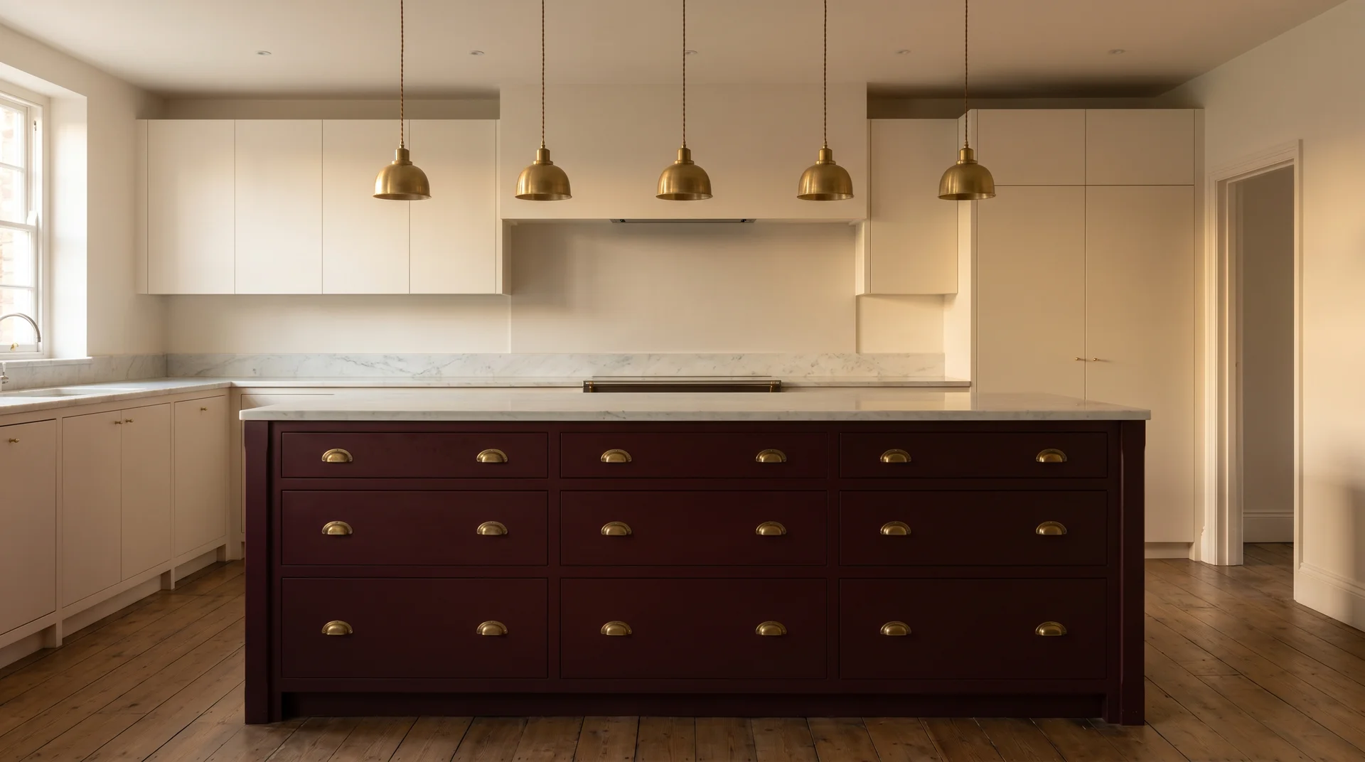
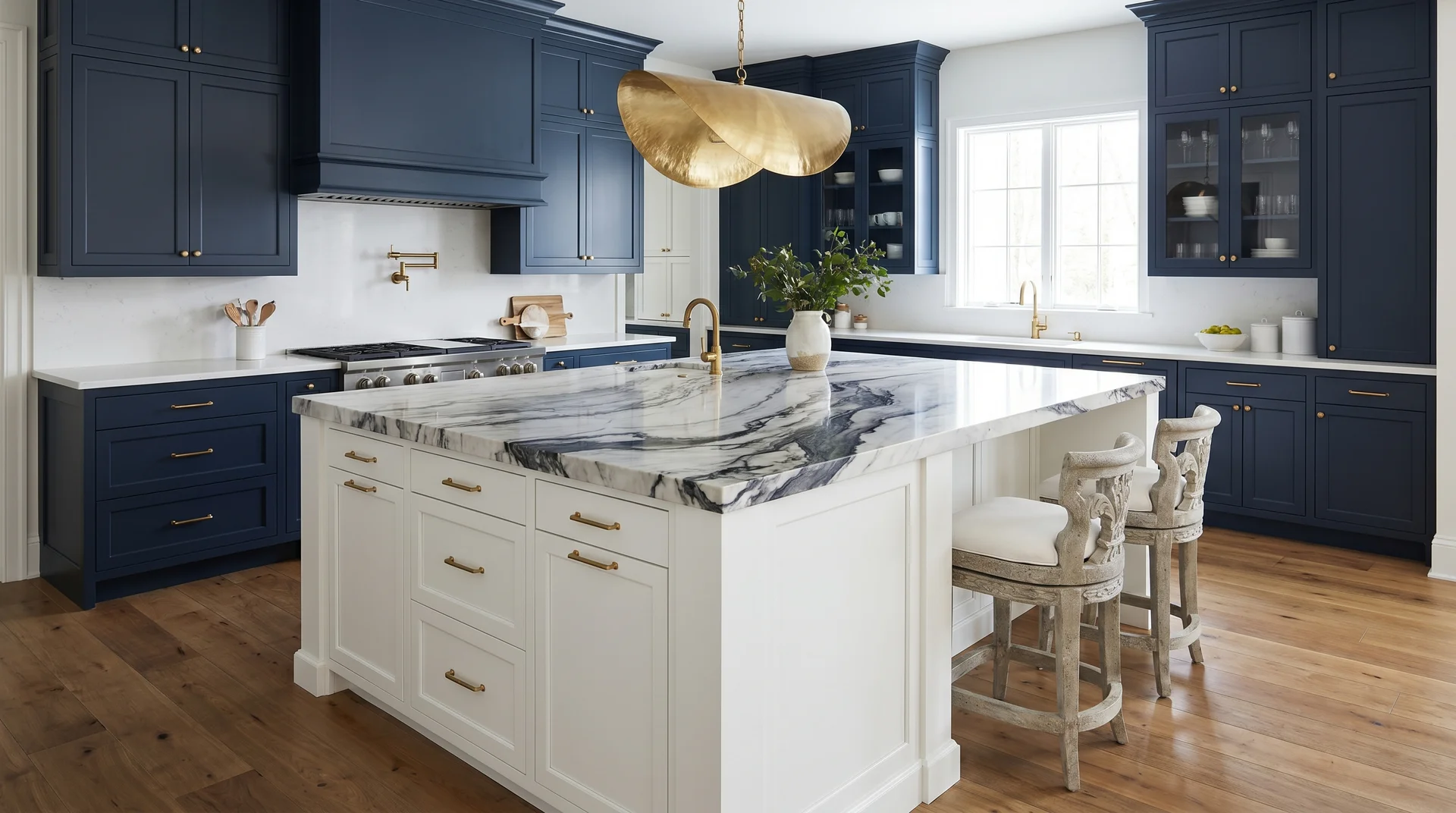
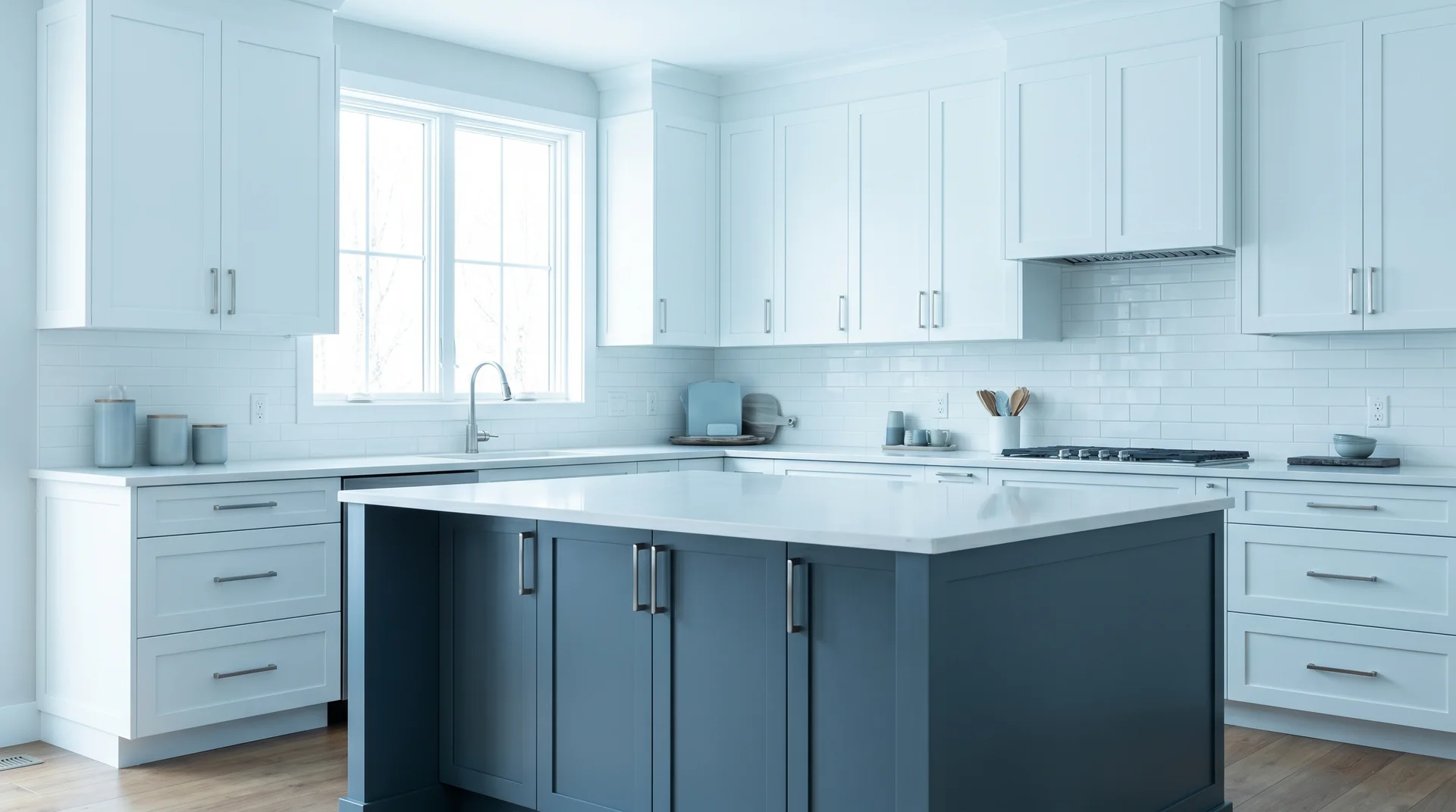
White Shaker Uppers, Hale Navy Island
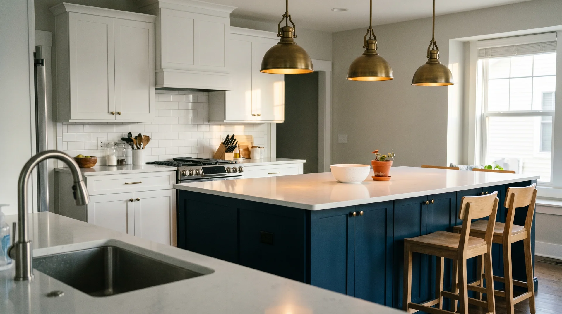
Benjamin Moore Hale Navy on the island is the most searched two-tone combination in this category, and it has earned that position.
You’re standing at the sink, looking across the kitchen. The white Shaker doors on the perimeter read quietly. The navy island pulls your eye toward it without competing with anything above or beside it. That’s the visual hierarchy working correctly.
Navy is the safest of the dark island colors, and I mean that as a compliment. It pairs with more countertop materials than charcoal and accepts warmer hardware finishes than black.
Aged brass or unlacquered brass on the island only. White quartz or marble countertops throughout keep the white Shaker cabinets dominant.
Cream Uppers, Kendall Charcoal Island
Benjamin Moore Kendall Charcoal is a true dark gray with no blue or green cast, which makes it the cleanest pairing for cream-toned upper cabinets.
Cream carries a warm undertone. Charcoal with a cool cast fights it at close range. It creates low-level visual tension that the room never fully resolves. Kendall Charcoal is warm enough to sit beside cream without that friction.
Oil-rubbed bronze or aged brass hardware throughout. A butcher block or dark granite countertop on the island, not white quartz. White quartz disconnects the island from its charcoal base.
The perimeter countertop can be light quartz to carry the cream tone across.
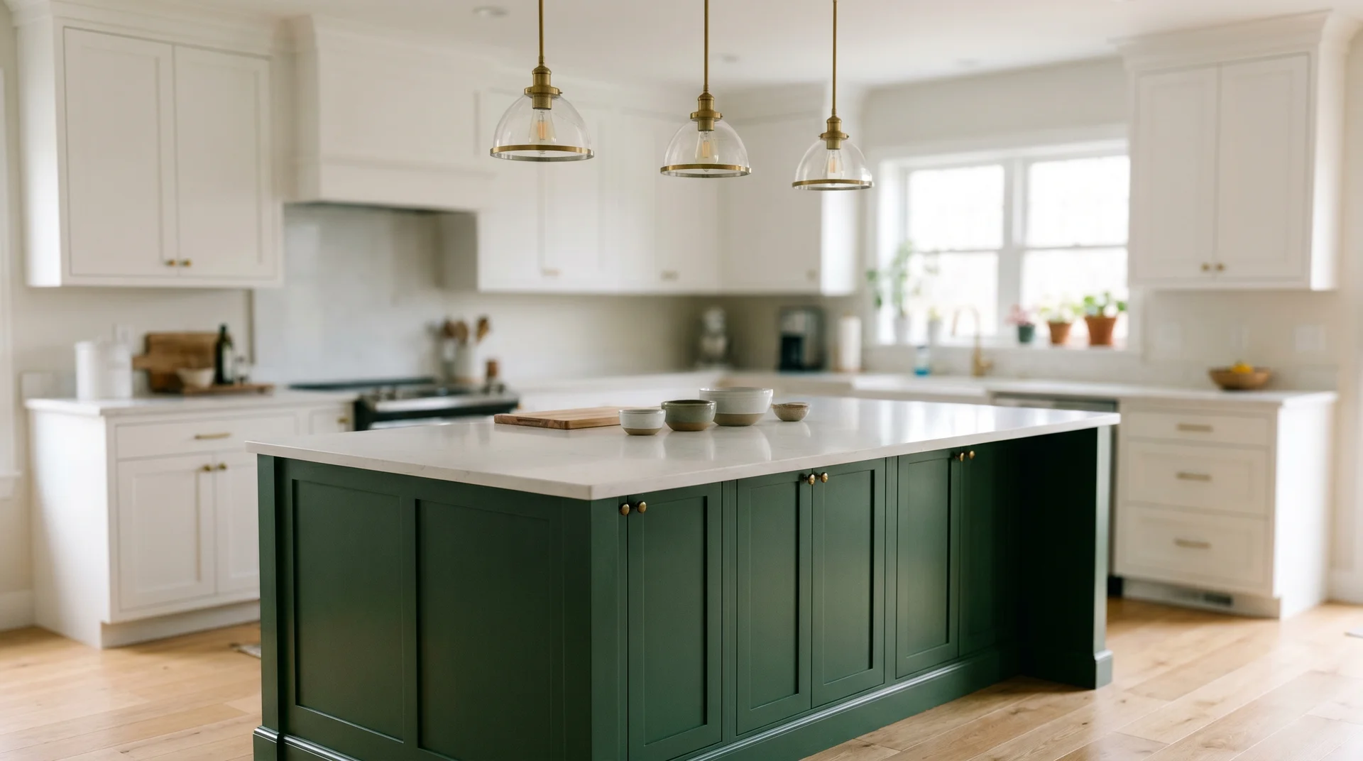
White Uppers, Essex Green Island
Benjamin Moore Essex Green is a deep forest green with enough tonal weight to anchor a kitchen island without competing with white painted cabinetry.
Walk into a kitchen with this combination, and the green pulls you toward the island immediately. The white uppers are giving it room. That is the island-as-hero approach working at its most direct.
Matte black hardware on both the island and the perimeter. White quartz countertop throughout. Essex Green performs better in kitchens with strong natural light.
In a north-facing kitchen, it can read close to black by late afternoon. That changes the entire feel of the room.
Warm White Uppers, Wrought Iron Island
Benjamin Moore Wrought Iron is a near-black with warm undertones, making it the right dark choice when the surrounding cabinets are warm white rather than cool white.
Cool black against warm white creates a subtle visual discomfort that is hard to identify but impossible to ignore. Wrought Iron resolves this. The warm undertone aligns with the warm white uppers, and the room settles.
Warm gold hardware on the island. A section of butcher block countertop on the island surface, not the full run, just a section. It softens the near-black and grounds it in warmth. White countertop on the perimeter run.
Off-White Uppers, Van Deusen Blue Island
Benjamin Moore Van Deusen Blue is a mid-dark blue with a slight purple undertone, placing it distinctly between navy and blue-gray.
It’s not a loud color. It’s composed and slightly moody, and it reads as confident without announcing itself. Off-white uppers give it space to be noticed without creating stark contrast.
Brushed nickel or chrome hardware, not brass. Brass competes with the purple undertone in Van Deusen Blue. White subway tile backsplash. Light quartz countertop throughout.
This combination works best in kitchens that receive afternoon light, which pulls the blue’s warmth forward.
Antique White Uppers, Cheating Heart Island
Sherwin-Williams Cheating Heart is a deep blue-gray that pairs cleanly with the warm, creamy base of antique white cabinetry.
Antique white reads as warm. Cheating Heart’s cool blue-gray creates contrast without the graphic starkness of true navy. The two tones hold a conversation rather than a standoff.
Matte black hardware on both the island and the perimeter. Black slate or dark quartz countertop on the island, light quartz or white marble on the perimeter run. A white or off-white backsplash throughout, nothing patterned.
Color-Forward: One Statement Color Against a Quiet Background
Statement color on the island only works when the surrounding cabinets are genuinely neutral.
Not off-white or warm gray. Genuinely colorless, with no visible hue of their own. The moment the perimeter introduces a competing color, the statement island reads as a collision. The ideas below move from the most liveable statement colors to the most demanding.
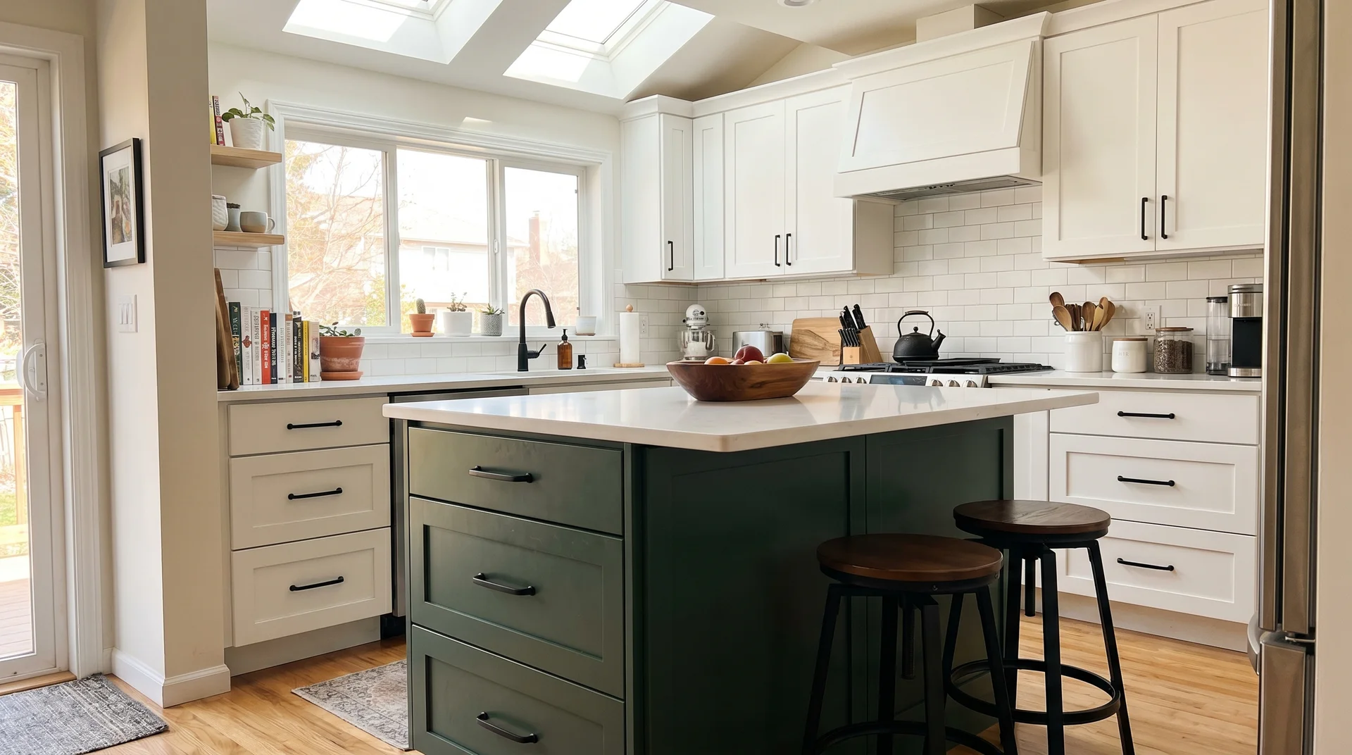
Light Gray Uppers, Sage Green Island
Sage green is the most forgiving statement color for a kitchen island because it reads as warm and natural, even when it carries real tonal presence.
I find sage the most liveable of the color-forward options. It softens against gray perimeter cabinets rather than fighting them. It also pairs with more countertop materials than any other statement color on this list.
Benjamin Moore Tarrytown Green or HC-2 Cushing Green in a satin finish.
Brushed brass hardware on the island. Natural wood or butcher block countertop on the island surface. Light gray or white countertop on the perimeter. One color statement per room is enough. Keep the backsplash neutral.
All-White Perimeter, Terracotta Island
Terracotta on a kitchen island requires a genuinely cool white surround, because warm tones stack and the room tips orange if the perimeter is cream or off-white.
You’re looking at the island from the kitchen doorway. Cool white wraps the perimeter. Warm terracotta anchors the center, and the contrast reads as a decision. Replace the cool white with warm cream, and the two warm tones merge. Neither reads clearly.
Matte black hardware throughout. Use a satin finish at the absolute minimum on the paint. Terracotta absorbs daily wear badly in a flat or eggshell finish.
It will need repainting on the island’s surface within two years. Concrete or dark stone countertop on the island grounds the warmth.
Greige Cabinets, Newburyport Blue Island
Benjamin Moore Newburyport Blue is a soft, dusty blue that reads as a color without demanding attention, making it the right choice against greige perimeter cabinets.
Greige carries both gray and beige in its base. A saturated, cool blue fights those undertones. Newburyport Blue’s dustiness resolves the tension. The room reads as considered rather than busy.
Chrome or brushed nickel hardware on the island. White countertops throughout, not butcher block. Butcher block competes with the greige’s warmth and creates a layering problem that the eye cannot resolve cleanly. White or light gray backsplash.
Pale Gray Uppers, Salamander Island
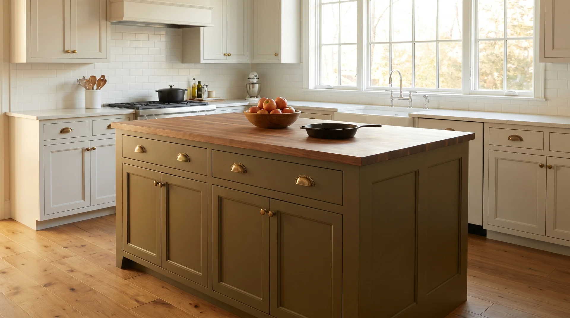
Benjamin Moore Salamander is a deep, muted olive green and the most underrated kitchen island color on this entire list.
Olive reads as sophisticated in a way that brighter greens do not. It carries enough brown to feel warm and enough green to feel organic. The dark value anchors a kitchen island without overwhelming a pale gray perimeter. Most homeowners walk past it at the paint store.
Aged brass hardware on the island. Butcher block island countertop. Wood and olive are natural companions in both tone and material. Light quartz on the perimeter.
The backsplash needs to be neutral. Olive with a patterned tile is where this look breaks down quickly.
White Cabinets, Dark Harbor Island
Benjamin Moore Dark Harbor is a deep, dramatic teal that requires the island to be the room’s undisputed visual anchor for the combination to hold.
This is the island-as-hero scenario from the approach section at the start of this piece: the island is the room’s undisputed visual anchor, and every other surface supports it. The island needs to be at least four feet long, ideally five.
It needs statement pendant lighting directly above. The perimeter cabinets need to be the simplest possible white, with no surface detail, no texture, no competing hardware.
Matte black hardware on the island. White quartz countertop throughout. Dark Harbor in a satin or semi-gloss finish. It needs the sheen to read at full depth under kitchen lighting. In a flat finish, it grays out, and the drama disappears.
Warm White Perimeter, Burgundy Island
Burgundy on a kitchen island will either look completely intentional or completely wrong, with almost no middle ground between those two results.
I got this particular combination wrong once, years into my practice. The color was right. The context was not. That kitchen had a patterned backsplash, open shelving, and dark hardware.
The marble countertop had strong veining. Every element was competing for the same visual position. The island had no room to lead. I redesigned that kitchen at my own cost, six thousand dollars out of pocket.
The lesson it produced is the rule I now apply to every high-risk color choice. One element leads the room. Everything else submits to it. The burgundy island was asking to be the hero. Every other decision in that room was making the same claim. That’s noise, not design.
For burgundy to work, the room needs genuinely warm white perimeter cabinets and no patterned backsplash. Simple brass hardware. A calm marble or off-white quartz countertop with minimal veining.
The island does one job. You give it room to do it. Benjamin Moore Heritage Red in a satin finish. Unlacquered brass hardware on the island only.
Light Gray Cabinets, Dusty Blush Island
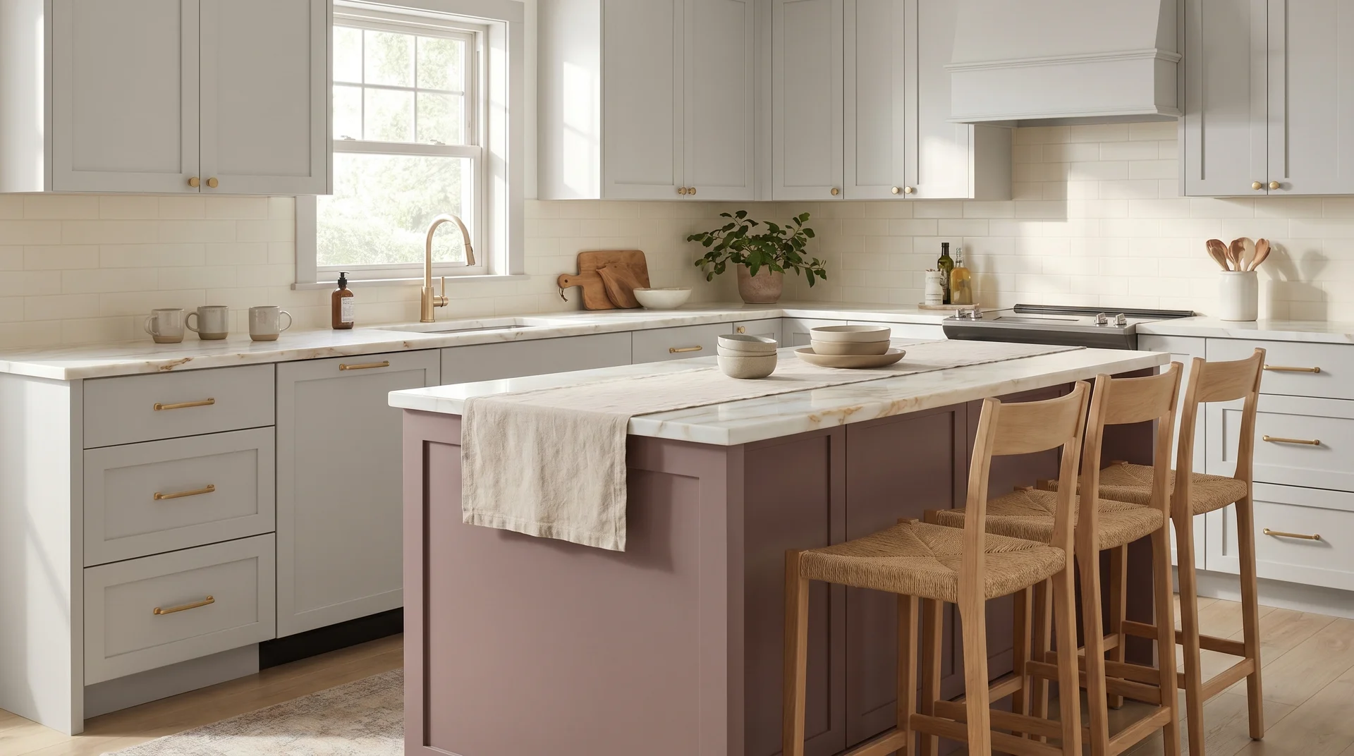
A dusty rose island works in a kitchen because “dusty” is doing the work. Desaturated pink reads as a warm neutral, and that distinction is what makes it livable.
Benjamin Moore Briar Rose or Pale Rose. The keyword is dusty. A fully saturated pink island reads as a mistake in nearly every kitchen context. A muted, almost-gray pink reads as intentional warmth, particularly against light gray cabinetry that shares its cool foundation.
Natural brass hardware in its most understated form. White marble countertop with a warm undertone. White or cream backsplash.
Any visual interest in the backsplash or countertop competes with the gray-and-blush tonal relationship. That relationship needs a clean surround to hold.
Material Contrast: Wood Tone Islands Against Painted Cabinets
Material contrast, meaning a wood tone island against painted cabinets, is the most undercovered approach in this category, and often the most effective.
A wood-toned island against painted cabinetry introduces warmth and material variation without adding a paint color decision. It’s also the most forgiving approach when the existing cabinet colors are already working hard.
Each idea includes the specific wood, the finish it needs to survive kitchen use, and where the approach breaks down.
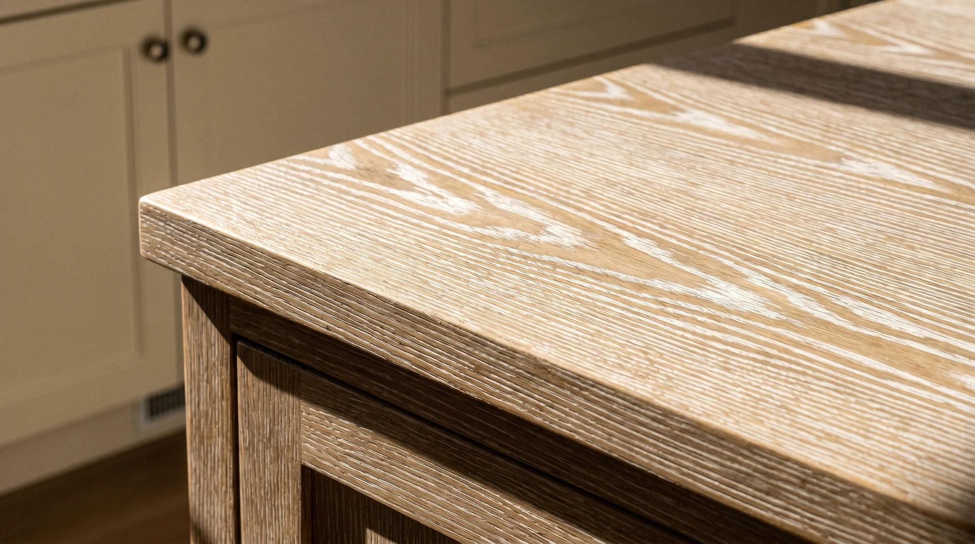
White Painted Cabinets, White Oak Island
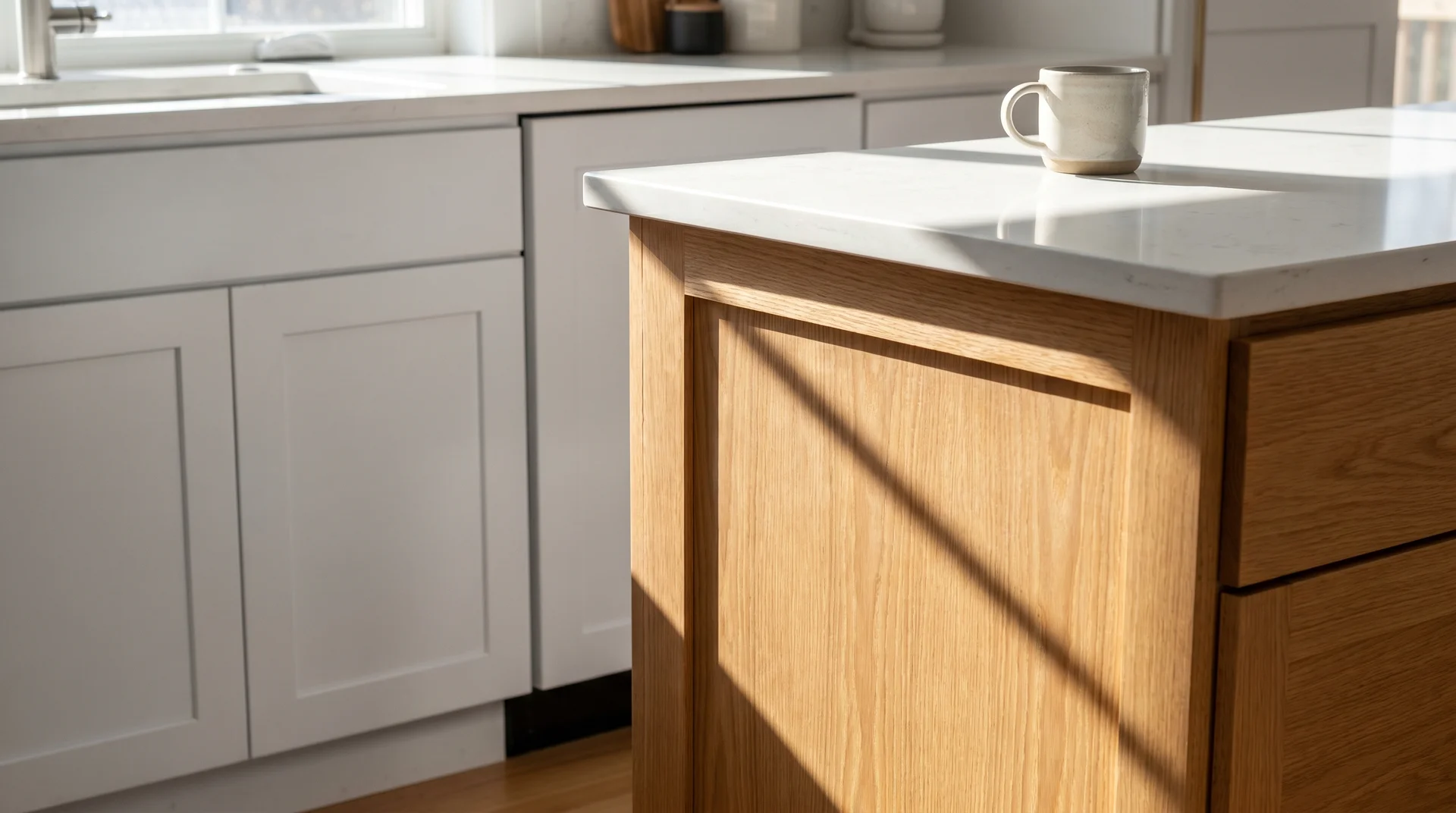
White oak against white painted cabinetry is the most popular material contrast on this list, and the one most consistently under-finished at installation.
The oak needs three coats of hard oil or conversion varnish to survive a kitchen island. Furniture wax will not hold. A single coat of raw oil will not hold. The contractor installing it will not always say this.
I’ve seen the pattern repeat: beautiful white oak at the reveal, visible wear on the prep surface inside eighteen months. In a low-use kitchen, hard oil might last a few years. In a kitchen with daily prep and seating, visible surface wear will show inside two years without the right finish.
The visual logic is clean and easy to read. White painted doors read cool and flat. White oak reads warm and textured. The contrast between them is material and tactile, not a color difference. It’s the most liveable version of a contrasting island because it introduces variation without requiring a color decision.
One practical note: conversion varnish has significant VOC content. Apply it in a ventilated space, away from kitchen use. Read the manufacturer’s safety sheet before starting.
Navy Uppers, Light Oak Island
A light oak island grounds a navy upper cabinet by introducing warmth where the navy reads cool.
This is the island-as-support approach at its most effective. The light oak does not compete with the navy. It completes it. The warm wood grain pulls the room toward comfort. The navy prevents it from reading as rustic. The two materials need each other.
The perimeter countertop needs to be warm as well.
Butcher block along the wall, or a warm quartz with cream or beige tones. A cool white quartz perimeter countertop beside a warm oak island creates a visual split. The room cannot fully resolve it. Match the warmth horizontally, and the room reads as unified.
Gray Cabinets, Walnut Island
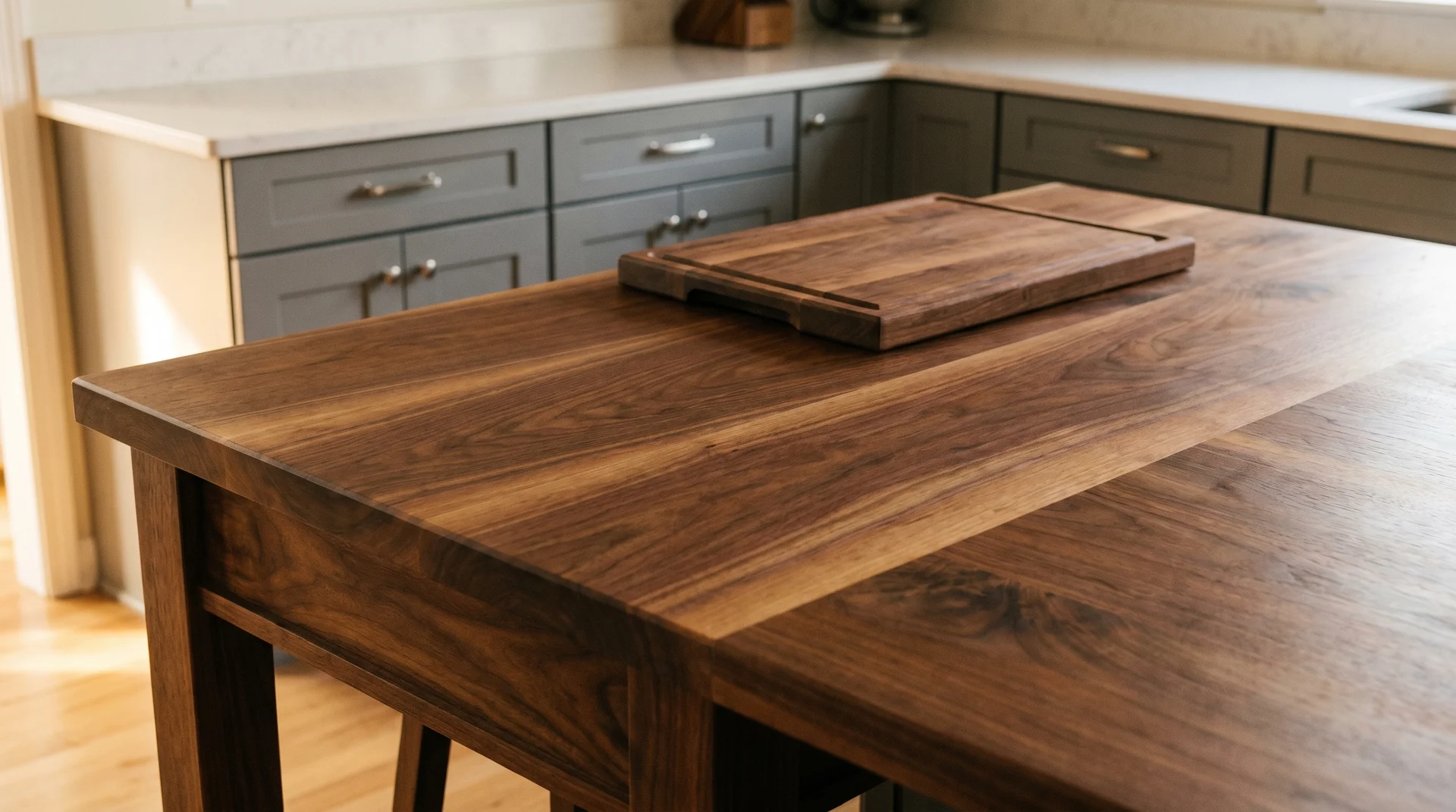
Walnut is the most striking wood choice for a kitchen island and the one that requires the most honest conversation about maintenance before installation.
I have watched walnut island tops split at the seam within three years. The cause, almost every time, was a missed annual resealing. It’s not a difficult maintenance task. Most homeowners are not told this at the showroom when they are choosing finishes.
Walnut needs sealing every twelve to eighteen months. That is the real cost of the look, and it belongs in the decision before the order is placed.
Do not pair walnut with a dark countertop on the perimeter. The island disappears into the room’s darker tones. The material contrast, the entire point of this approach, is lost.
Light quartz or white stone on the perimeter. Gray cabinet hardware in brushed or satin nickel.
Black Cabinets, Maple Island
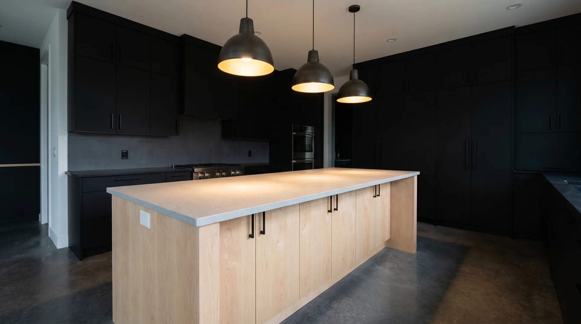
Maple is the most practical wood for a kitchen island: tight grain, low porosity, and the lightest tone in the domestic hardwood range, giving it maximum contrast against black cabinetry.
Black cabinets with a wood island require the island to be the room’s warmth provider. Maple delivers that without the maintenance demands of walnut or the sourcing cost of specialty white oak.
It also withstands moisture better than open-grain woods, which matters on a surface that sees daily prep and cleaning.
A hard oil or conversion varnish finish. Matte black hardware throughout, because the island’s warmth provides enough visual relief on its own. White or light gray countertop on the island gives the maple base a clear visual boundary within the dark kitchen.
Cream Cabinets, Cerused Oak Island
Cerused oak, wire-brushed and white-filled to expose the grain, is the most sophisticated material contrast available for a kitchen island. It’s also the hardest to source through standard showrooms.
Stand in the doorway of a kitchen with cerused oak, and you see the texture before you see the color. The grain is pronounced, white-filled, almost graphic. Against cream cabinetry, it reads as an architectural detail rather than a material choice.
It’s a specialty woodworking commission, not a big-box lumber purchase. A local cabinet maker or custom mill, a longer lead time, and a meaningful price premium over standard white oak.
The finish needs to be a hard wax or conversion varnish that preserves the grain visibility. Any finish that builds up on the surface will gradually obscure the wire-brushed texture over time. That is the execution requirement most homeowners do not hear until they are mid-project.
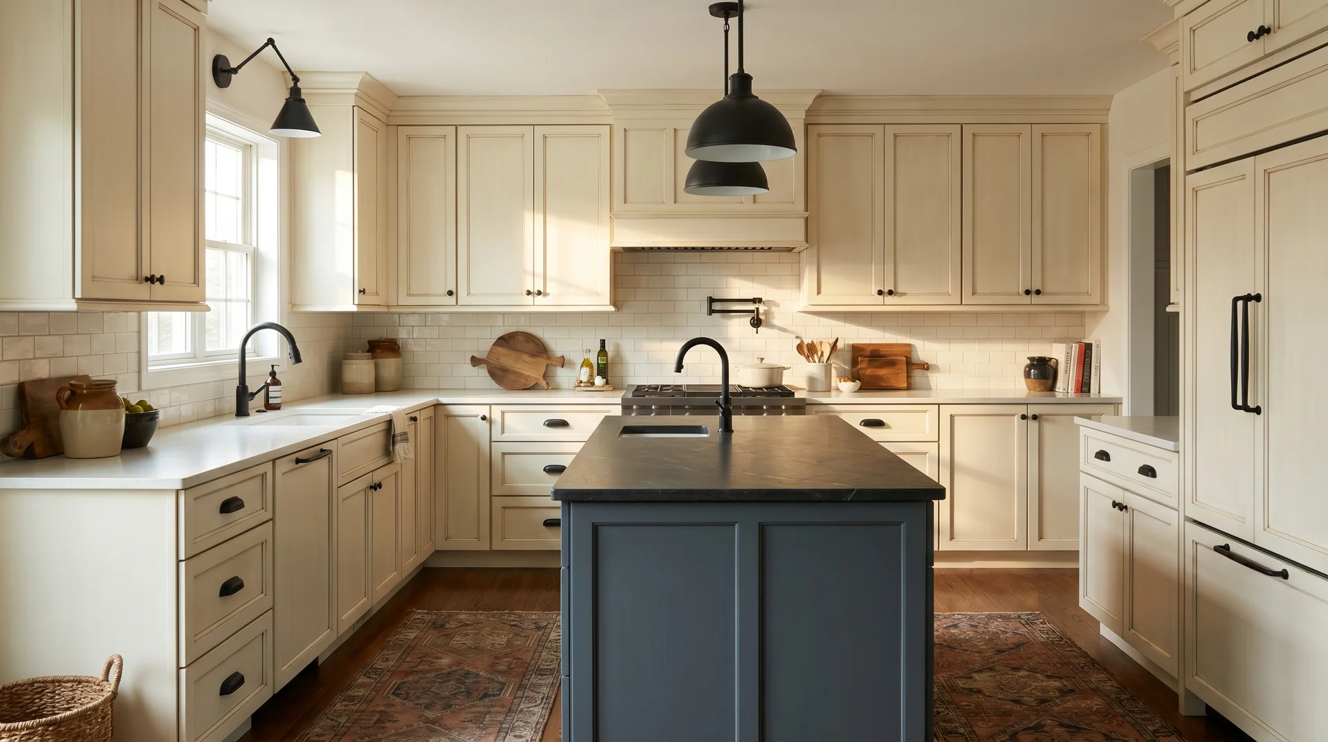
Dark Perimeter, Light Island: The Inverted Approach
Dark cabinets with a dark island is the most common two-tone mistake I see.
When the perimeter cabinets are dark, the instinct is to give the island a darker tone for cohesion. What actually happens is the island disappears.
A dark island in a dark-cabinet kitchen reads as floor-level furniture, not a design feature.
The inverted approach provides visual rest and gives the island its own presence in the room.
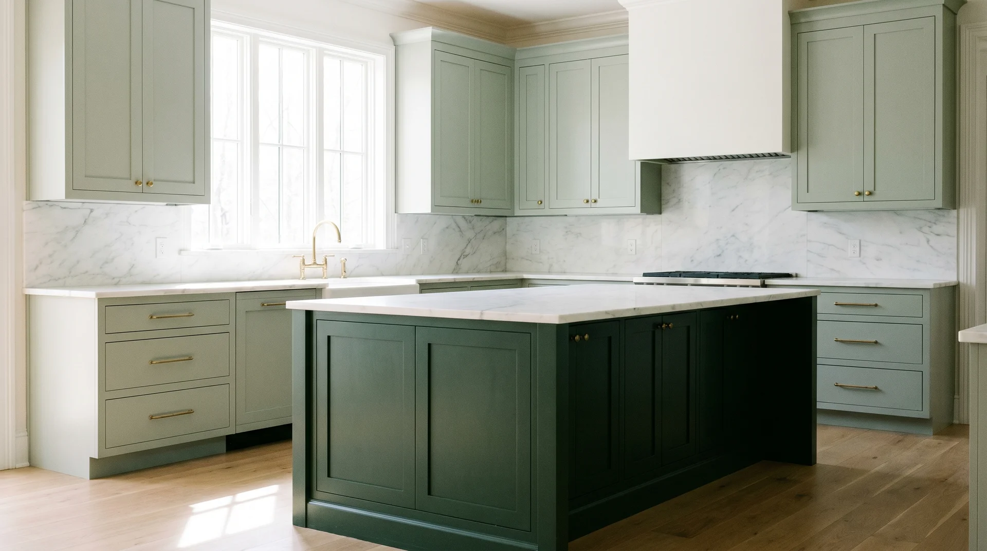
Dark Green Perimeter, Cream Island
A cream island against dark green perimeter cabinetry provides the visual rest the room needs and prevents the space from reading as a single dark mass.
You’re standing at the kitchen entry. Dark green wraps the perimeter: Essex Green, Salamander, Sherwood Green. The cream island sits at the center. Your eye finds it immediately, and the room breathes.
The cream needs to be warm. Benjamin Moore White Dove or Navajo White are both in the right range. Cool white against dark green reads as stark rather than grounded. Warm brass hardware on the perimeter.
A light quartz or marble countertop throughout, including the island, carries the cream tone across both surfaces.
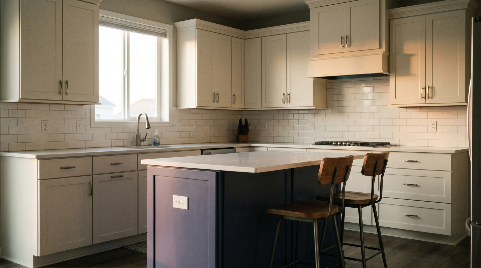
Navy Cabinets, White Island
A white island in a navy-cabinet kitchen needs a countertop that distinguishes it from the perimeter sink run, or it disappears into the wall at first glance.
This is the most common execution problem with the navy-and-white inversion. A white island with a matching white countertop, surrounded by navy cabinetry, reads as part of the perimeter. It disappears.
Add a contrasting countertop on the island: butcher block, a marble slab with strong veining, or a dark quartz. The island reads as its own piece. That visual separation is what makes the color contrast worth the effort.
Brass hardware on the island. Statement pendant lighting directly above. The island needs at least one additional point of distinction beyond paint color alone.
Charcoal Cabinets, Light Greige Island
Greige is the most versatile island color for a charcoal-cabinet kitchen because it pairs cleanly with both warm and cool charcoal undertones.
Pure cool charcoal and warm charcoal read differently under kitchen light. Greige sits at the midpoint of the warm-cool spectrum and resolves against both. It’s the most forgiving inversion in this section, with the smallest margin for execution error.
Use brushed nickel or satin nickel hardware. Keep the countertop in light quartz throughout. The backsplash should be white or very light gray.
Greige reads best when the horizontal surfaces stay clean and neutral. Add a pattern to the backsplash, and the charcoal-greige tonal relationship becomes hard to read as deliberate.
Black Cabinets, Warm Ivory Island
Warm ivory is the right light tone for a black-cabinet kitchen because it prevents the room from reading as commercial or industrial.
True white against black produces a stark, high-contrast environment. In a home kitchen, it can read as clinical. Warm ivory introduces enough of a yellow-beige undertone to soften the contrast without reducing it. The room reads as dramatic and warm rather than dramatic and cold.
The ivory needs yellow-beige undertones, not pink ones.
Benjamin Moore Ivory White or White Sand are both in the right range. Warm brass or unlacquered brass hardware on the island. Matte black hardware on the perimeter. That single hardware distinction reinforces the two-tone division at the detail level.
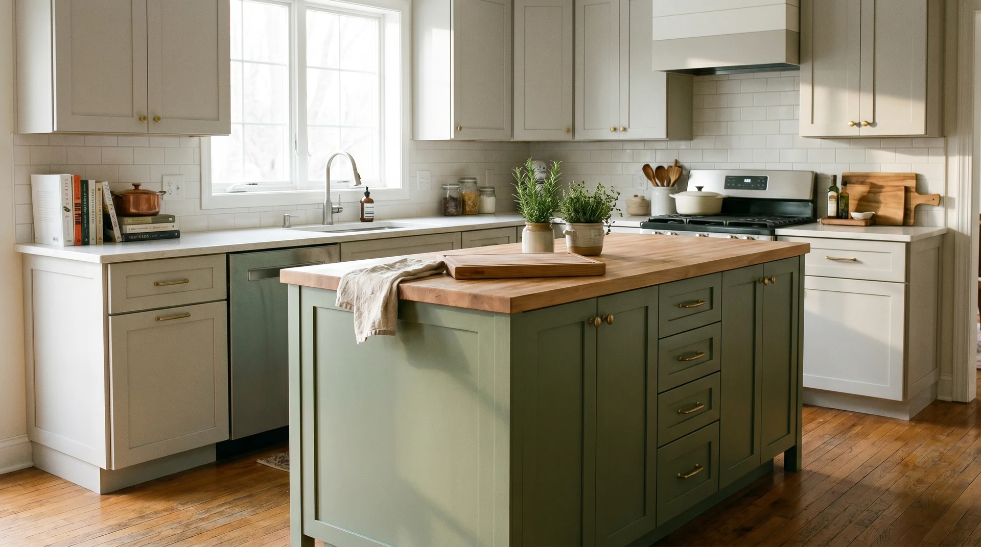
Tone-on-Tone: Same Color Family, Different Depth
Tone-on-tone is the approach I respect most and have seen fail most often.
Two tones from the same color family create a layered look that reads as designed rather than decorated. That means sage and forest green, pale blue and slate, or warm cream and butter. The execution constraint is precise.
The undertones must match exactly, or the variation reads as a color-matching error rather than a deliberate choice. I will say directly where the genuine uncertainty lives in this section, because it matters to the result.
Soft Sage Cabinets, Forest Green Island
Sage cabinet uppers and a forest green island work when the Light Reflectance Value difference between the two tones is at least 20 points. Below that threshold, they read as a failed color match.
LRV, or Light Reflectance Value, measures how much light a paint color reflects on a scale of 0 to 100. Most paint brands publish LRV data on their chip sheets. A sage green like Benjamin Moore Aganthus Green reads around LRV 40.
A forest green like Essex Green reads around LRV 7. That gap is wide enough for the contrast to read as intentional from across the room.
Here is where I will acknowledge genuine uncertainty: undertone matching in artificial kitchen light is difficult, even with experience. A sage-forest green pair that looks right on paint chips can read as mismatched under warm-spectrum kitchen bulbs.
Test both colors in the actual kitchen, on the actual surface, under the actual lighting. Not at the paint store. Not in a south-facing window on a clear afternoon. What you see on a chip is not always what you get on sixty square feet of cabinet face.
Pale Blue Uppers, Slate Blue Island
Pale blue and slate blue must share the same base blue undertone: pure blue, not purple-leaning or green-leaning. If they do not match, the tone-on-tone relationship collapses into a near-miss.
Benjamin Moore Iceberg (pale) and Benjamin Moore Cadet Blue (medium-dark slate) share a clean, pure blue base. That shared foundation is what makes the pair hold across the distance of a room. Replace either one with a blue that carries a purple cast.
The two tones will fight each other. That friction is hard to name, but once you are living with it, you cannot ignore it.
Brushed nickel or chrome hardware throughout. Warm metals compete with cool blues, and that competition reads as a mistake in this combination. White countertop and backsplash throughout.
The simplicity of the surround allows the tonal cabinet relationship to read clearly rather than getting buried under competing surfaces.
Warm Cream Cabinets, Butter Yellow Island
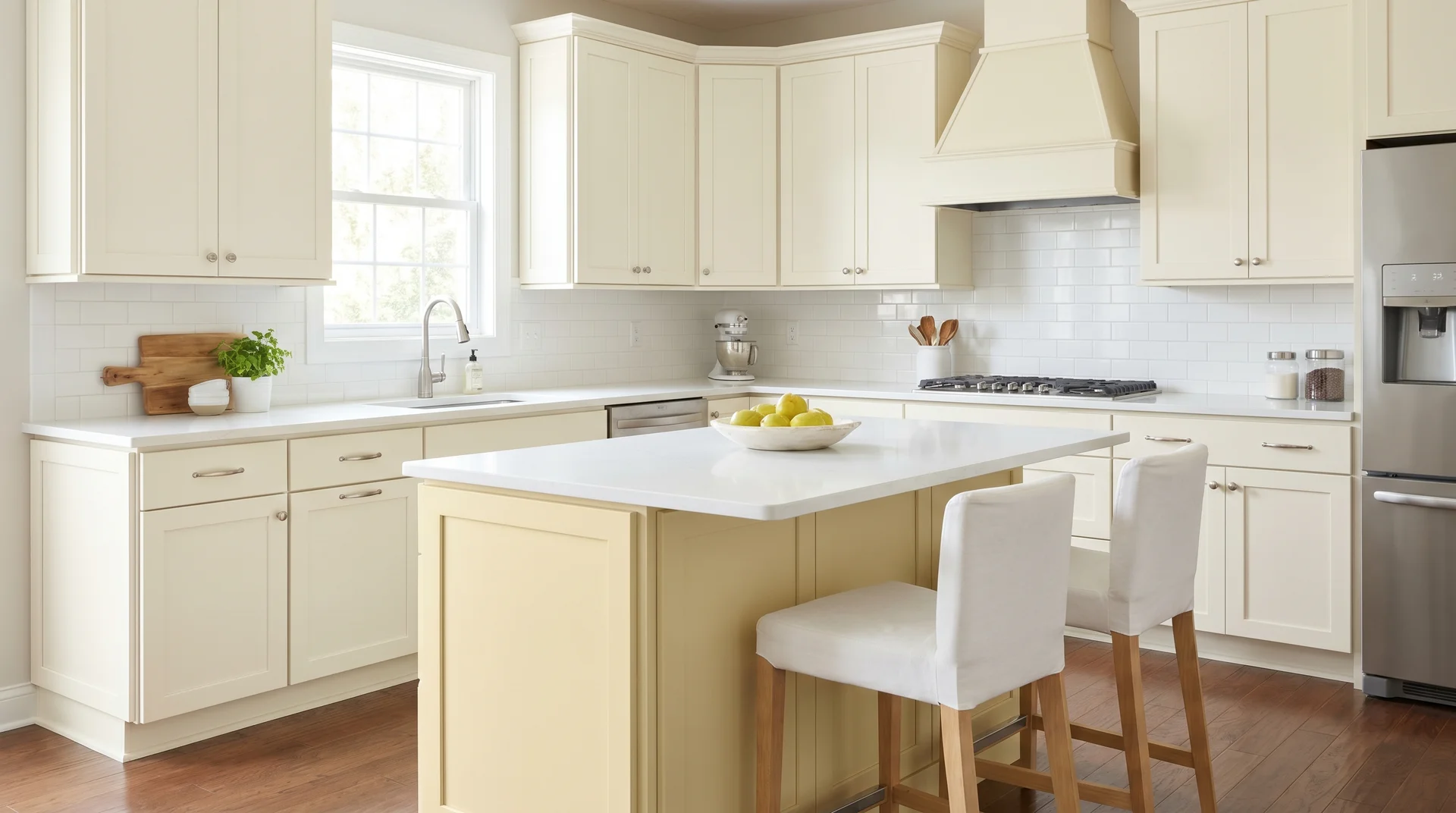
Cream and butter yellow work together when the cream is warm-based, and the yellow is muted enough to read as deepened cream rather than a separate color.
Benjamin Moore Pale Moon is close to the target. It’s a soft, warm yellow with enough gray in it to prevent it from reading as a primary color. Paired with White Dove or Navajo White on the cabinet uppers, the island reads as warmth deepened. It’s the most delicate color relationship on this list.
The countertop and backsplash need to be cool: white quartz, white subway tile, gray stone. Warm countertops compound the warm tones in the cabinets and the island, and the whole kitchen tips yellow.
One cool element in the horizontal surfaces resets the balance. Keep hardware minimal: simple knobs in brushed nickel or oil-rubbed bronze. Statement hardware competes with the tonal relationship it is meant to support.
How to Make Your Island Color Work?
Every combination in this piece works when the room’s visual hierarchy is resolved before the paint is chosen. These principles hold across all 25 ideas, regardless of which cluster fits your kitchen.
Establish the Hero Before the Palette
Every kitchen has one dominant visual element. It is the thing the eye lands on first, every time, without choosing to.
If it is the island, the perimeter cabinets need to recede. If it is something else, a range hood or a statement backsplash, the island should support rather than compete. Color choice follows this decision. It does not precede it.
A rough guide: the dominant color takes roughly 60 percent of the visual space, the secondary about 30 percent, and the accent around 10.
The island almost always sits in the accent position, which is why bold colors work on it even when they would overwhelm a full perimeter.
The Countertop
The countertop is the horizontal plane connecting the island to the perimeter, and it either holds the two cabinet tones together or reveals that they were never quite right for each other.
A matching countertop material throughout creates visual continuity across the two colors. A contrasting countertop on the island separates it cleanly from the perimeter. Either approach works.
What does not work: a countertop chosen separately that competes with one of the two cabinet tones. Countertop selection belongs in the same conversation as the cabinet colors. A full treatment of countertop pairing for two-tone kitchens belongs in a different article. It needs different criteria and its own framework to be useful rather than superficial.
Different Hardware on the Island
Using the same hardware finish on the island and the perimeter reduces the visual distinction between the two, which works against the purpose of a two-tone design.
One deliberate distinction is enough. Aged brass on the island, matte black on the perimeter. Brushed nickel on the perimeter, unlacquered brass on the island. One point of difference reinforces the color distinction at the detail level.
Two or more hardware finish differences require management that most homeowners do not want to sustain long-term. They rarely produce a cleaner result than a single distinction does.
Keep the Door Style Consistent
Mixing cabinet door styles between the island and the perimeter introduces a visual complexity that rarely pays off.
Shaker doors on the perimeter with flat-panel doors on the island, or vice versa, create a split that competes with the color distinction you are trying to achieve. Keep the door style consistent.
Shaker is the most forgiving across all the combinations in this piece. It works with painted finishes, wood tones, dark colors, and light ones. The island gets its distinction from color or material, not from a different door style.
The Five-Second Test
Stand in the doorway of your kitchen and give the room five seconds.
Wherever your eye goes first is the room’s current hero. If it goes to the island, the color is doing its job. If it goes to the backsplash or the range hood, the island has not earned its place.
I think the five-second test is underused in kitchen design conversations. It cuts through more paint-chip indecision than any single tool I have used across 220 projects.
A two-tone kitchen where the island cannot be identified in five seconds is one where color came before hierarchy. Go back to the three approaches at the start of this piece and begin there.
The budget shapes this decision more than most people want to acknowledge up front. A material contrast island in white oak or walnut costs differently than a painted island.
A specialty wood like cerused oak costs differently still. The constraint is where the real design decision lives. It’s not a caveat to work around. It’s the problem the design needs to solve.
Five Questions to Answer Before You Commit to a Color
These are the questions that come up in almost every two-tone kitchen conversation.
Should the kitchen island be the same color as the cabinets?
In most kitchens, no. When the island repeats the perimeter cabinet color exactly, it reads as part of the wall run. A different color, material, or depth of tone gives the island its own presence.
The exception is compact kitchens, roughly those under 150 square feet, where strong contrast creates visual noise rather than definition.
Should the island match the upper cabinets or the lower cabinets?
In a true two-tone setup, the island reads best when it aligns with the lower cabinet tone. Contrasting with both also works. The lowers sit at the same visual level as the island base. Repeating that tone creates a grounded, connected look.
Repeating the upper cabinet color on the island tends to make the island appear to float above its own base.
Can you use three colors in a two-tone kitchen?
Yes, but the same visual hierarchy discipline applies. One color must be dominant, one supportive, and one the accent.
Three colors at equal visual weight is where three-tone kitchens become difficult to resolve. The island as the third color can work, provided that the earlier framework still governs the decision.
What is the best finish for a painted kitchen island?
Satin finish at minimum. Eggshell and flat finishes absorb grease, staining, and daily contact damage faster than any other surface in the room. Satin cleans easily while resisting the glare of semi-gloss.
For dark island colors, semi-gloss can work and add depth. For light islands, satin is almost always the right call. I’ve repainted more flat-finish islands than I can count. The conversation is always the same: it looked fine until it didn’t.
Does the island hardware need to match the perimeter hardware?
No, and in a two-tone kitchen, it specifically should not. The visual distinction between the island and the perimeter is reinforced by a different hardware finish on each.
One deliberate distinction is enough: aged brass on the island, matte black on the perimeter. Two or more hardware finishes in the same kitchen require sustained management that most homeowners do not want to provide.
Final Thoughts
The island’s color has one job. That job is one of three. The island can anchor the room as its visual hero. It can support one of the existing cabinet tones, or bridge the two tones together.
The three-approach framework at the start of this piece applies to every combination in this list. Pick the approach first. The color follows from a clear decision about what the island is supposed to do.