
The best engraved charcuterie board ideas work around one clear design element like a name, a date, an illustration, or a phrase.
Adding more than one is the most common reason a $70 board looks like a $30 one.
This piece covers the design decision, like what to engrave and why some ideas work where others don’t.
Engraved Charcuterie Board Ideas for Wedding Gifts
The wedding gift board is the most ordered personalized charcuterie board in the market.
It’s also the most over-engraved. What separates a board they’ll keep: the design commits to one thing that’s specific about them.
First Names Only
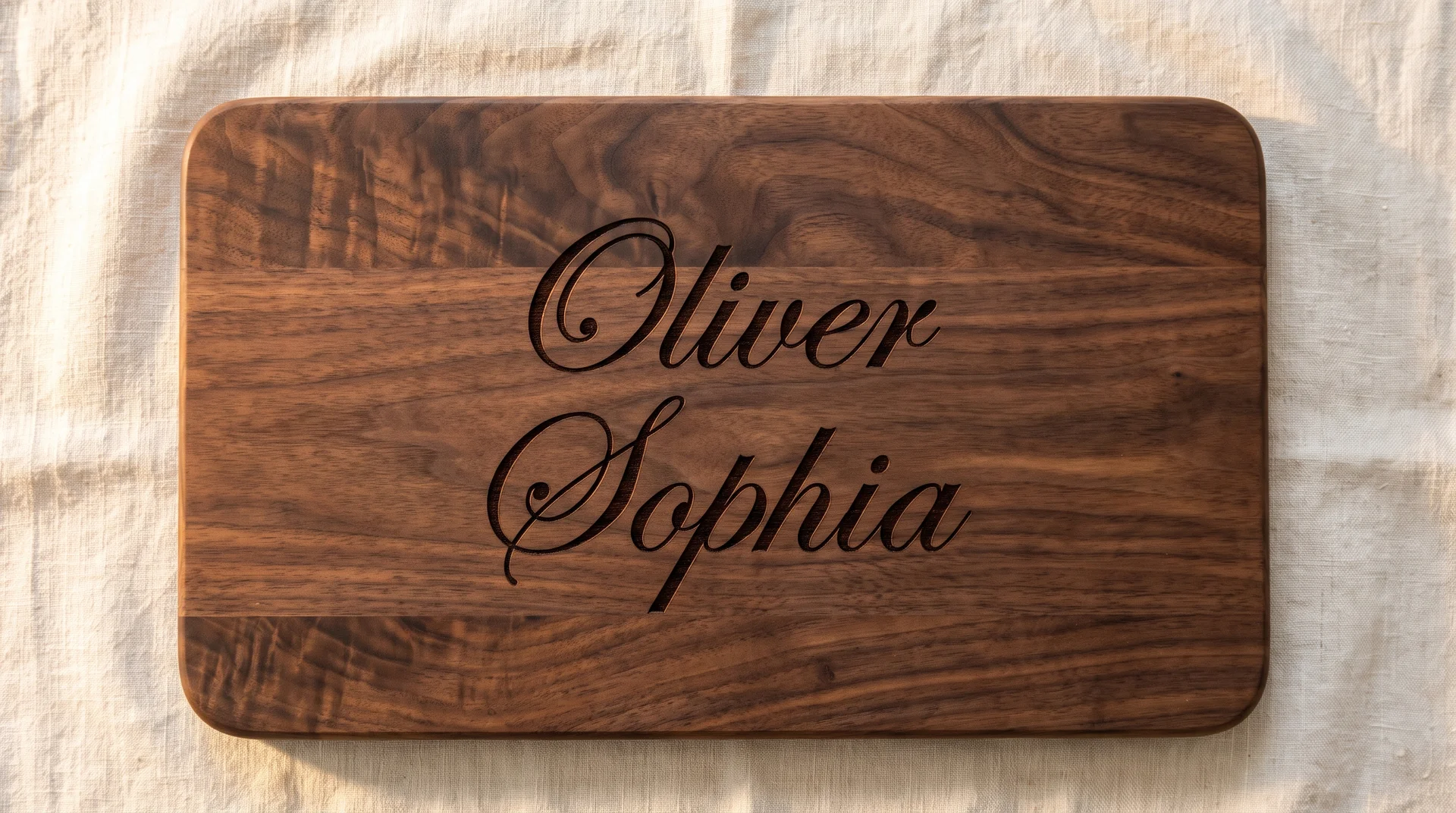
The simplest wedding board design is the one most dependent on the font.
Two first names in elegant script, centered, with generous space above and below. Clean and specific when the names are distinctive. A less common name pair gives the engraver more to work with.
With common names, even an excellent script reads as a placeholder. The font is the only design element here, so it carries the full weight. Ask for a script with real stroke weight variation, not a uniform handwriting font.
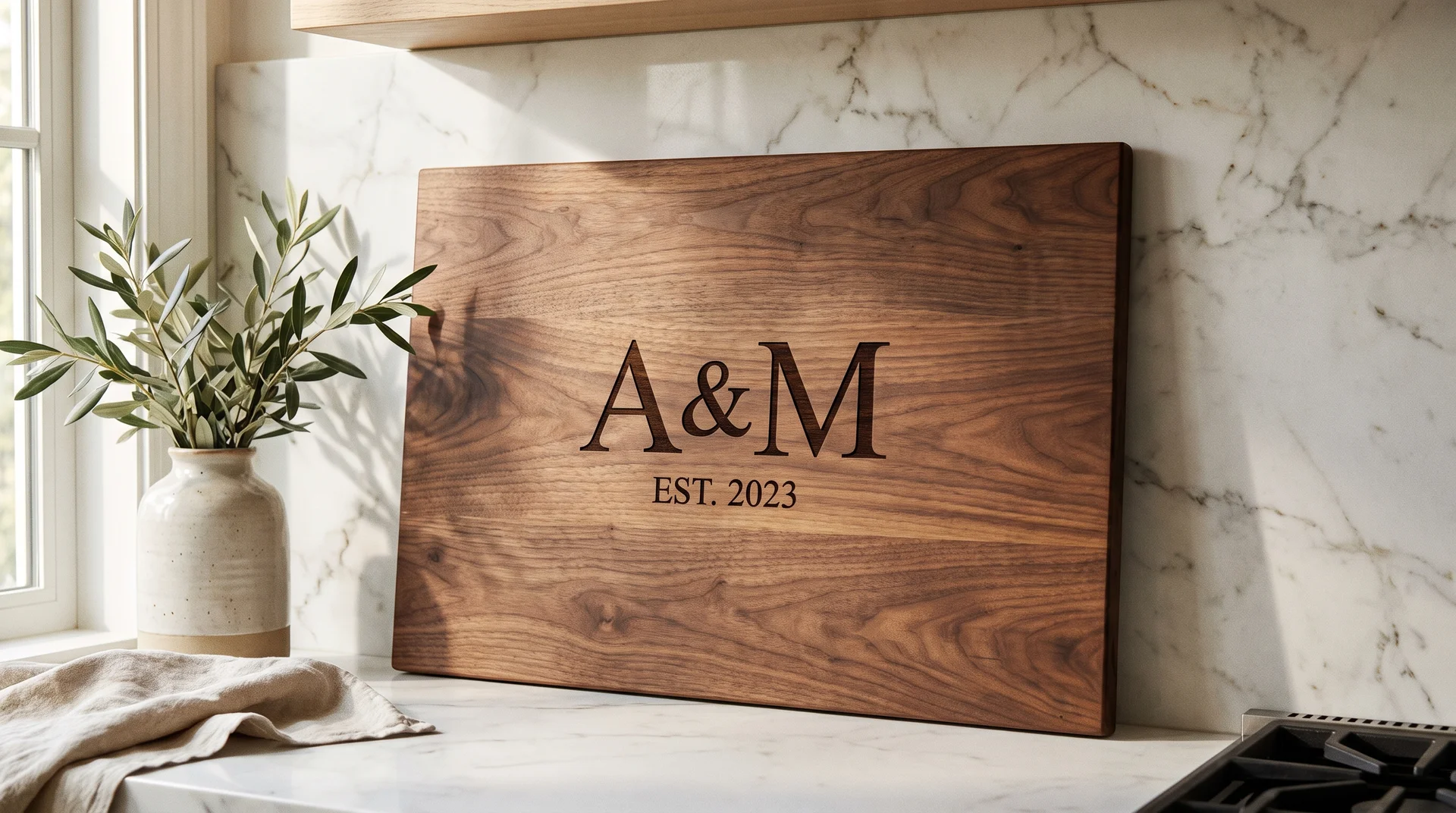
Surname with “Est. [Wedding Year]”
Lasting and unambiguous, when the sizing relationship between the two lines is right.
The surname in a larger serif occupies the upper center of the board. “Est.” followed by the wedding year sits below in the same typeface, noticeably smaller. The proportional relationship between the two lines is the design.
Set the year at roughly half the capital letter height of the surname. Both lines at the same size is the most common fail point I see with this design. Tell the engraver, and note that walnut makes the size difference read most clearly.
A Line From Their Vows or a Phrase
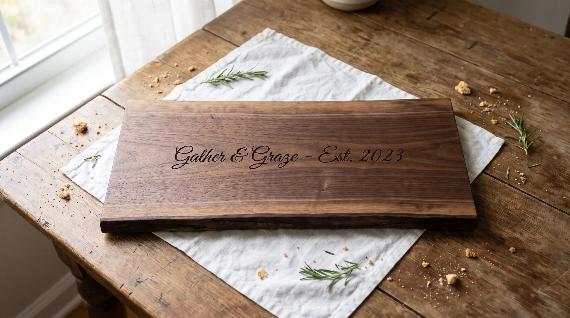
The highest-risk text-only option is also the most personal one available.
A single line centered on the board, generous space above and below, nothing else. Works when the phrase belongs unmistakably to this couple. It should be a line from their actual vows, or a phrase only they would recognize as theirs.
Fails when it’s a wedding sentiment that could describe any couple. The filter: can you name exactly where this line comes from in their relationship? If the answer is unclear, this is not the right idea.
Last Name Monogram with One Botanical Element

One botanical element works when it’s clearly subordinate to the monogram.
A bold serif monogram at center, a small olive branch or laurel flanking it. A full botanical border framing the entire board is a different design. The botanical is a supporting element: the eye should land on the monogram first and register the botanical second.
The visual hierarchy only holds if the burn depth differs between the two elements. Tell the engraver: the botanical should be a shallower burn than the monogram. Walnut takes different burn depths cleanly and is the right material for this design.
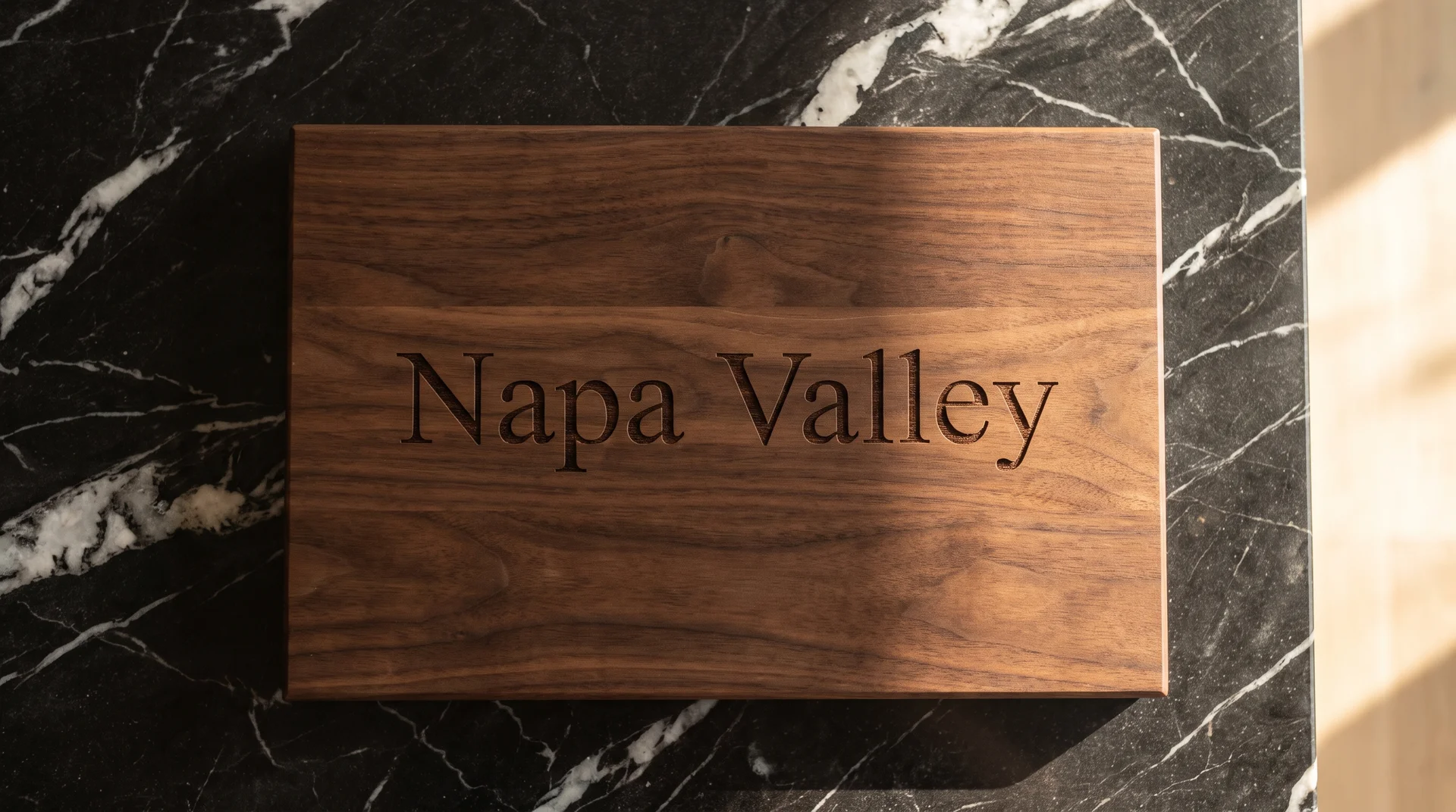
Wedding Venue City Name Plus Year
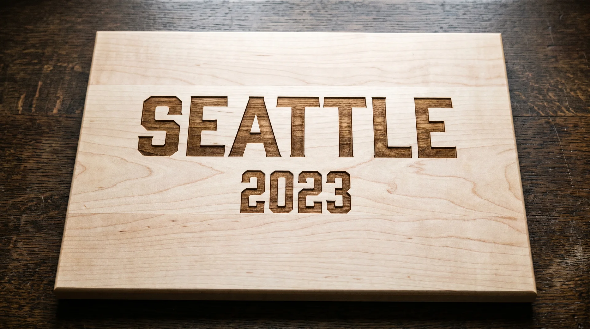
A place name can carry enough weight to stand alone on a board.
The city name in bold centered text, the year below in the same typeface at a slightly smaller size. Two lines, nothing else. Works when the city genuinely matters to the couple, and they’d call it theirs even without the venue.
Fails when the city was chosen because the venue is beautiful. If neither of them would name that city without the wedding, the board is marking the venue, not the couple. Idea 1 or Idea 2 is the cleaner choice in that case.
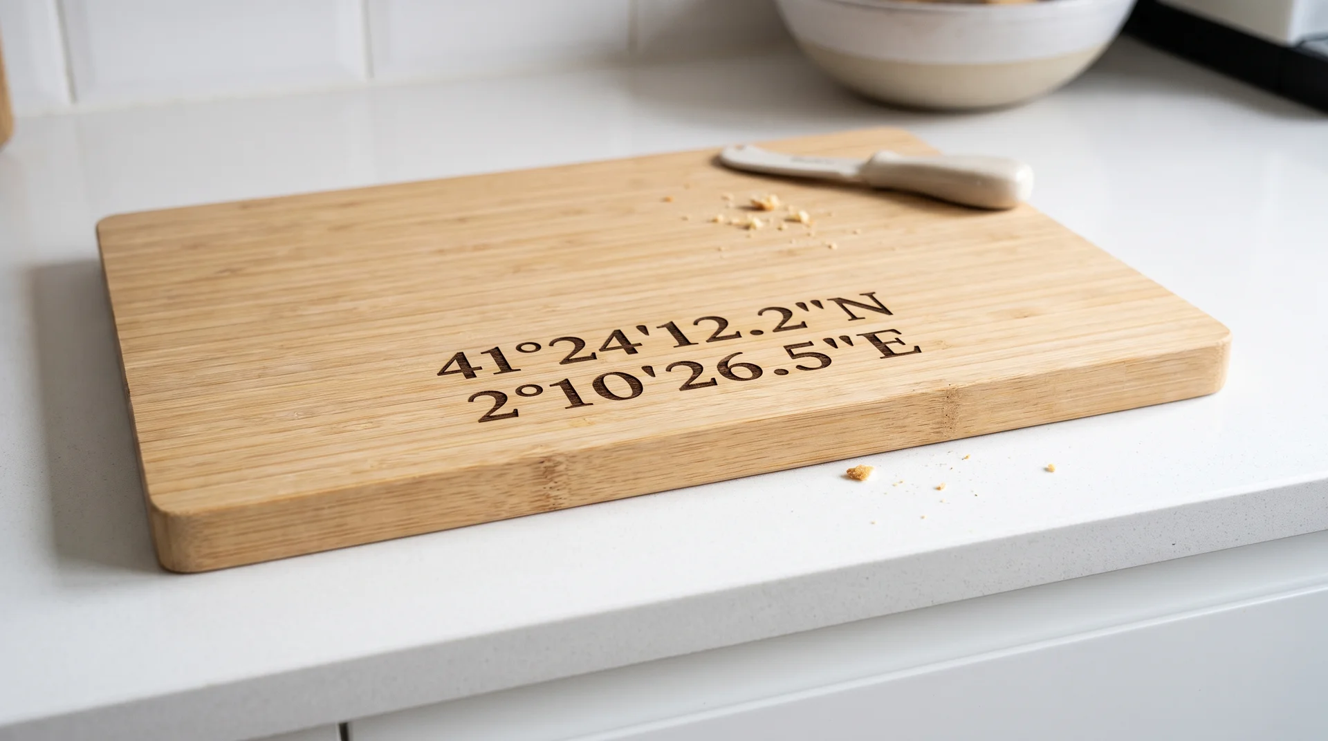
GPS Coordinates of Where They Met or Got Engaged
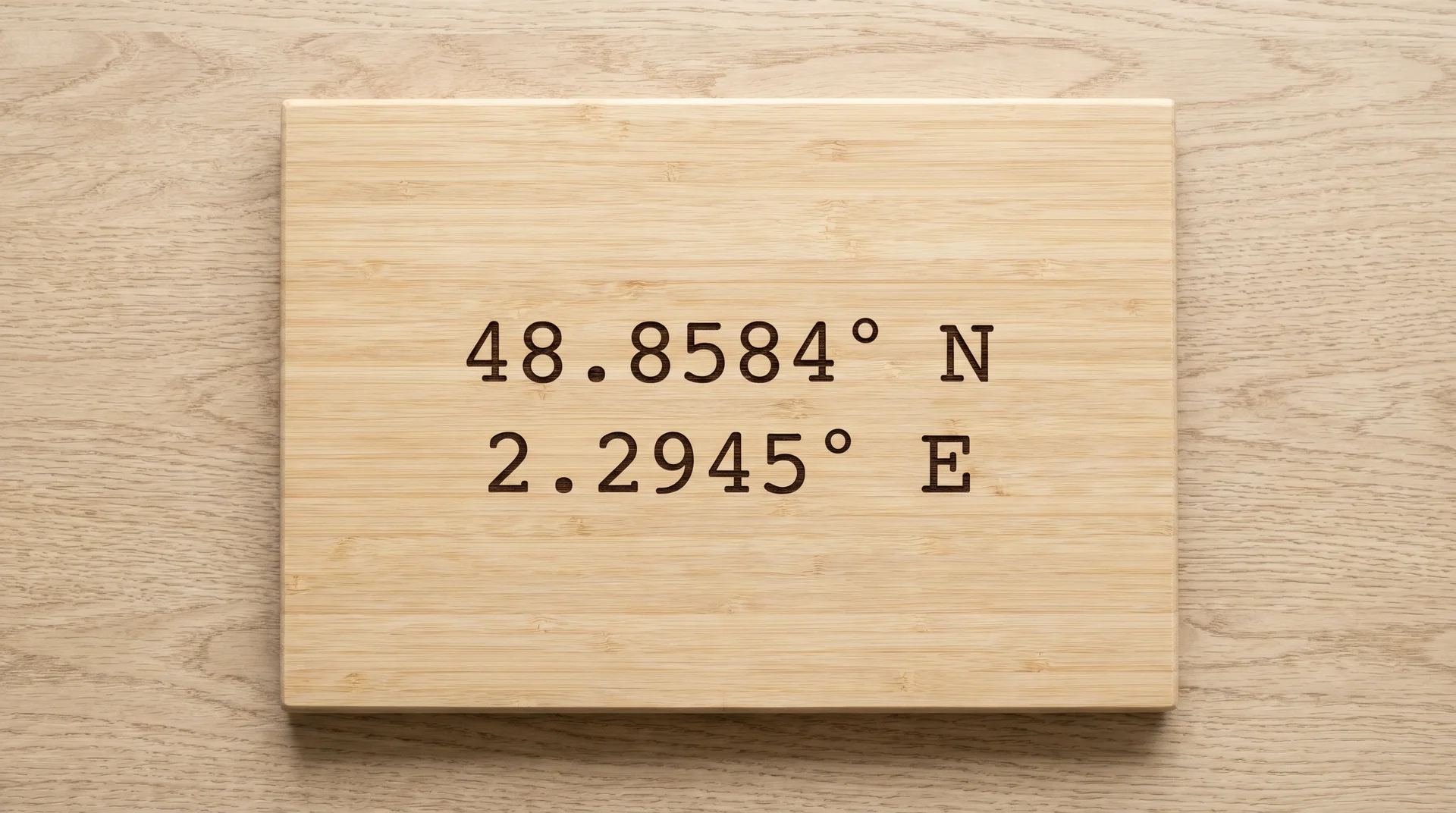
GPS coordinates are the most commonly ordered and most frequently misused wedding engraving on this list.
They appear as a default suggestion on nearly every custom board listing. I have mixed feelings about them. Coordinates only work when the recipient recognizes the numbers at a glance, immediately and without consulting a map.
The test: would you need to explain what the numbers mean when the board is opened? If yes, they’re decorative text. If the location genuinely matters to them, Idea 5 or Idea 17 communicates it more directly.
Combined Initials With an Ampersand, Wedding Date Below
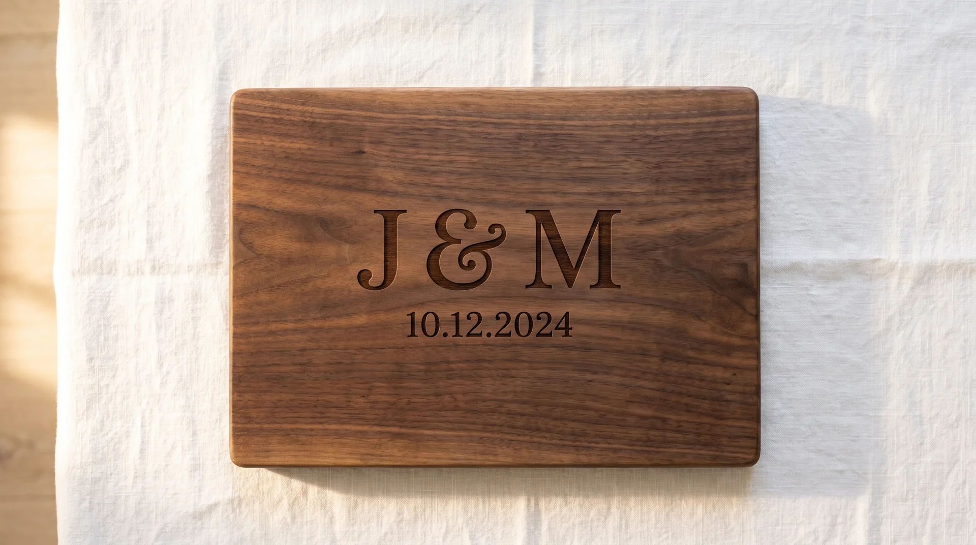
The most commonly ordered wedding board design is reliable, and that is worth knowing before you commit to it.
Two initials flanking a decorative ampersand, wedding date in a secondary line below. Works when the initials sit well together and the ampersand is elegant enough to earn its space. This is the proven choice.
It’s also likely what several other wedding guests ordered. If the couple would prefer something they’ve never seen on a board before, this isn’t it. Knowing which kind of people you’re buying for makes this decision straightforward.
Engraved Charcuterie Board Ideas for Housewarmings
A housewarming board is different because the home itself is the reference.
The board will live in that kitchen. The right design connects to the specific house, not just to the occasion of moving in.
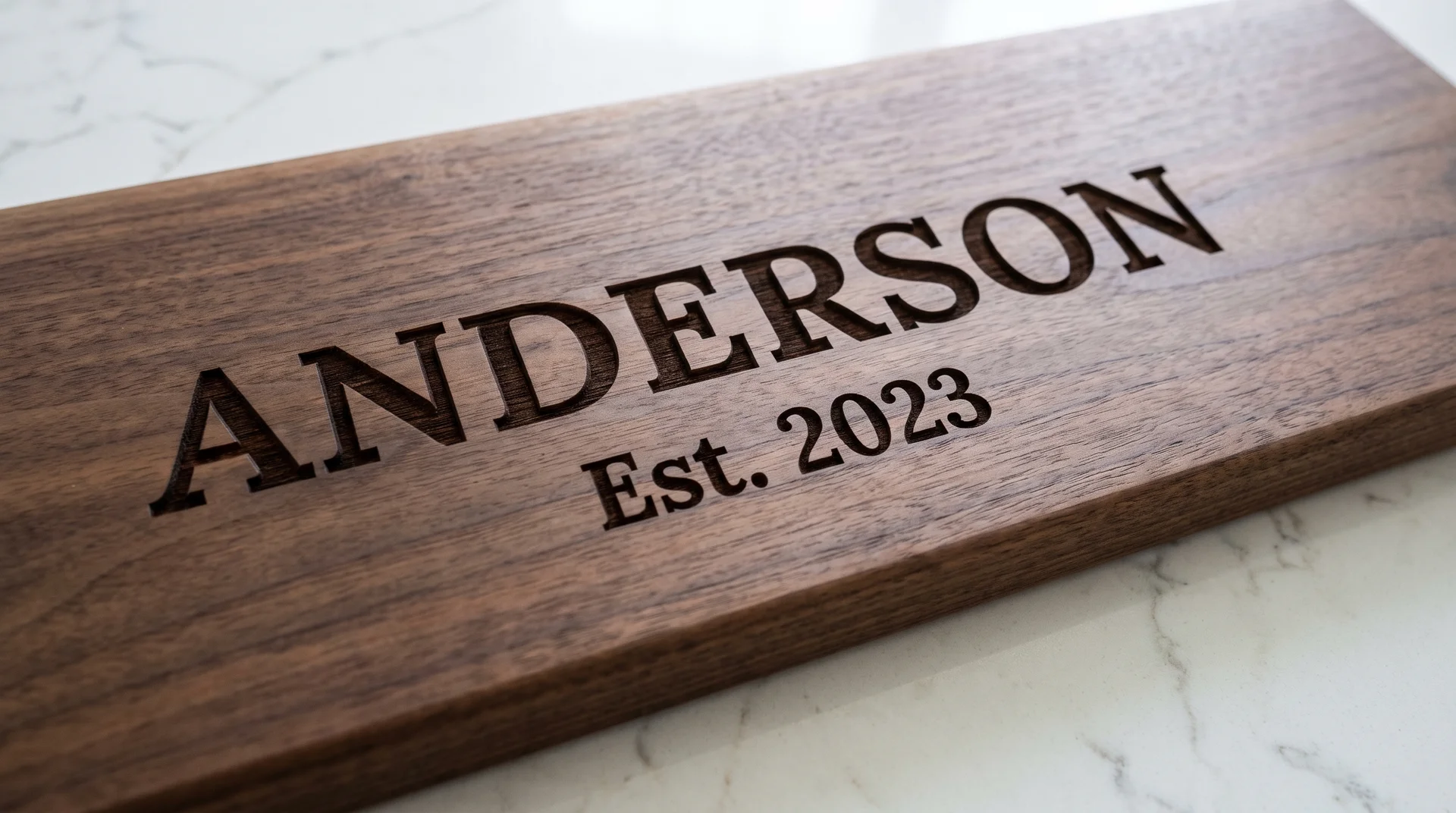
Street Number Plus Family Name
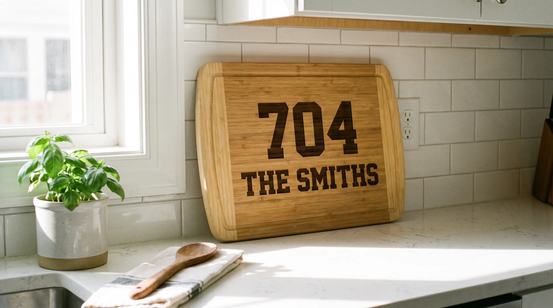
The clearest housewarming engraving puts the house directly into the design.
Street number in the upper position, family name below in the same bold type. This is my first recommendation for housewarming gifts. It reads immediately, needs no explanation, and stays relevant every time the board comes out.
The board becomes part of the kitchen rather than a guest on the counter. Bamboo is the practical choice here. It’s lighter to store, holds its finish under washing, and reads cleanly on bamboo’s lighter burn contrast.
“[Family Name] Est. [Year Moved In]”
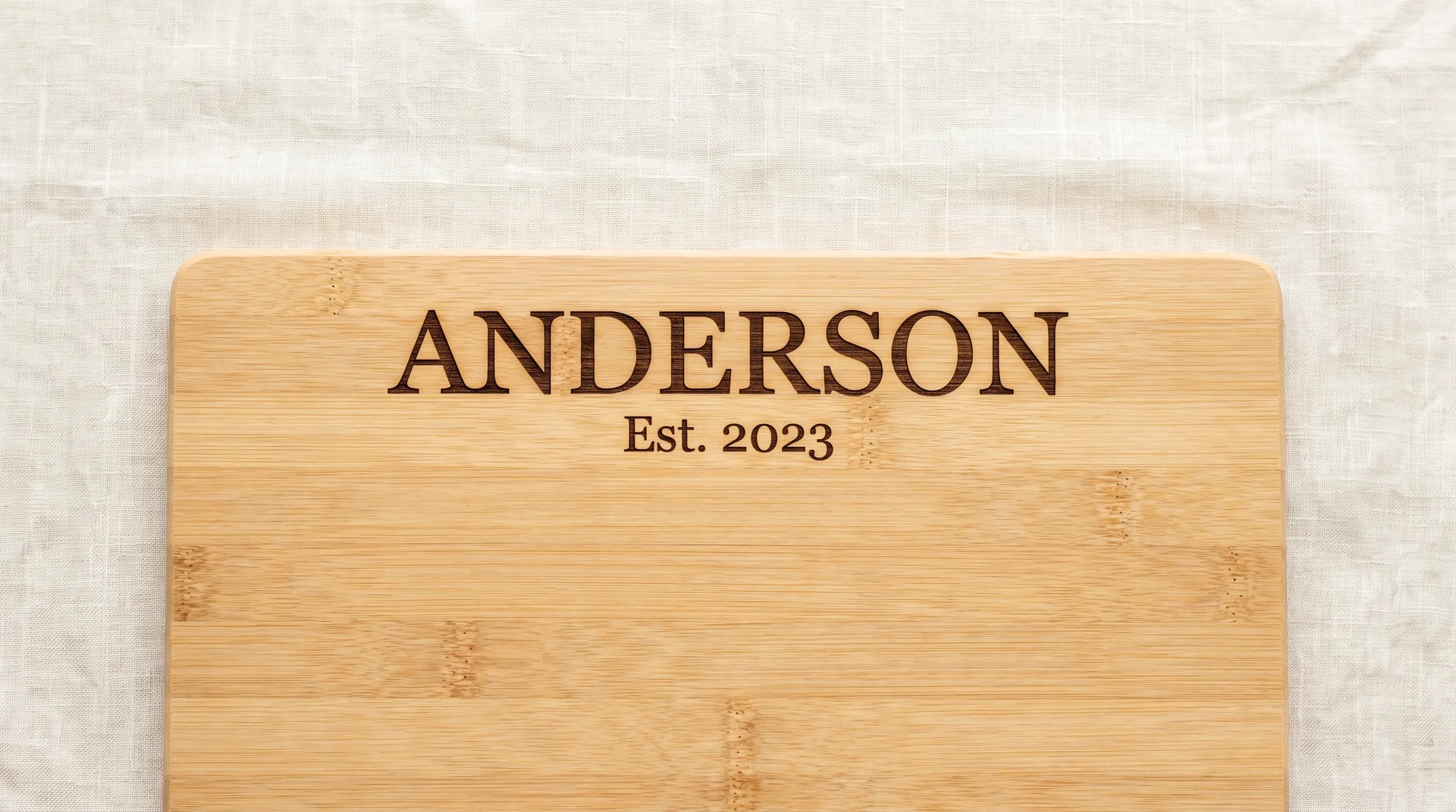
Slightly warmer than the street number alone, with one sizing constraint to sort out first.
The surname in larger text, “Est.” followed by the year in a secondary size below. Works well when the surname is short enough to scale properly on the board. A four- or five-letter surname leaves clean room for the year beneath it.
If you have a long or hyphenated surname, you need a larger board to keep the proportions right. The sizing problem is the only thing that makes this design fail. Confirm board dimensions before ordering, and ask for a mock-up if the surname is seven letters or more.
State Silhouette With a City Marker and Family Name
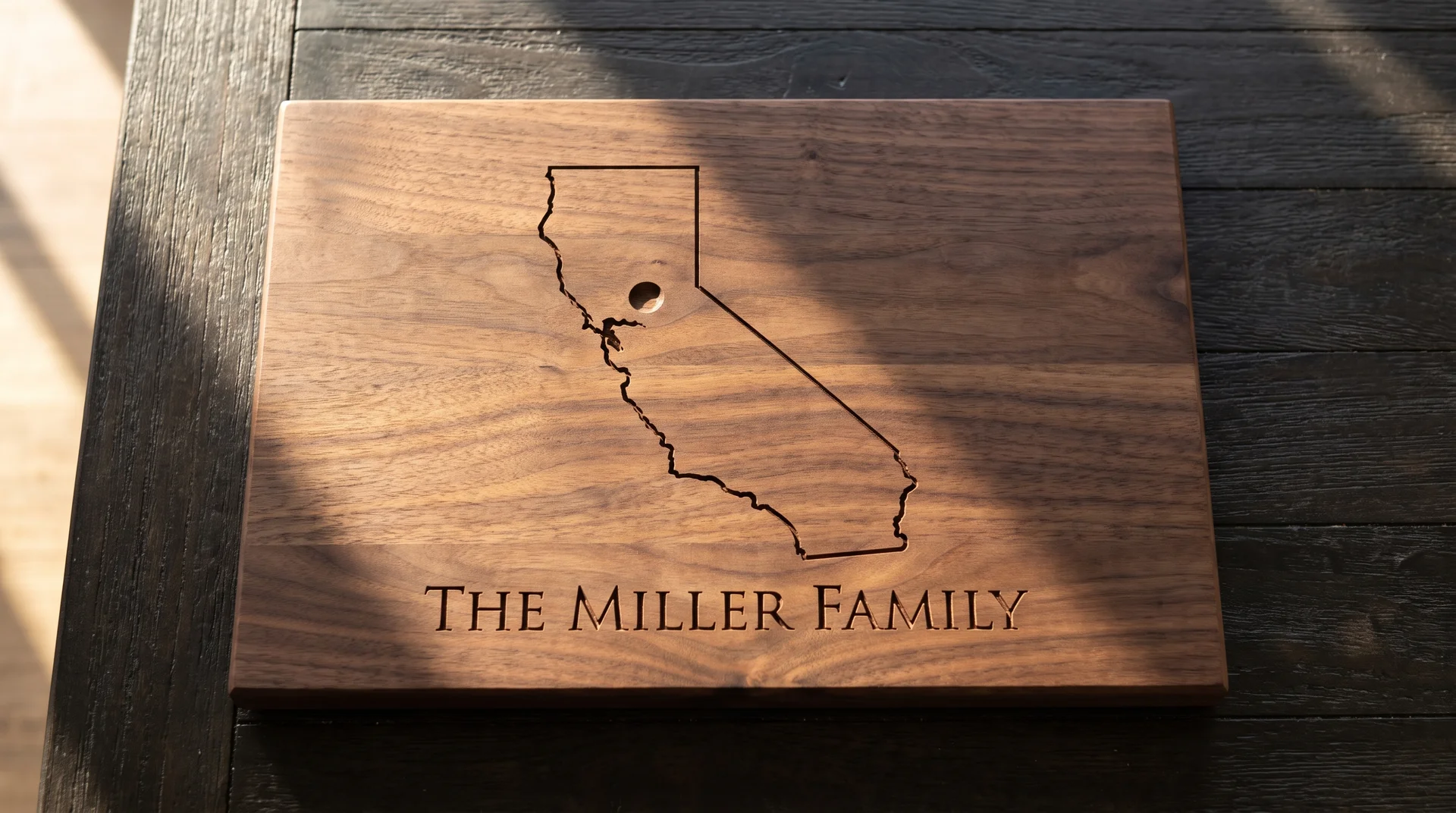
A state silhouette works as a housewarming engraving when the state reduces cleanly to an engraved line.
A state outline with a location marker dot and the family name beneath it. Works well for states with clean, simple profiles. Texas, Colorado, Wyoming, and Kansas all reduce clearly at board scale.
States with complex coastlines or narrow peninsulas lose definition when reduced. Ask for a digital proof at actual board scale before committing. A blurry silhouette reads as a production error, not a personalized gift.
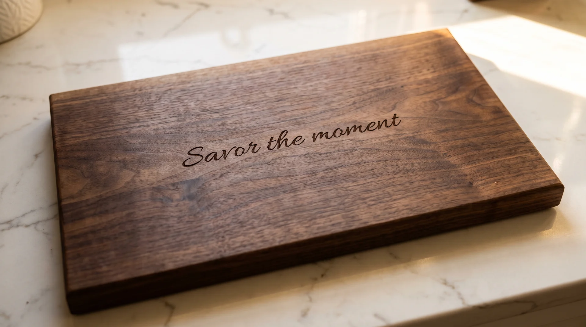
A Short Hosting Phrase They Would Actually Say
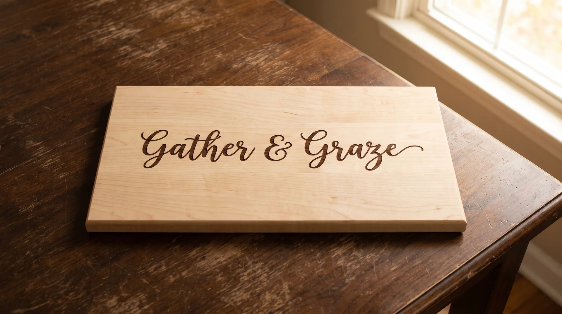
The right hosting phrase sounds like the specific person receiving the board.
Not a phrase from a Williams Sonoma display or a kitchen tea towel. Something the recipient would actually say when people come over. If you can’t hear them saying it, it’s the wrong phrase.
Keep it to one line. A phrase that wraps to a second line loses the clean, centered look that makes text-only engravings work. The execution requirement: specify one line maximum and confirm the character count before the order is placed.
Coordinates of the New Address
Address coordinates carry the same limitation as any coordinate engraving on this list.
They work when the numbers are immediately recognizable as home. For the people moving in, that recognition is usually there. It’s their address, and they know it.
For a friend giving a housewarming gift, there’s an extra translation step. The recipient has to connect the numbers to the address before the board lands as personal. The street number and family name in Idea 8 skips that step and does more work with less ambiguity.
Engraved Charcuterie Board Ideas for Anniversaries
Every anniversary has a built-in timeline.
The most effective anniversary engravings name something specific about that timeline. Generic sentiment is everywhere and reads that way.
The Year They Met Plus the Anniversary Year
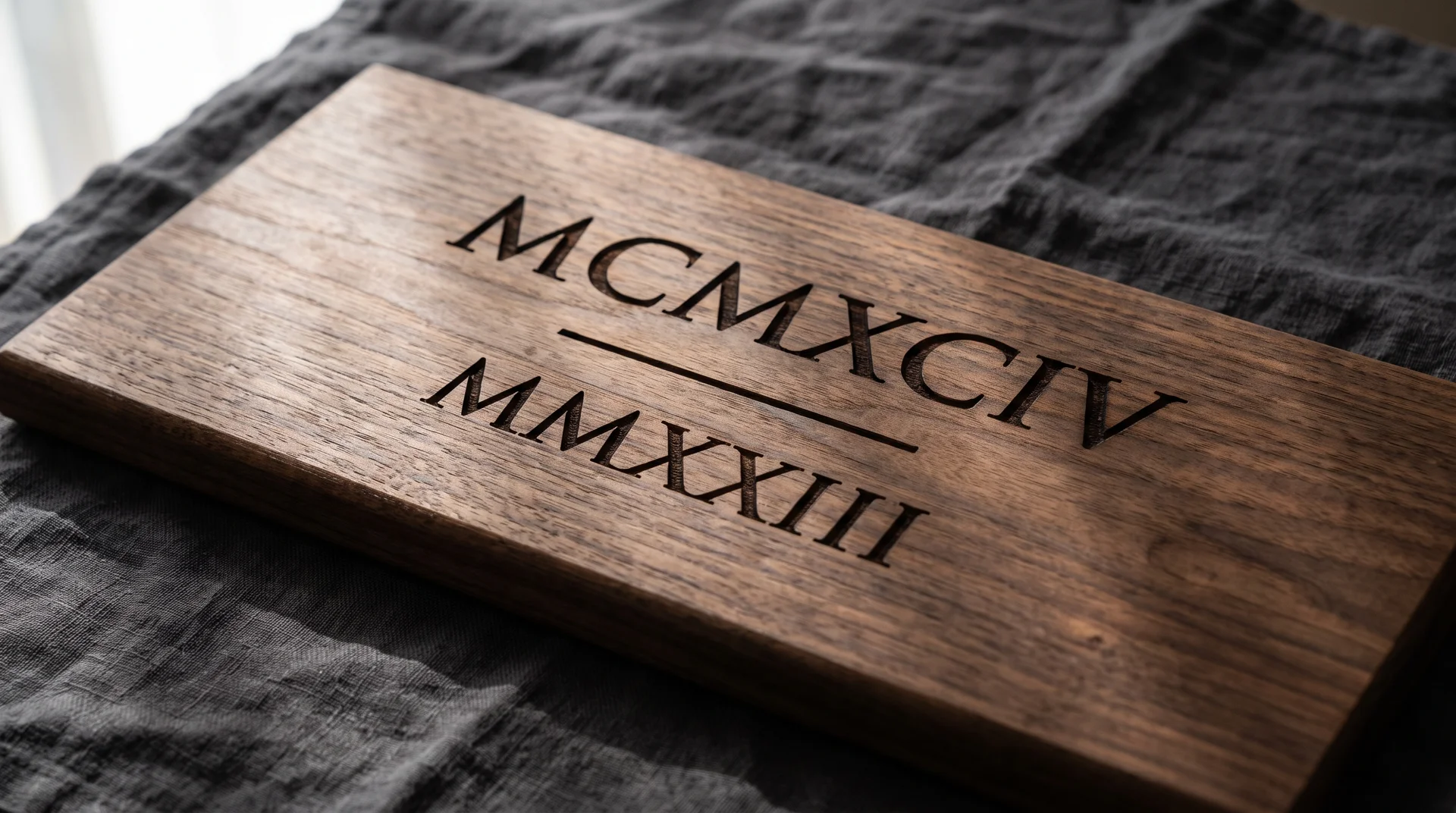
Two years in Roman numerals is the safest and most legible anniversary design on this list.
The year they met in the upper position, the anniversary year below, separated by a short centered rule. MMXII · MMXXV reads as intentional in a way that 2012 · 2025 does not. The numeral system adds visual weight that makes the layout feel deliberate.
This is the one I recommend most often for anniversaries. The information is specific to this couple, the format is clean, and the execution is simple. Use walnut, and ask the engraver for a serif that handles the broad Roman numeral characters cleanly.
“Then. Now. Always.” With Names Beneath
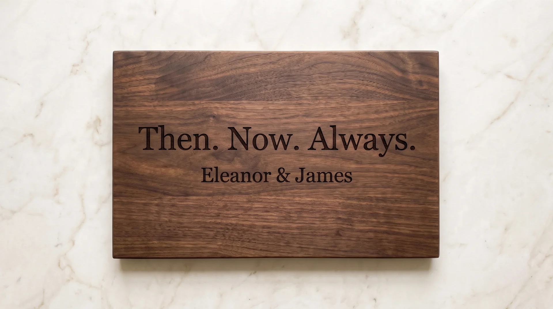
This phrase works exactly as well as the typeface it’s set in, and not a word better.
“Then. Now. Always.” in the upper position, the couple’s names in the same font at a slightly smaller size below. In a classical serif with real contrast between thick and thin strokes, this is an elegant anniversary design. Compact and visually clean when the font earns it.
In a rounded sans-serif, it reads like a motivational poster. The execution requirement: give the engraver a specific font name or a reference image. “A nice font” is not a specific enough instruction.
A Phrase or Expression That’s Genuinely Theirs
The highest-risk anniversary idea is also the most personal one available.
One line, centered, no explanation attached. It must be the actual phrase that belongs to them, not something close to it. You must know it with certainty before this idea is right.
I can’t tell you whether your version of this idea will land. When the phrase is right, this is the most memorable board in this section. When it’s slightly off, it reads as a mistake engraved on walnut.
First Names Plus the Number of Years
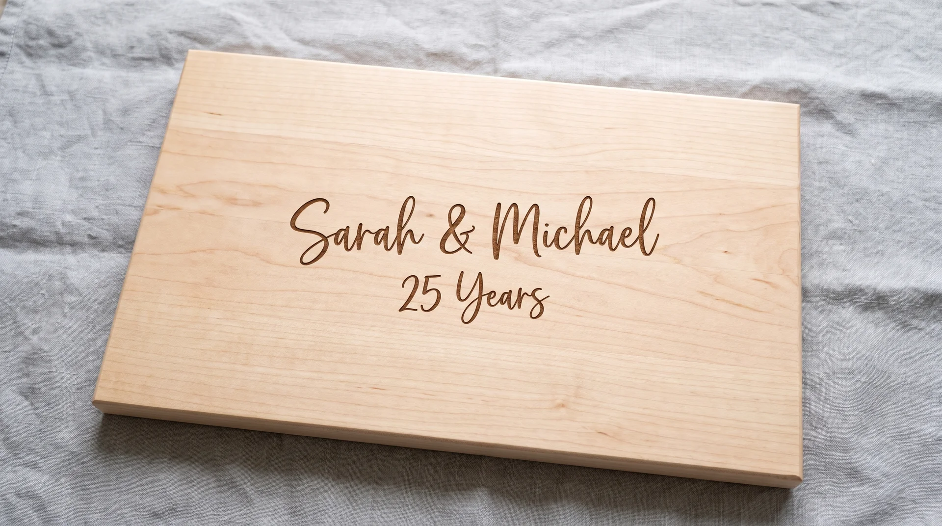
The most direct anniversary engraving is often the most right one.
Two names connected by an ampersand, the number of years below in slightly smaller text. “Sarah and Tom, 25 Years” says something specific about two people and a specific duration. The number does the emotional work that a sentiment phrase rarely matches.
I’d take specific over poetic every time on an anniversary board. A sentiment phrase could describe any couple. The names and the number can only be on this board.
A Meaningful Place Name
A place name works when both recipients recognize it without a pause.
A road name, a neighborhood, a city block, engraved as clean text with no illustration attached. Works when the place is instantly recognizable to both recipients. They know what the name means without needing context.
If you’d need to explain the reference when the gift is opened, it’s the wrong choice for an engraving. A good engraving doesn’t need a caption. If the name won’t land immediately for both of them, Idea 16 is more reliable.
Engraved Charcuterie Board Ideas for the Regular Host
A board that comes out every month needs different design logic than a keepsake.
The design needs to work every time: with every food setup, for every group of guests. Occasion-locked engravings are the wrong choice for someone who genuinely uses their board.
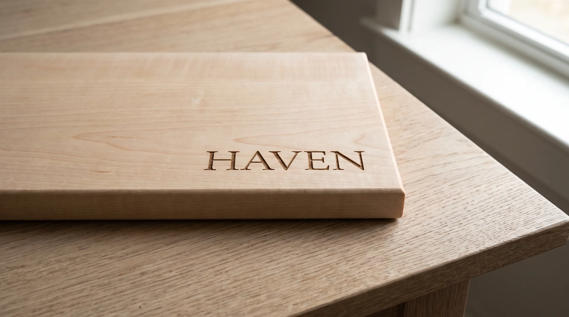
Surname or Initial Only
Maximum versatility comes from maximum restraint.
A single well-set initial or the full surname in a strong serif or block font. No occasion lock, no date that connects the board to a specific event. Right for someone who reaches for their board every month and wants it to work every time.
I’ve seen this dismissed as the safe option. One character against the full surface reads with more presence than three competing elements. Ask for a bold serif with clean geometry, and use bamboo for a board that gets regular use.
A Single Food Illustration With No Text
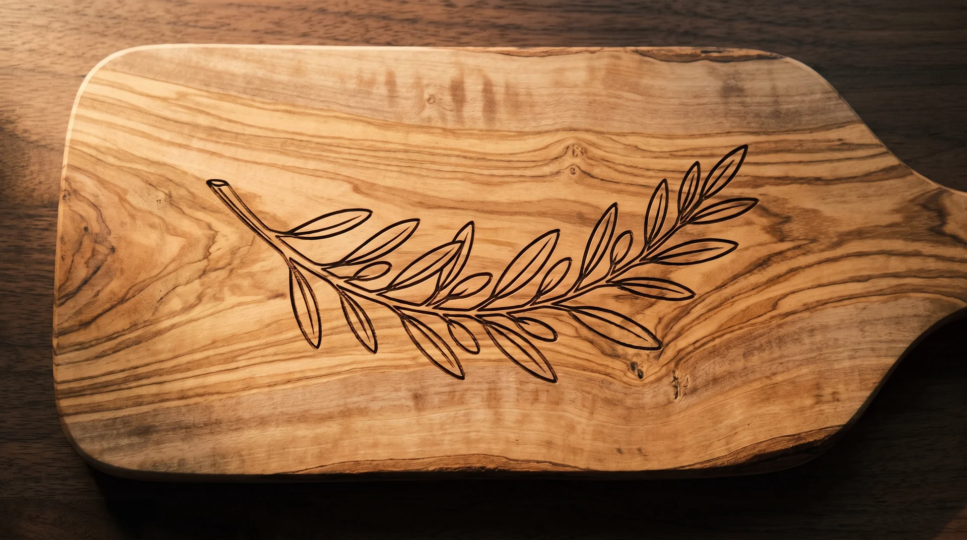
A food illustration without any text is the most versatile single-element design on this list.
A cheese wheel, a grape cluster, or a clean olive branch engraved in the center of the board. No name, no date, nothing to explain. I recommend this for anyone who genuinely uses their board, because a beautiful object outlasts any occasion.
The execution requirement: confirm illustration scale with the engraver before placing the order. A small illustration on a large board looks accidental, and a large one on a small board looks crowded. Get a digital proof at actual board dimensions and evaluate it at that scale.
A Wine Region or Food Region as Text
This idea works only when the region is genuinely specific to the recipient.
A wine region or food region name in clean, centered text. Works when the recipient genuinely knows this region and would name it without prompting. The word is a reference, not a decoration.
It falls flat when the region was chosen because it sounds good on a board. The test: could you picture them naming that region without prompting? If not, the region is a design choice made for them rather than about them.
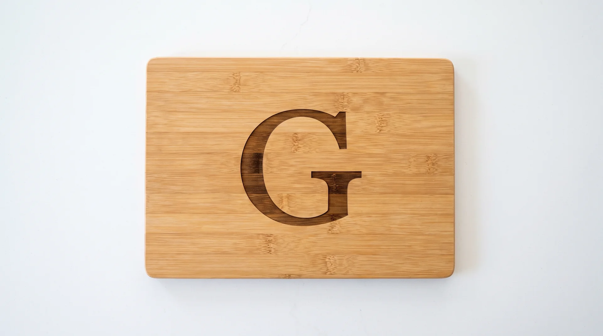
A Monogram Only, in a Clean Serif or Block Font
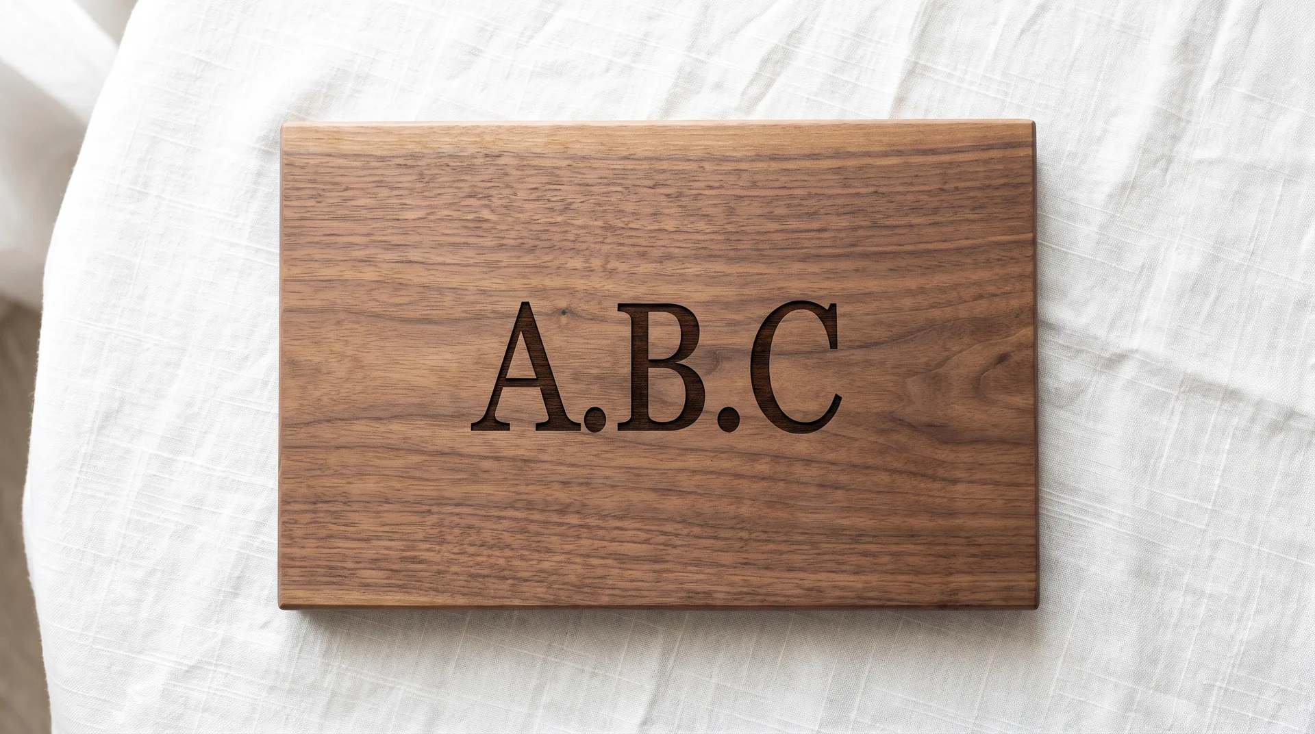
A monogram turns the board into a kitchen object rather than a keepsake, and that distinction matters.
Three letters in a clean serif or block font. No occasion lock, nothing that marks a specific event. Right for someone who uses their board regularly and wants it to feel like theirs, not like a commemorative piece.
The decision is about what the recipient wants the board to be. Someone who wants Idea 4 or Idea 7 wants a board that marks something. The person who wants Idea 21 just reaches for their board.
Genuinely Personal Engraved Charcuterie Board Ideas
Most engraving ideas are organized by occasion. These four don’t need one.
They need you to actually know the person. If you’re not certain you do, the wedding or housewarming sections are the more reliable choice.
An Inside Phrase or Expression
An inside phrase requires that you actually know the person well enough to be certain of it.
One line, centered, instantly recognizable to the recipient and meaningless to anyone else in the room. If you can find this phrase on a greeting card, a poster, or any printed product, it’s not inside enough. It must require context that only the recipient has.
A near-miss inside phrase reads as a mistake, not a sentiment. When you’re not certain, go back to the occasion sections. This idea has the highest ceiling and the narrowest margin for error on this page.
Their Pet’s Name or Breed Silhouette
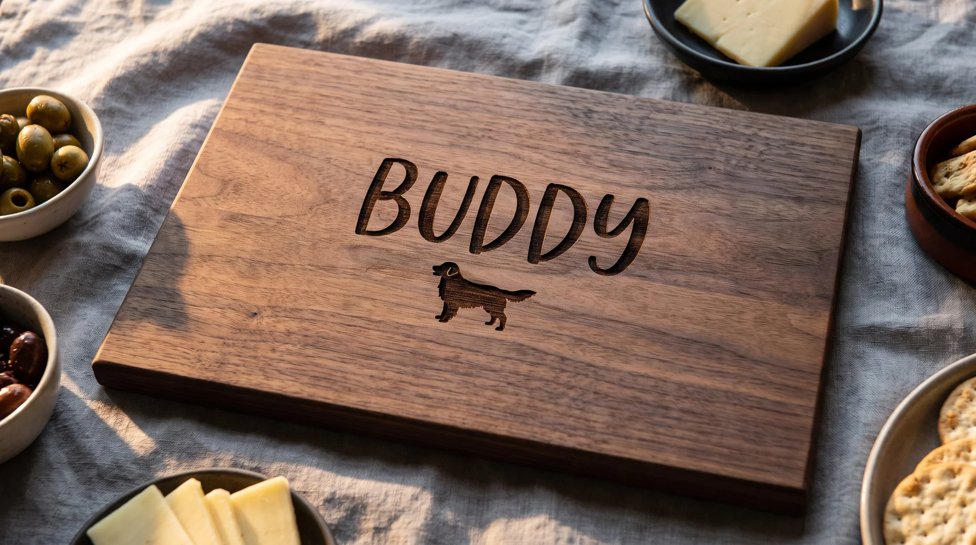
Pet engravings carry more execution risk than any other idea on this list.
The pet’s name in clean text is the safer option. A distinctive pet name in a good font reads immediately and never looks like clip art. A breed silhouette is elegant when executed well and looks like clip art when it isn’t.
Ask for a proof image before committing to the silhouette, at actual board scale. Confirm the output before the order is final. This is the one idea in this section where the verification step is not optional.
A Date That Isn’t a Wedding Date or Milestone Anniversary
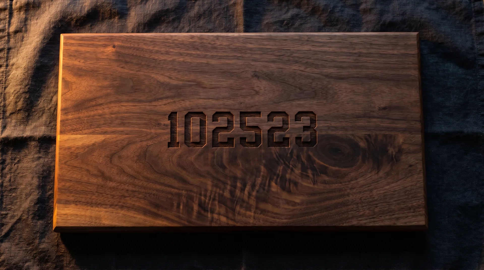
A graduation, a first meeting, a day only the two of you would mark.
Engraved as numbers only, the board becomes a record of something no one else thought to keep. This is my favorite idea in this section. It means nothing to anyone else and needs no explanation to land.
The execution is simple: four or six digits in clean block numerals, centered, no additional elements. The absence of a label is intentional. A date without a caption means something different from one with a label attached.
A Symbol From Their Heritage, Culture, or Personal Practice
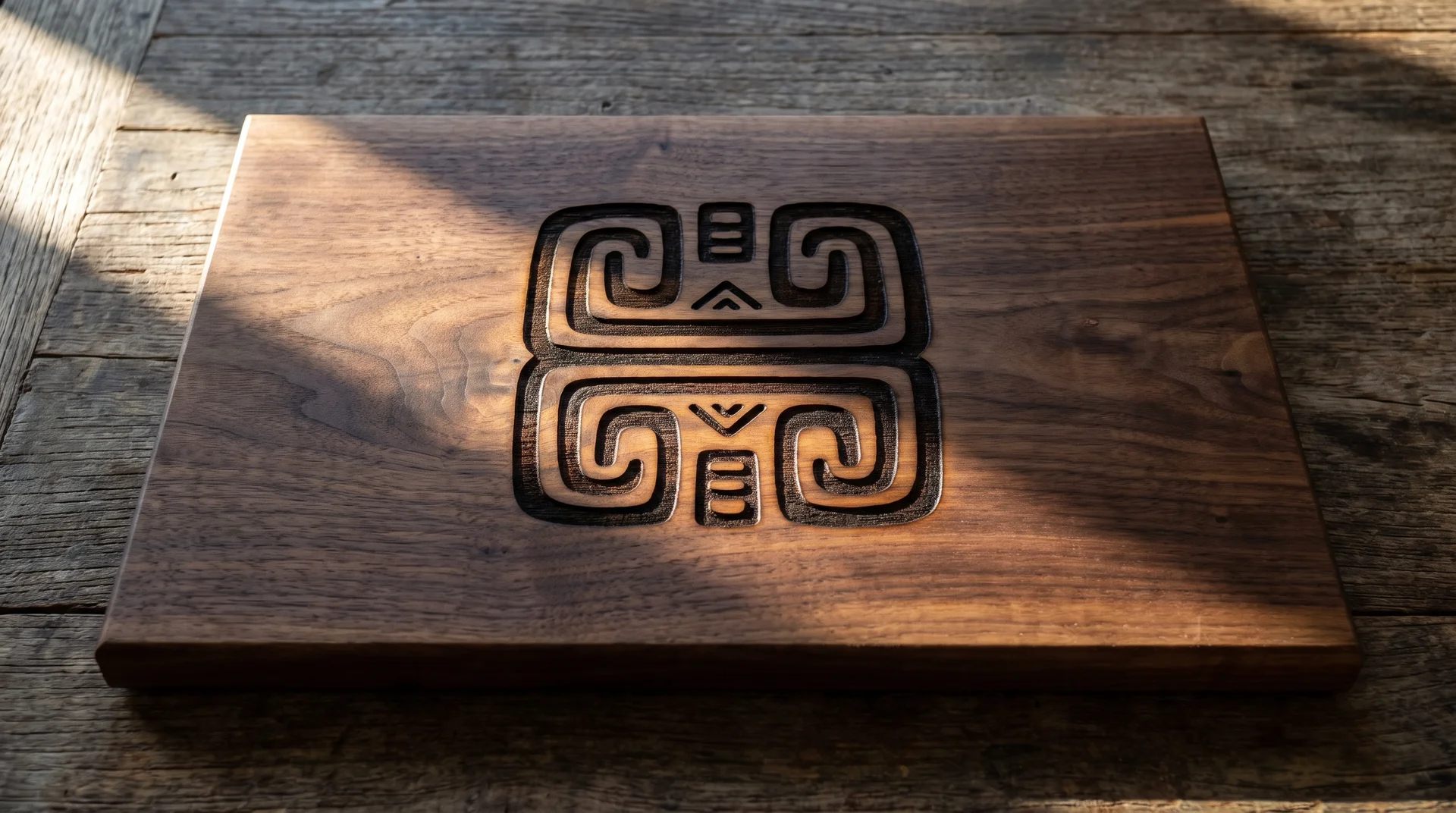
Cultural and heritage symbols work when they reduce cleanly to bold line form at board scale.
A symbol from the recipient’s heritage, spiritual practice, or personal tradition. Works when the symbol has bold outlines, minimal interior detail, and a clean form that holds at 14 inches. The burn needs something clear to follow.
Intricate interior detail does not survive the engraving process at board scale. Fine interior lines become a blurred shape when burned into wood grain. Send a clean vector file and ask for a test burn at actual scale before the order is final.
What Over-Engraved Charcuterie Board Actually Looks Like?
Over-engraved boards always read as cheaper than simply-engraved ones.
I keep a folder of photographs from real design projects: twelve years of choices I’ve watched fail in real rooms. Three combinations come up most reliably in that folder.
- Full surname plus a decorative border plus a date. The border and the surname compete for dominance. The date gets lost between them, and nothing lands as the clear visual statement.
- GPS coordinates plus a monogram. Two elements competing to be the meaningful one. The eye doesn’t know which one is the point.
- A long phrase plus an illustration at the same scale. Text and imagery at equal weight is too much for an 18-inch surface. One or the other, not both.
The eye has nowhere to go when a surface says three things at once.
The one-element rule from the opening section is the fix. Pick one thing and let it be what the board says.
One Thing to Confirm Before You Submit the Order
The design decision and the order submission are two different moments.
Between them, confirm the design has been previewed at actual board scale. A layout that reads cleanly at 400 pixels can look very different at 14 inches. Material choice also changes how designs read.
| Material | Burn Quality | Works Best For | Avoid |
|---|---|---|---|
| Bamboo | Light, shallow burn | Bold text, clean initials, monograms, frequently used boards | Fine-line illustrations, script fonts with thin strokes |
| Walnut | Deep, dark contrast | Fine-line work, detailed illustrations, botanical elements, serif scripts | Nothing specific. Forgiving for most designs. |
| Olive wood | Variable (prominent natural grain) | Bold text, simple silhouettes, large initials | Fine-line scripts, detailed botanical illustration |
Confirm font with a reference image rather than a category label. If the board will be used for food, confirm the engraver applies no lacquer over the engraving area.
For more on wood surface safety and material selection, see our safest cutting boards and cutting board design ideas guides.
Read: Safest Cutting Boards
Read: Cutting Board Design Ideas
The Decision Starts With One Call
Every idea in this list works when it’s the only idea on the board.
The board that felt generic at the reveal was almost never the engraver’s fault. It was a design that didn’t commit.
Pick one element that says something true about the person, and let the wood do the rest.