

You already know you want teal in this kitchen. The problem is turning a general preference into a specific decision.
Teal is a good kitchen color. The shade runs wide enough to work in small, bright rooms and large, moody ones.
These 17 teal kitchen ideas are organized by commitment level. Each one includes what it takes to execute, not just what it looks like when someone else has already done it.
Choose Your Own Shade of Teal Kitchen
Your shade of teal determines what your room can handle.
Teal spans a wide range. At one end, it sits close to turquoise: bright and blue-dominant. At the other, it pushes toward forest green and near-navy.
Light teal reflects more light. It works in kitchens that don’t get much natural light. Deep teal absorbs light and creates atmosphere, but it needs specific room conditions to work without making a space feel smaller than it is.
Before you choose any idea below, know where your kitchen sits on that spectrum.
How Light Changes Teal
Teal shifts color based on your light source more significantly than most other cabinet paint colors.
- Under cool white LED lighting, teal skews bluer after dark.
- Under warm white, the same shade slides toward green.
- In natural daylight, teal reads closest to what you saw on the chip.
The light in your kitchen is doing more work than the paint.
Get a large paint sample of at least 12 by 12 inches. Lay it on the counter under your actual kitchen lights. Check it at three different times of day before committing.
That single test has saved more of my clients from an expensive repaint than any amount of inspirational browsing.
The Full Cabinet Commitment
Painting kitchen cabinets is the highest-impact teal decision you can make.
It’s also the one with the most variables. Shade, cabinet profile, primer, and finish each shift so that the color reads at scale across a full kitchen run.
I’ve watched the same shade look sophisticated in one kitchen and muddy in the one next door. The difference was the door profile and the light condition, not the paint color.
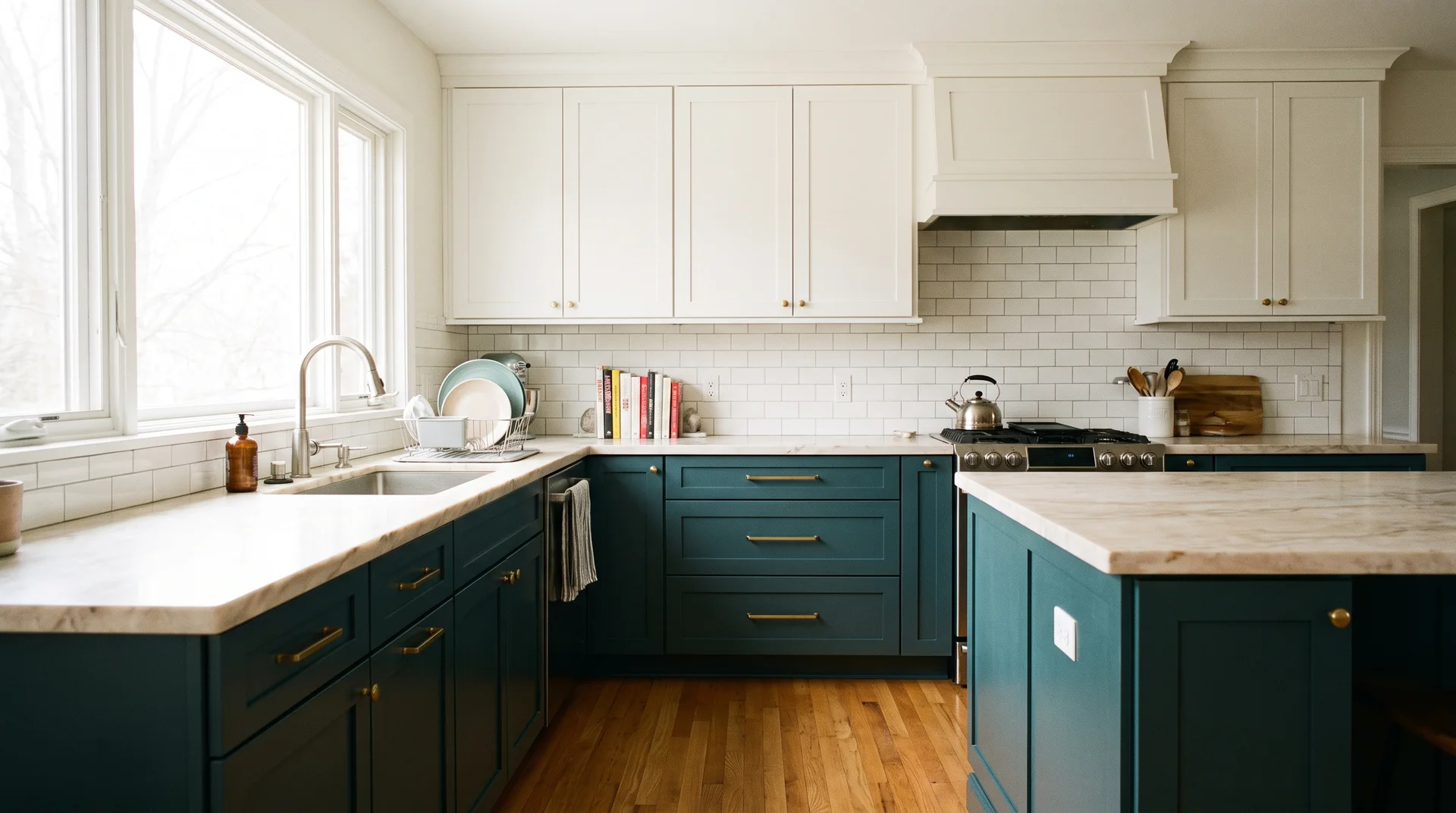
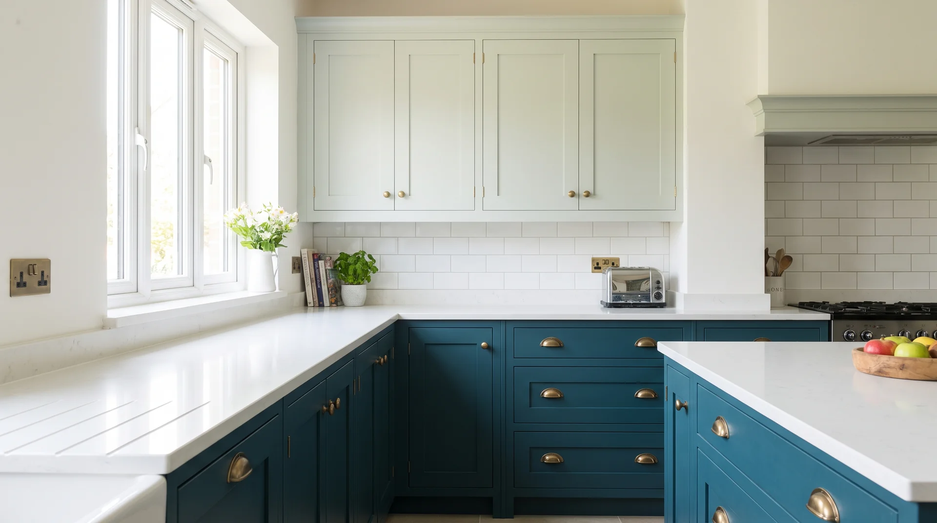
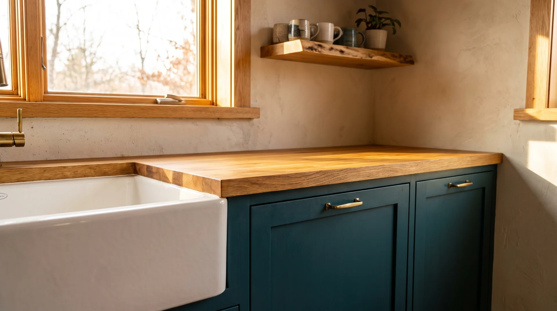
Dark Teal Lower Cabinets and White Uppers
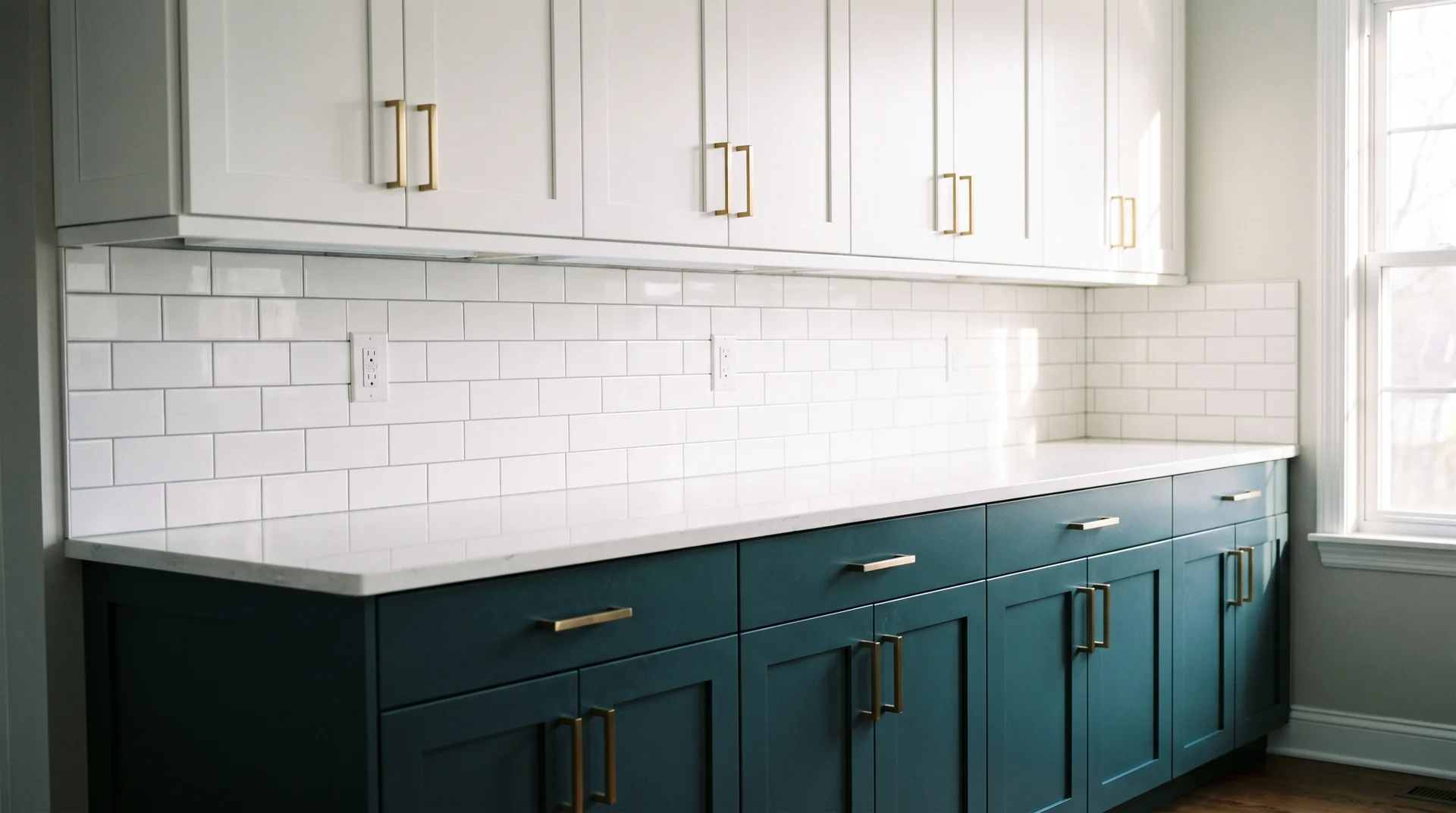
Dark teal lowers with white uppers is the most reliable teal cabinet combination.
Stand at your lower cabinets and picture the visual weight of the room. The lower half of a kitchen is where visual weight should naturally sit. White uppers keep the top half open and stop the color from enclosing the room on both sides.
Before you prime anything, stand at the doorway and look at the full cabinet run. The profile of those doors will change how teal reads as much as the shade will.
Two-door profiles respond to deep teal very differently:
- Shaker doors with a recessed panel give the eye somewhere to rest inside the color. The same shade reads lighter and more varied across a full run.
- Flat slab doors make deep teal look continuous and heavy. The color has nowhere to break.
Slab doors aren’t wrong for teal, but they require a lighter shade to avoid closing the room down.
On primer: deep teal pigments on factory-finished cabinet doors need a bonding primer, not a standard water-based primer. Without it, the color can lift at door edges within a year.
MDF cabinets, with the smooth pressed-wood finish common in most production kitchens, need shellac-based primer specifically.
Standard bonding primer isn’t enough on that surface. Work in a ventilated space: Shellac primer is solvent-based, and the fumes need somewhere to go.
For the full step-by-step on cabinet preparation, priming, and painting sequence, read…
Read: How to Paint Kitchen Cabinets Correctly?
The transition line between teal lowers and white uppers needs a deliberate decision, too.
A white subway tile backsplash is the most reliable bridge. A patterned or colored backsplash becomes a third element competing for attention, and that’s where this combination most often goes wrong.
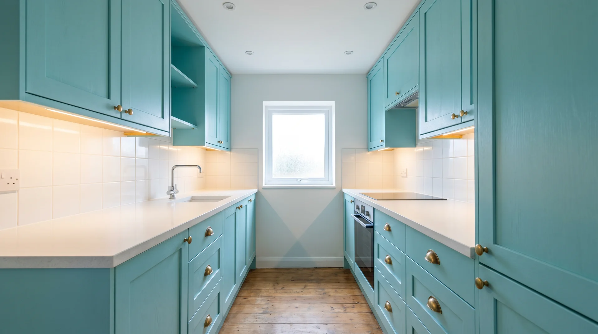
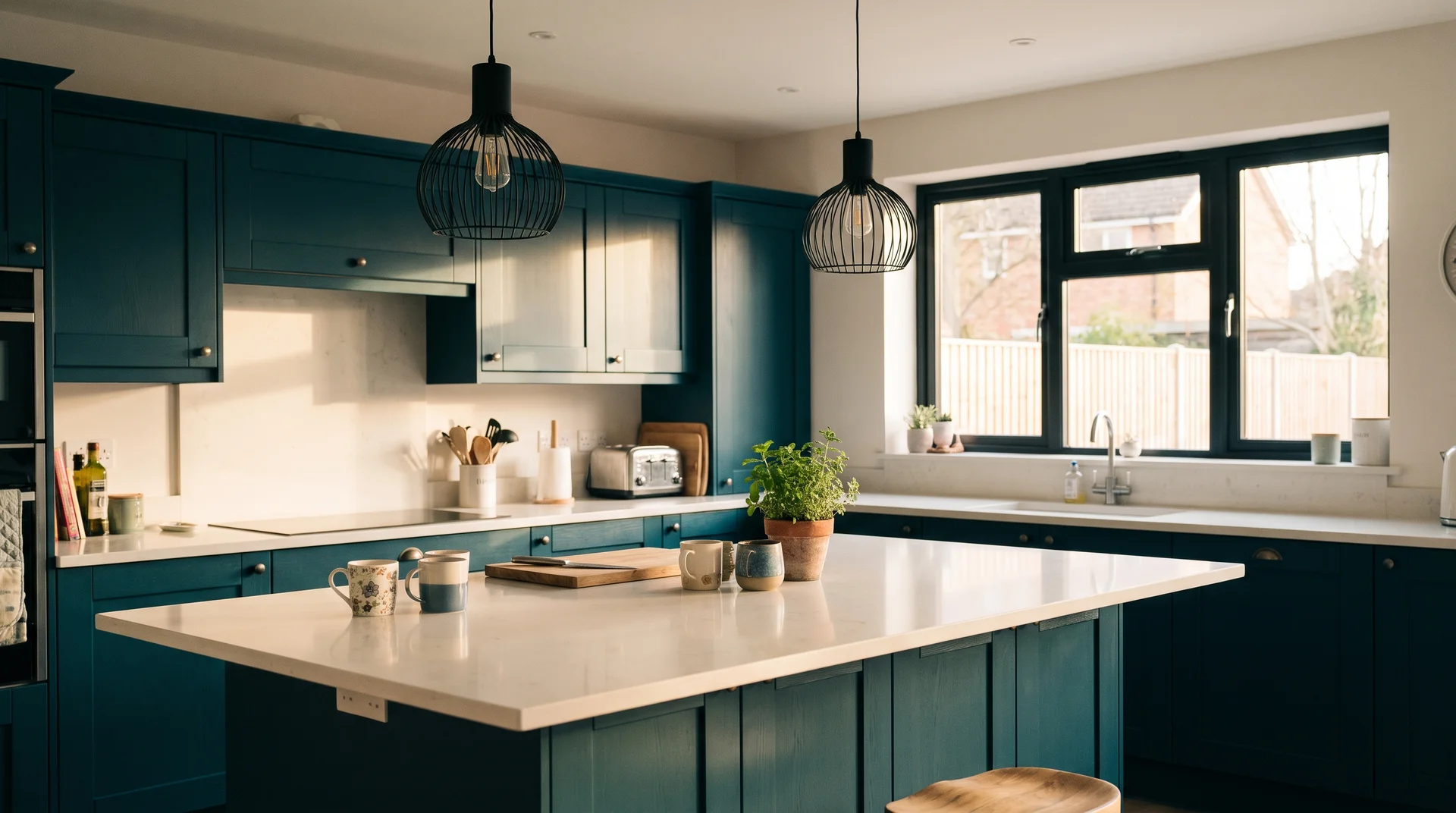
All-Over Dark Teal Cabinetry
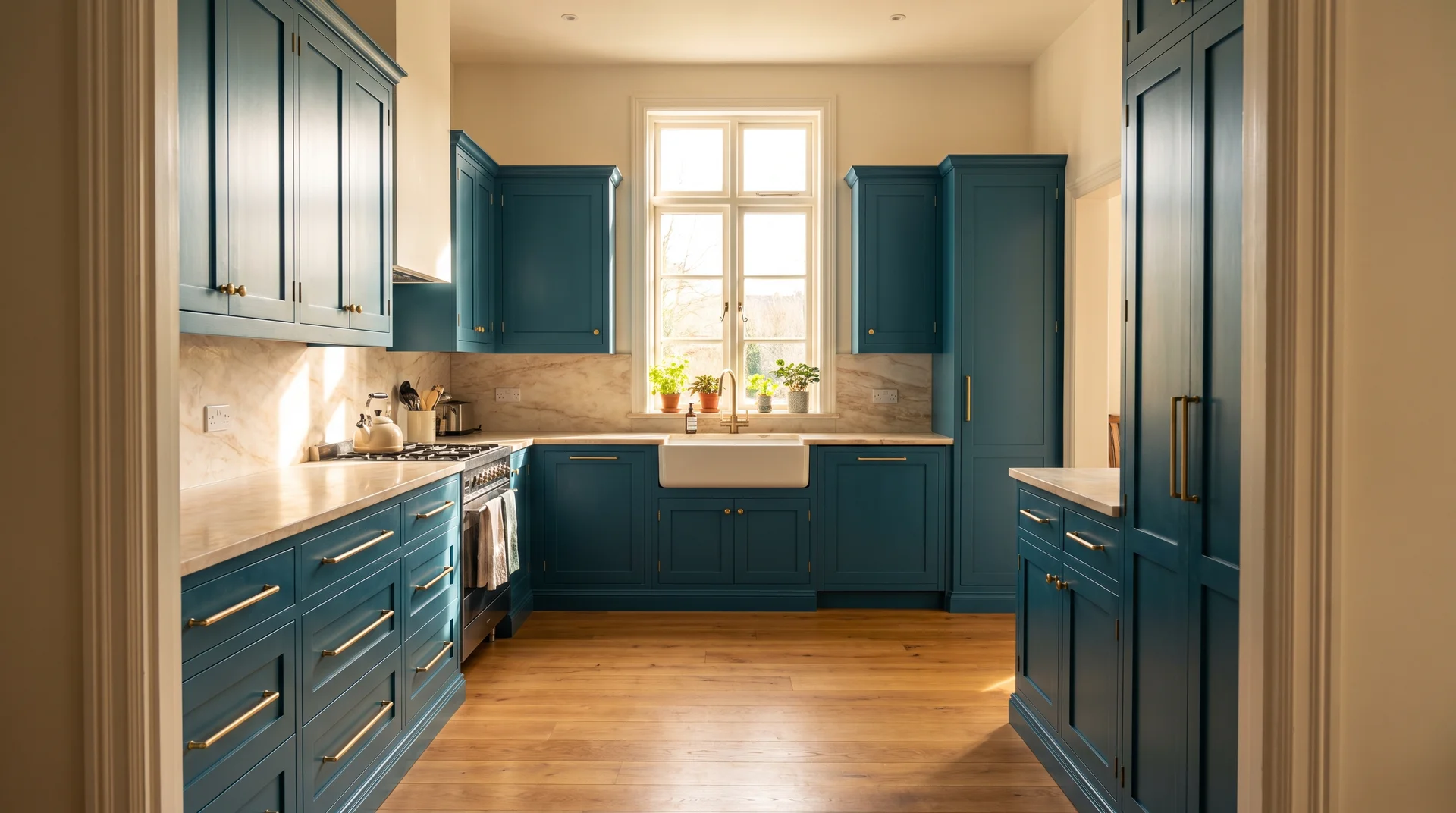
All-over teal works, but the room conditions and the supporting palette both need to be right.
I’ve seen this look extraordinary. I’ve also watched it make a perfectly good kitchen feel like a corridor. The difference is usually ceiling height and light, not the shade itself.
The room needs at least two of the following to support all-over teal:
- Ceilings at nine feet or higher
- At least one south- or east-facing window with direct light during cooking hours
- A kitchen that opens to an adjacent living space, giving the eye a visual exit
Without at least two of these, the better starting point is Idea 1.
When the room can carry it, the supporting palette has to stay quiet. Countertops in white marble, pale quartz, or light soapstone. Hardware in brushed or unlacquered brass. Chrome and brushed nickel push the room colder.
Gloss paint on all-over teal doubles the visual intensity. Satin or eggshell makes this livable in a way that gloss doesn’t.
Two-Tone Teal Lowers and Sage Green Uppers
Teal lowers with sage green uppers work because both shades share the same blue-green family.
This combination appears rarely in teal kitchen content. Most two-tone articles pair a bold color with white or with wood. Teal and sage can work together, but the value relationship between them has to be right.
The uppers must be significantly lighter than the lowers. Same hue family, two to three steps lighter in value. If the sage reads too close in depth to the teal, the combination looks like a mistake rather than a choice.
The execution is demanding. The cut-line where the two colors meet will show any wavering. This isn’t a beginner DIY project.
Apply painter’s tape to the upper cabinet edge, not the lower. The tape goes above the transition line to produce a clean result.
A painter with two-tone cabinet experience will do this better than most DIY attempts, and it’s worth pricing that before you start.
Teal Cabinets with Natural Wood Open Shelves Above
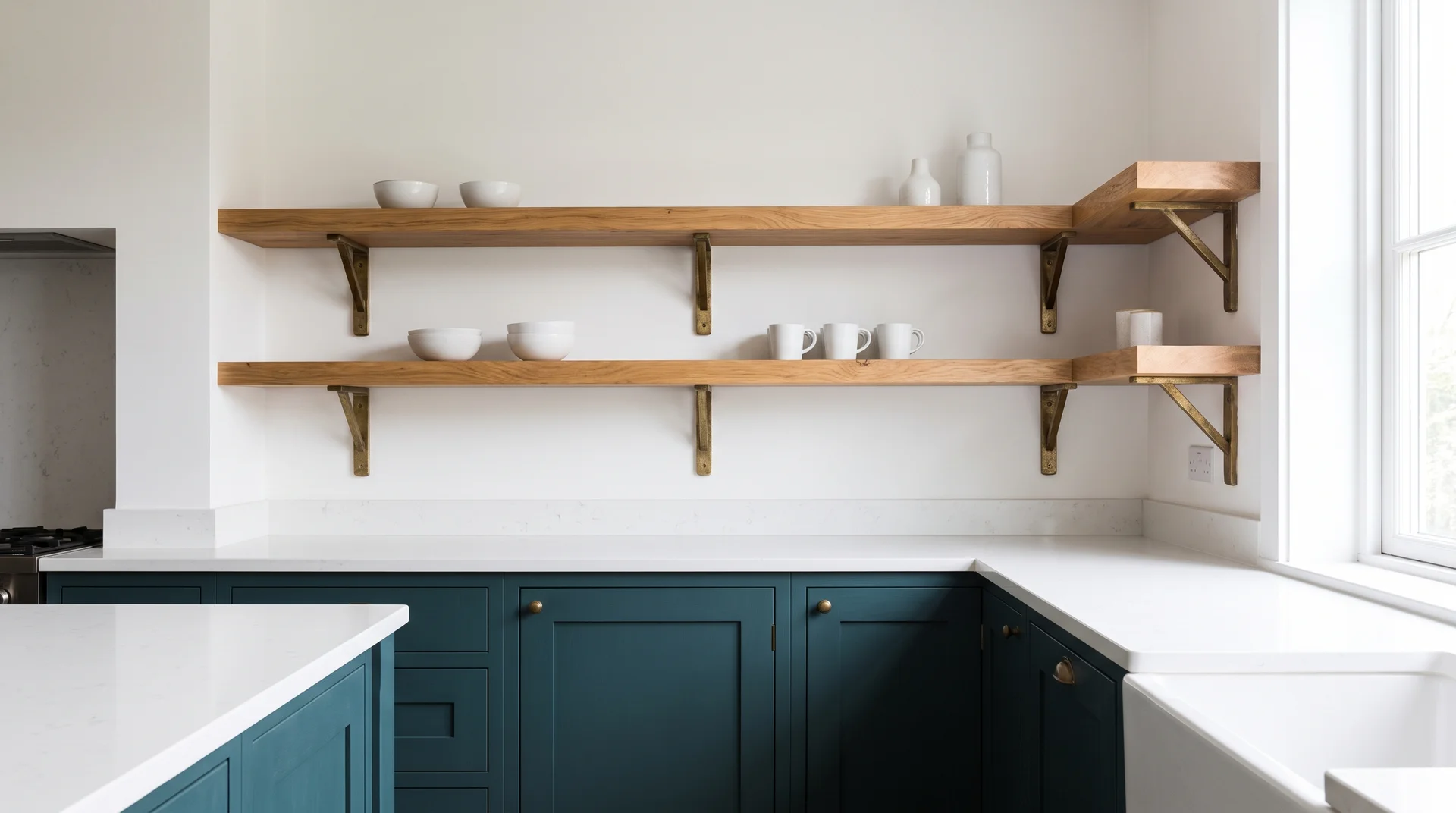
Replacing upper cabinets with natural wood floating shelves above teal lowers gives depth without enclosure.
Teal handles the drama below the countertop. Raw wood above handles warmth. Walk into that kitchen and the eye lands on the color at cabinet level, then travels up to the wood grain and natural texture.
It reads less like a color statement and more like a kitchen with considered character.
Floating shelves above a heavy cabinet color need to be at least 1.5 inches thick, in my experience. Thinner shelves look provisional next to a densely painted cabinet run. Wall anchoring into studs is mandatory at this shelf depth; never anchor into drywall alone.
Bracket style matters as much as thickness. A heavy bracket in unlacquered brass or a wood-tone finish reads as intentional.
A thin metal bracket competes visually with a bold shelf color. That decision follows the same logic as choosing cabinet hardware for any other teal application.
One Hero Piece With All the Impact
Not every teal idea means repainting the whole kitchen.
In my experience, the kitchens where teal works most reliably are the ones where it has one clear job. One element carries the color. Everything else supports it.
I call this the one-hero rule. It came from a kitchen I got badly wrong early in my career: everything competed, the backsplash, the hardware, the cabinets, the open shelving. Not one element won. What followed was a full redesign at my own cost, $6,000 out of my pocket. The rule I built from that is the thing I now apply to every kitchen with a bold color in it.
The three ideas below are all one-hero applications of teal.
A Teal Island as the Sole Color Statement
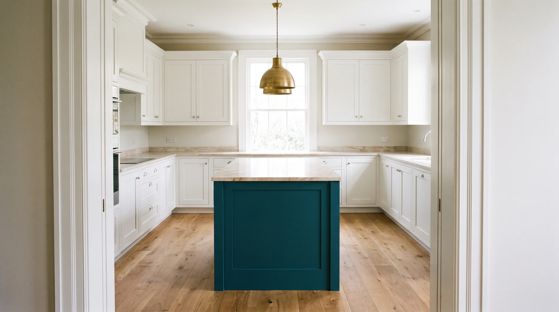
A teal island surrounded by neutral perimeter cabinets is one of the highest-impact, lowest-commitment teal moves available.
Walk to the center of your kitchen. The island is already physically separated from the perimeter cabinetry. That separation means it can carry a different color without creating the visual fight you get when two competing colors share the same wall run.
The perimeter cabinets need to stay quiet: white, cream, or soft greige. Not another bold color. The island is the hero; everything else in the room submits to it.
A neutral countertop on the island works better than a complex marble. The island is already the statement. A dramatic countertop on top of a teal island competes with itself.
Designer Kate Guinnessrecommends trying teal “on an island or pantry run alongside soft greige cabinetry” for homeowners who aren’t ready to commit fully.
She notes that teal pairs particularly well with Carrara marble, which works here because the island countertop is a single contained surface rather than a full kitchen run.
One execution note: if the island is original cabinetry in poor condition, painting it teal may not be the right move. Deep teal shows surface imperfections more than white does. Replacement door fronts are worth pricing before you commit to painting worn originals.
I’ve applied this approach across renovations at very different budgets. The island-as-hero works at the lower end of mid-range just as well as at the higher end. The constraint is not the budget. It’s the clarity of the decision.
If the island layout or sizing is still being decided, the kitchen island shape and sizing covers those decisions separately.
Read: Unique Kitchen Island Shapes & Sizes
A Teal Pantry Run or Single Cabinet Column
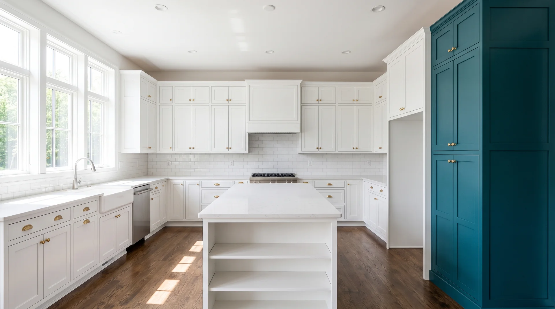
Painting one floor-to-ceiling cabinet column teal is the best live test of the color before a larger commitment.
Choose the column the eye lands on first when entering the kitchen. A pantry tower beside the refrigerator or the far-end cabinet runs both work. One column reads as a design decision.
Multiple columns start to feel like a commitment you haven’t fully made.
The execution requirements are the same as Idea 1: bonding primer on factory-finished surfaces, satin or eggshell finish.
Tall doors show any drips or unevenness that shorter doors can hide. Work with a brush on the detail edges and a small foam roller on the flat panels for the cleanest result.
A Teal Range Hood Against Neutral Cabinets
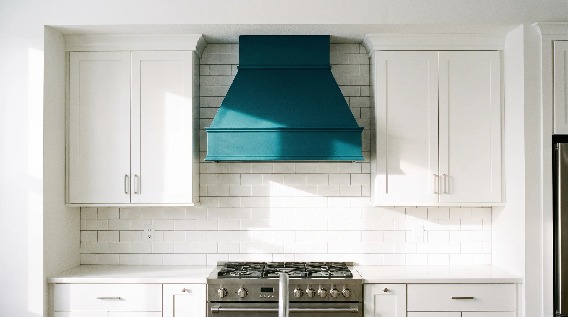
A teal range hood makes a color statement without touching a single cabinet door.
The range hood sits centered above the cooktop at eye level. The eye goes there anyway. Painting it teal puts the color exactly where attention already lands.
Metal hoods take paint differently from wood cabinet doors. A brush or roller applied at home will show every stroke, and close range at eye level is exactly where this piece lives.
There are two serious options for finishing a metal hood in teal. Appliance spray paint designed for metal surfaces is the DIY route.
A powder-coat service provides a professional baked-on finish, holds up to kitchen grease, steam, and heat far better for three to five years.
Be honest about which one your budget and skill level support before you start.
Low-Commitment Teal Kitchen Ideas
These ideas add teal without changing any cabinet finish permanently.
Low-commitment doesn’t mean low-impact. Some of the most effective teal kitchens I’ve seen don’t have a painted cabinet anywhere. One well-chosen backsplash, one careful wall, or a few objects in the right place can do more than a full repaint handled without a clear plan.
The rule is the same here as with the full commitment ideas. Give teal one job, and it works. Give it several, and it competes with itself.
Teal Backsplash Tile with White or Wood Cabinets
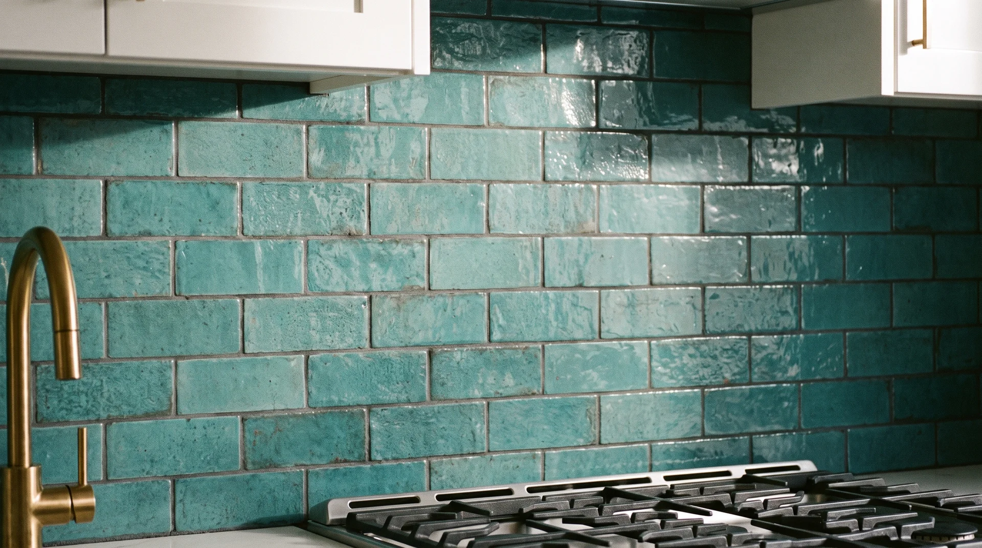
A teal tile backsplash lets the color do real work without a single paintbrush touching the cabinets.
There’s a meaningful difference between teal tile behind the range only and teal tile running the full backsplash. Behind the range, teal reads as an accent. Full backsplash requires the cabinets to stay very quiet.
Three tile styles work consistently in real kitchens with teal:
- Subway tile in a teal glaze: clean, applicable to both traditional and modern kitchens
- Moroccan-pattern tile in teal and white: geometric and energetic, needs neutral cabinets and countertops to avoid competing
- Herringbone in a muted teal: directional and settled, particularly effective in a galley where the pattern guides the eye along the length of the wall
These are starting points, not the only options. Your cabinet color and countertop will pull the final tile choice in one direction or another.
Grout color is a separate decision with real consequences. White grout with teal tile reads casual and clean. Dark grout reads more deliberately modern. If you cook heavily, light grout in a working kitchen shows grease and steam residue faster than dark grout does.
Peel-and-stick backsplash tile in teal is a legitimate renter option. Finish quality varies significantly between brands.
Inspect a sample in person before installing across a full backsplash; the grout line on most panels looks artificial at close range, and you stand directly in front of this surface every day.
Teal Wall Paint, No Cabinet Work Required
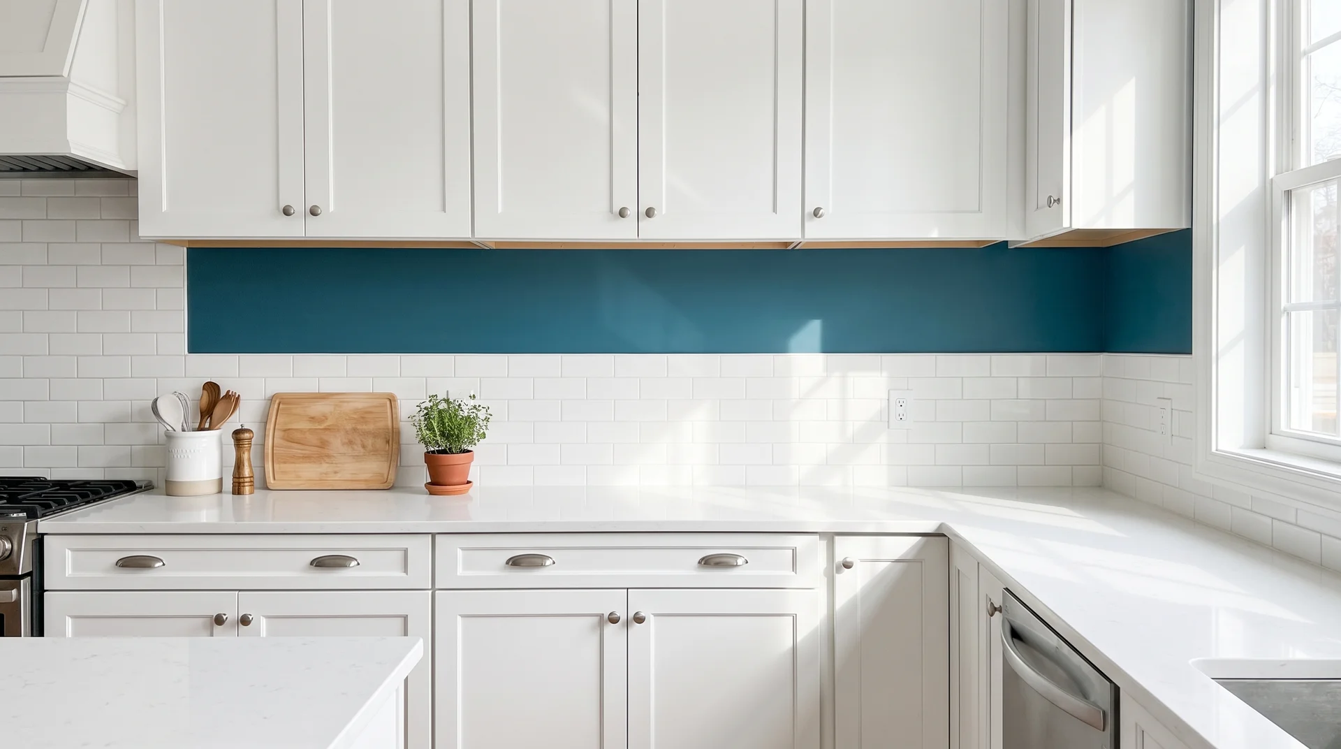
Teal wall paint is one of the most underrepresented approaches in teal kitchen content, and one of the most misunderstood.
“Teal kitchen walls” has its own search audience and almost no editorial coverage. Here’s what actually works and what doesn’t.
Teal wall paint works when three conditions are met:
- Cabinets are white or a very light natural wood
- The kitchen has meaningful natural light
- The backsplash tile is simple and neutral
Add teal walls to a kitchen with medium-brown wood cabinets, and neither color wins. Both fight for the same visual space without either one landing.
The most effective approach is more specific than “paint the walls teal.” Paint only the narrow band between the backsplash tile and the bottom of the upper cabinets. That strip reads as a clear color decision without enclosing the room.
That strip does more work than you’d expect.
In kitchens without upper cabinets, a full teal wall behind open shelving can work. The kitchen needs to be white-dominant with good natural light coming from at least one window.
Teal Open Shelving
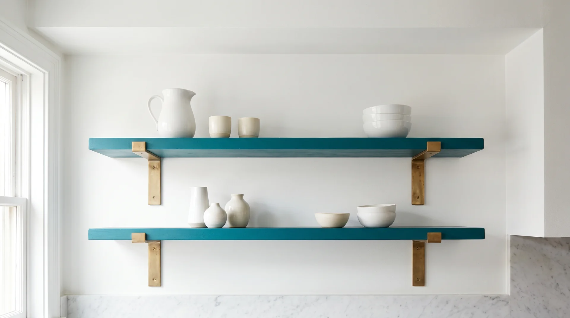
Painting existing open shelving teal or replacing upper cabinets with teal floating shelves adds visible color without touching a single door.
This works best when the rest of the kitchen is neutral. Teal shelving against white walls and light cabinets below reads as curated. Against a busy background, it disappears.
Bracket choice matters here as much as the shelf color. A heavy bracket in unlacquered brass or a wood-tone finish reads as intentional. A thin metal bracket competes visually with a bold shelf color.
Before you paint existing wood shelves, degrease them with a kitchen degreaser, sand lightly, then prime. Kitchen shelves accumulate cooking residue even when they look clean. Skip the degreasing step, and the paint will peel within a year; you won’t notice the grease is there until it’s lifting the primer off the shelf.
Teal Decor and Accessories
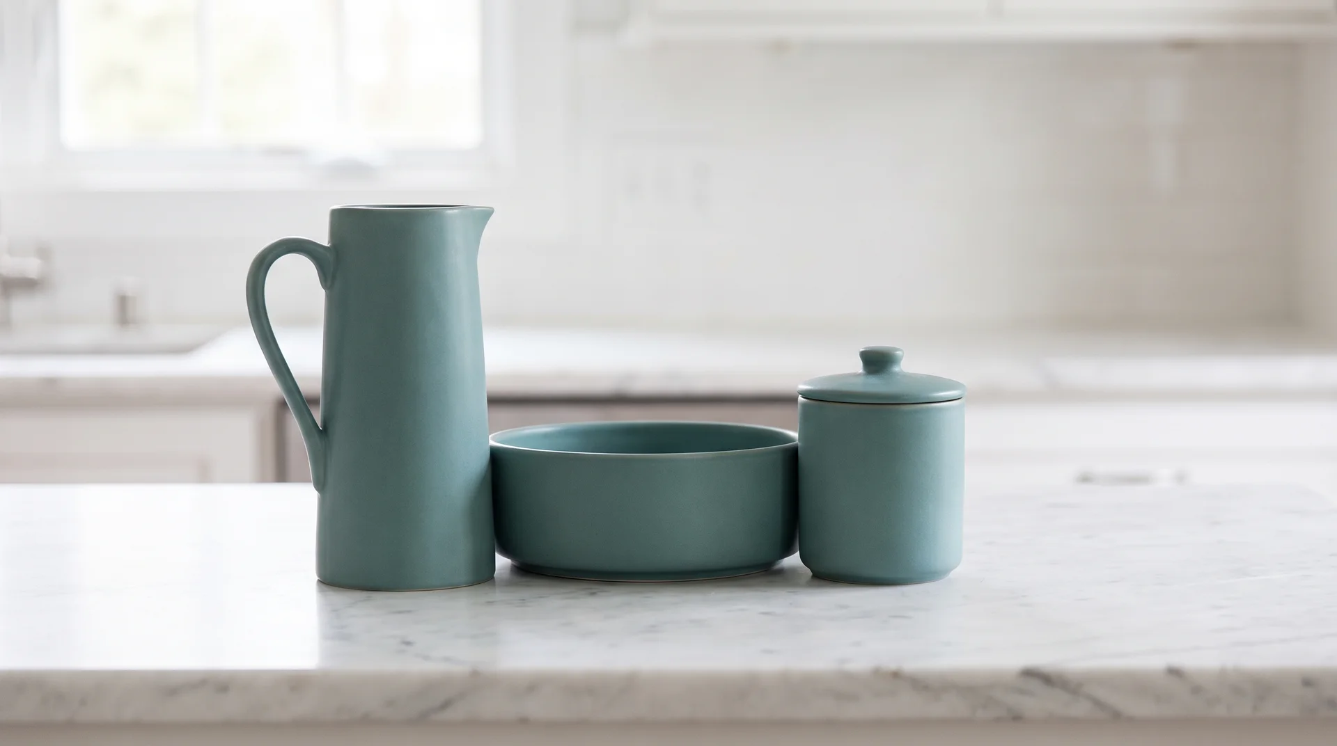
Teal decor and accessories let you test the color in your actual kitchen before committing to any permanent change.
Teal objects work better grouped than scattered. Three teal objects in one part of the kitchen create a visual anchor. Seven teal objects distributed randomly create noise.
After more than 220 kitchen projects, I believe this consistently. Homeowners who live with the color before committing almost always end up liking what they get.
Matching the Idea to Your Kitchen
Room conditions determine which teal ideas are actually available to you.
This is the layer most teal inspiration content skips. Showing failure conditions is less photogenic than showing success conditions.
But knowing what rules a choice out is the thing that protects you from a decision you can’t easily undo.
Small or Low-Light Kitchen: Use the Lighter End of the Teal Spectrum
Light teal keeps a small or low-light kitchen from feeling smaller than it actually is.
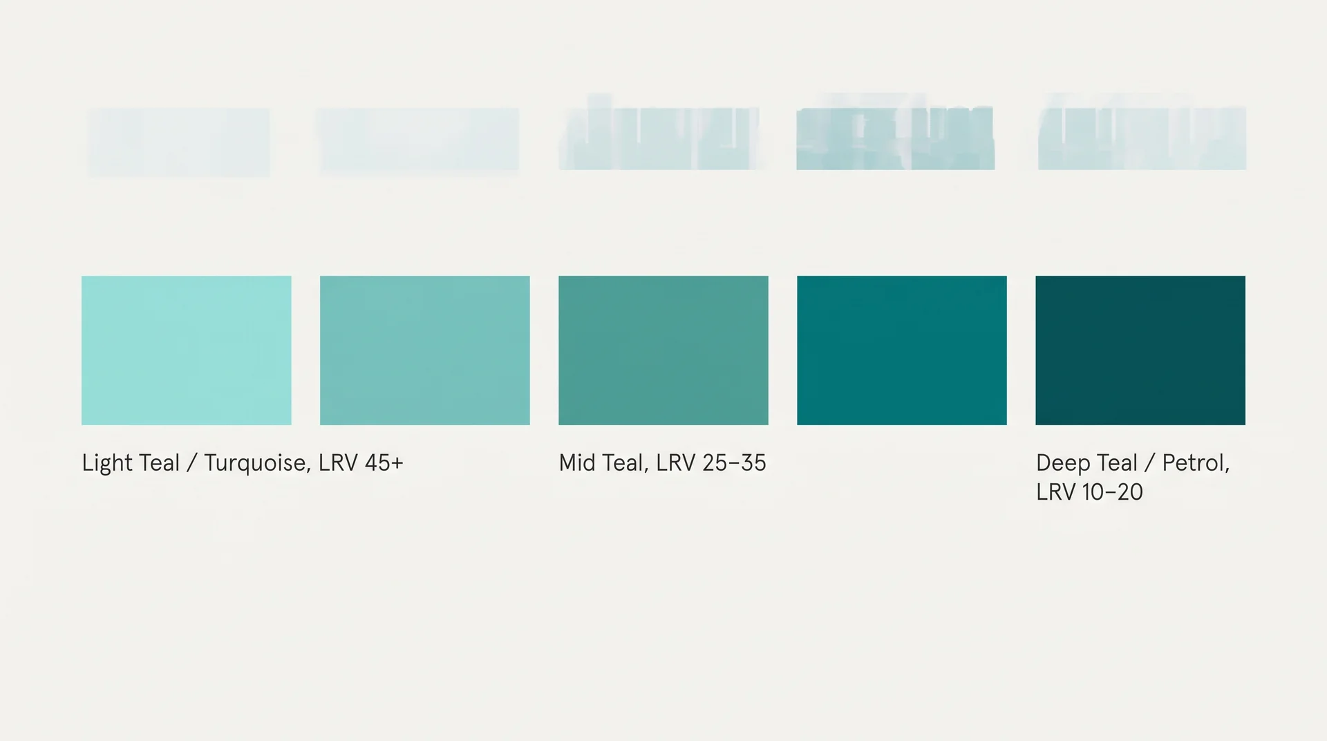
LRV stands for Light Reflectance Value. It’s a number between 0 and 100 that measures how much light a paint color reflects.
Deep teals typically sit between LRV 10 and LRV 25. Light teals, closer to the turquoise end, sit between LRV 30 and LRV 50.
Here’s how that translates to real kitchen conditions:
| Kitchen Condition | LRV to Target |
|---|---|
| Low natural light, ceilings under 8 feet | Above LRV 30 |
| Good natural light, ceilings at 9 feet or above | LRV 10–25 (deep teal range) |
Below LRV 30 in a low-light kitchen, the color absorbs more light than it reflects. The room feels smaller than its square footage should allow.
I genuinely don’t know if there’s a universal rule about which specific shade works in every low-light kitchen. The interaction between teal and a room’s particular light quality is too variable for that.
What I know from watching this go wrong: always test a large sample card in the actual kitchen under the actual lights. A 3-by-3-inch chip in a hardware store is useless for this color.
Well-Lit or High-Ceiling Kitchen
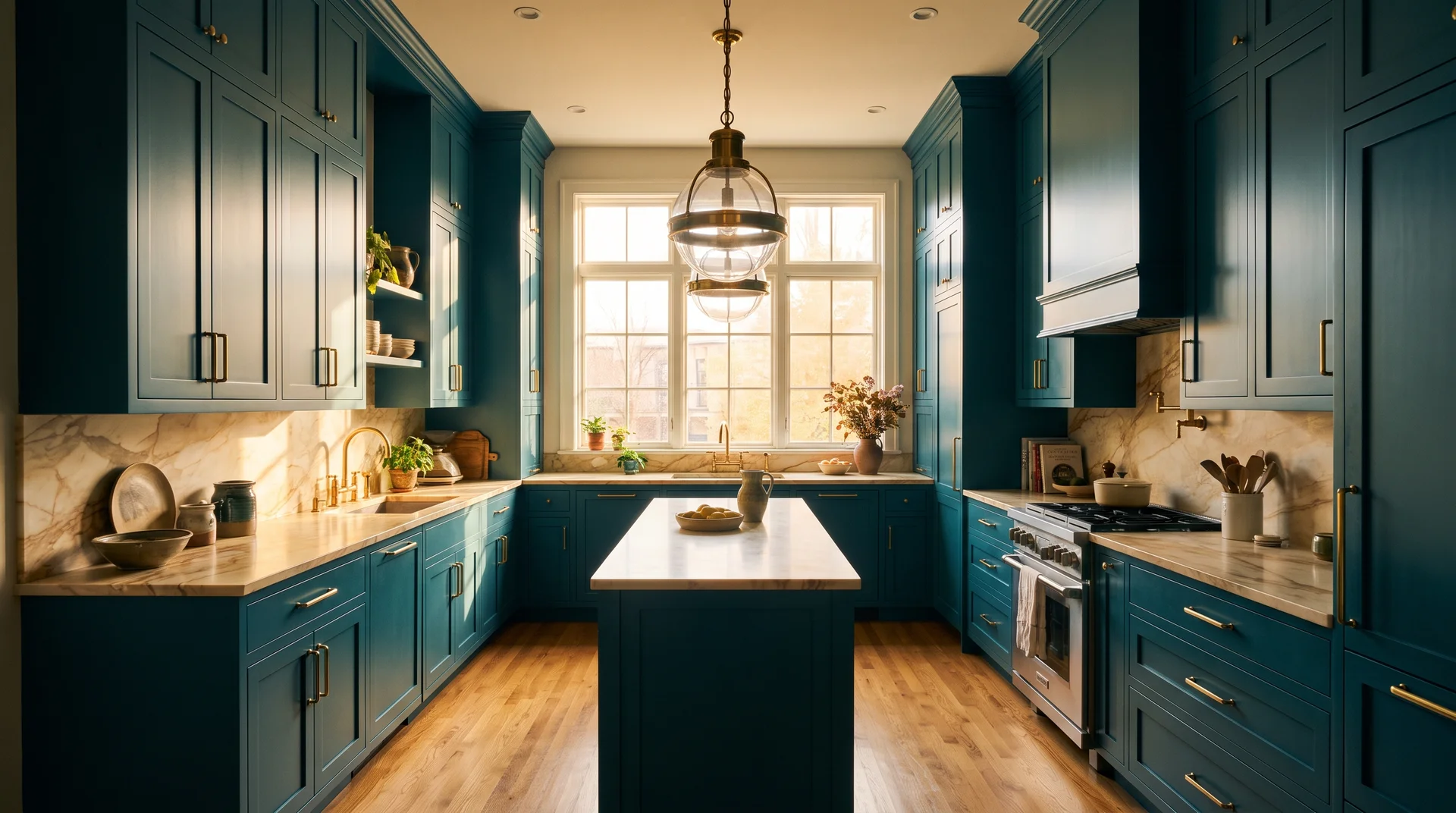
Deep, moody teal needs a well-lit room with height to work without becoming oppressive.
A kitchen with south-facing windows, or one that opens to an adjacent living area, can carry deep teal. So can a kitchen with ceilings above nine feet.
These are the rooms where colors below LRV 20, the measure of light reflectance explained in the section above, work without compressing the space.
WGSN called out “Transformative Teal” as a key shade for 2026.
Behr’s Hidden Gem and Sherwin-Williams’ Gulfstream both sit in the same blue-green mid-tone family. All three are better understood as shades that suit specific room conditions. Deep teal before dark is not deep teal after dark.
Anna Hill, color consultant at Fenwick & Tilbrook, describes deep teal as a shade that “helps to ground the room and make it feel timeless, ideal for spaces where you want energy and comfort.”
The operative word is ground. The room needs the height and light to be grounded, not compressed.
In a well-lit room, deep teal pairs best with three specific elements:
- White marble with warm veining, not cool grey (see Idea 16)
- Natural timber flooring in an amber or honey tone
- Unlacquered brass hardware that patinas and warms as it ages
The warm veining note connects directly to what follows. It’s not a decorative preference.
Where deep teal goes wrong most consistently: a galley kitchen with no natural light. The kitchen reads as a corridor at the bottom of a well. When the room is right for it, the pairing decisions become the real variable. That’s what the next section covers.
Pairing Decisions That Make or Break Teal
What sits next to teal determines whether the color works or fights.
Teal is a cool color. It reads cooler than any warm-toned material and cooler than most neutrals. The pairings that work introduce warmth without competing for attention. The pairings that fail add a second cool element, which amplifies the coldness rather than balancing it.
Teal and Brass Hardware: Which Brass and What to Avoid
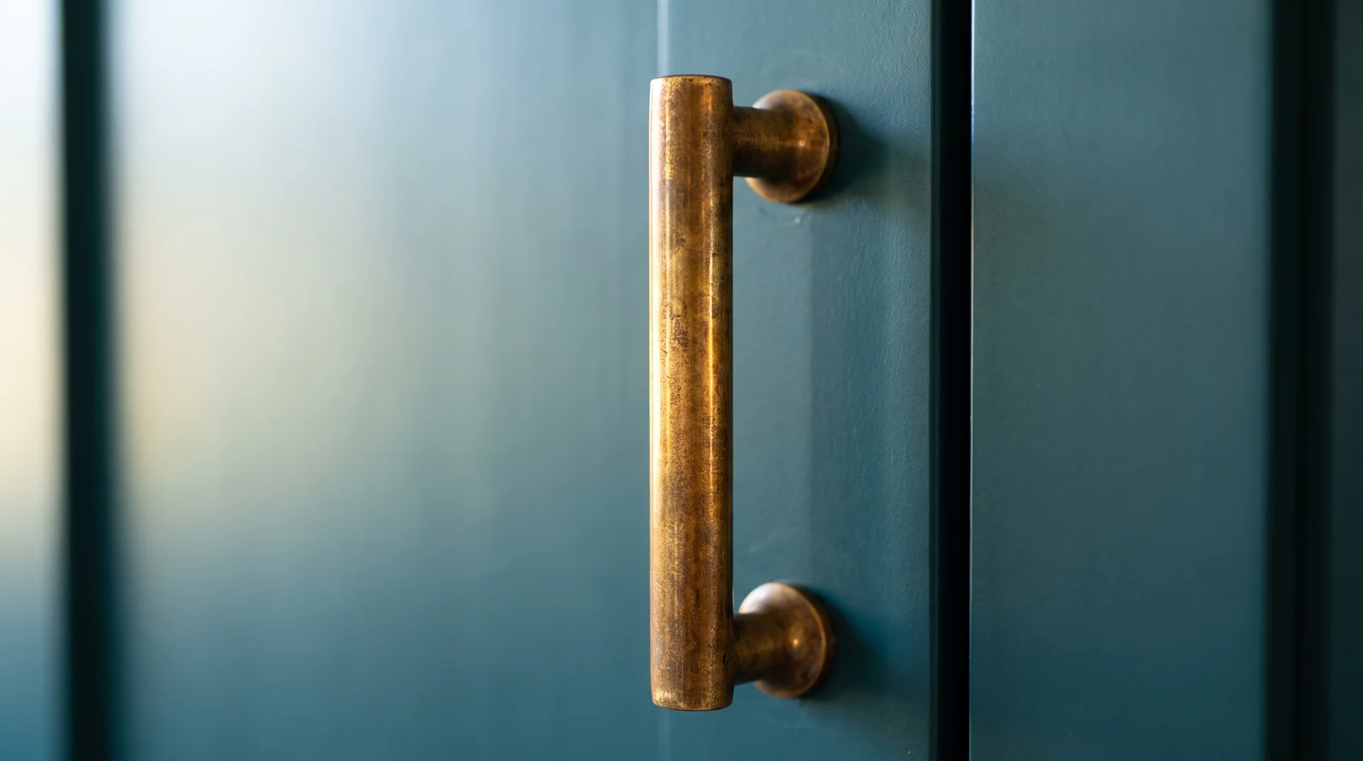
Not all brass finishes work equally against teal, and the shade behind them changes how each finish reads.
Brass comes in several distinct finishes. Here’s how the main ones perform against teal:
| Brass Finish | Works With Teal When | Avoid When |
|---|---|---|
| Satin brass | Deep teal, most shades | Very bright turquoise (can feel heavy against it) |
| Polished brass | Saturated bold teal, larger kitchens | Muted or softer teal tones |
| Unlacquered brass | All teal shades, especially deep | Kitchens where a consistent finish is required |
| Champagne gold | Very light teal or turquoise only | Deep teal (disappears against it) |
| Brushed nickel or chrome | Stainless-heavy kitchens without bold color | Teal of any shade |
The table is a starting point. Your specific shade, your countertop, and your lighting will shift which finish lands best.
Sourcing hardware at flea markets alongside client projects over the years has taught me something production showrooms can’t show you: how brass ages.
Unlacquered brass develops a patina that moves toward warm amber over two to three years. In a deep teal kitchen, where aging is an asset, the hardware becomes more interesting as the room settles. Production satin brass stays exactly as it is, which suits some kitchens and feels static in others.
Know which you’re buying before you install it. For finish types, sizing, and placement, read…
Read: How to Choose Kitchen Cabinet Hardware?
Teal and Natural Wood
Natural wood in the amber-to-honey tone range is the most forgiving neutral to put alongside teal.
Wood tones in this range are oak, maple, iroko, and pine, which contrast naturally against teal’s blue-green and warm the room without competing for attention.
The shade of teal you chose in the opening section of this article will guide which specific wood tone works best.
Two wood categories to approach carefully with teal:
- Very dark woods (walnut, ebony-stained oak): work in larger kitchens but compress smaller rooms when combined with deep teal
- White-toned or bleached wood (white oak, ash): makes a teal kitchen feel cold, because both colors sit on the cool side of the spectrum
The most reliably successful application I’ve seen is natural wood flooring under teal cabinets. Teal sits at eye level, and wood sits underfoot. Neither one directly competes.
Teal and Marble Countertops
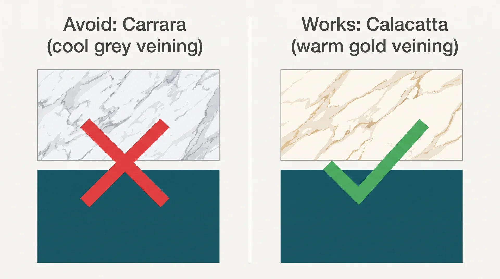
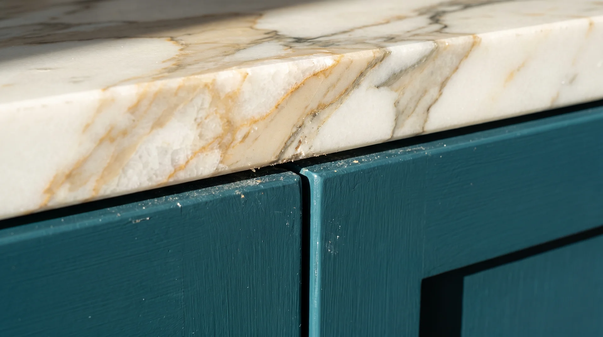
Marble works with teal, but which marble you choose changes the whole outcome.
I keep a folder of photographs from twelve years of real kitchen projects, actual rooms I’ve walked into, not staged ones. The teal-and-marble combinations appear there more than any other pairing. Here’s what the pattern shows:
| Marble Type | Veining Color | With Deep Teal |
|---|---|---|
| Carrara | Cool grey | Avoid — both colors are cool, reads clinical in most lighting conditions |
| Calacatta | Warm gold or beige | Works well — warm veining balances a cool-dominant cabinet color |
| Arabescato | Bold grey or brown | Avoid — competes as a visual statement rather than supporting the cabinets |
| Calacatta Viola | Purple | Strongly avoid — pulls teal bluer and intensifies both colors simultaneously |
The Calacatta Viola note deserves its own sentence. I’ve seen that pairing attempted in two real kitchens. Both countertops were replaced within two years.
The rule for marble with teal is functional, not decorative. Warm veining introduces the contrast that a cool cabinet color needs. That’s the structural reason behind what most articles describe as a matter of taste.
Teal and Matte Black Accents for a Modern Kitchen
Matte black against deep teal creates a high-contrast, architectural look with specific conditions required to keep it livable.
Matte black pendant lights, window frames, faucet, and cabinet hardware against deep teal read as sharp and considered. The visual logic is contrast: black grounds the teal and gives the room a defined edge.
For this to work, the countertop has to be neutral. White marble, pale quartz, or pale soapstone. A dark countertop combined with matte black accents and deep teal pushes the room into visual heaviness.
This combination is described as “dramatic” in most teal kitchen inspiration content. That’s accurate. It’s also the combination most likely to feel like too much after 18 months of daily use, and inspiration images won’t tell you that.
Matte black fixtures collect fingerprints and grease far more visibly than brushed finishes. Faucets and cabinet hardware are the most obvious problem areas. If you cook heavily or have children in the kitchen daily, know this before you choose it.
The One Decision Behind Every Teal Kitchen That Works
Look back at the 17 ideas above, and you’ll find one thing they share.
Teal has one job in every kitchen where it works. One surface carries the color. Everything else supports that choice.
The kitchens that don’t work are the ones where teal was assigned to multiple surfaces until it stopped being a decision and became a default.
Make the decision once, make it clearly, and every choice that follows becomes easier to plan.