

Black grout on white tile can transform a kitchen. It can also strain one, depending entirely on what else is happening in the room.
Before you commit to this combination, you need to know what role your backsplash plays in your kitchen’s visual hierarchy, and whether black grout supports that role or competes with it.
What Black Grout on White Tile Actually Does to a Kitchen
Black grout makes your tile pattern the room’s primary visual statement.
Black grout isn’t a grout upgrade. It’s a decision about which surface in your kitchen is allowed to speak the loudest.
When you run dark lines between white tiles, you create a grid that the eye reads as structure. The grout stops being filler and becomes a design element in its own right.
Black grout on white tile is a hero-surface choice. Before you commit to it, ask what else in your kitchen is already claiming that role.
Heavily veined countertops, a statement range hood, a saturated cabinet color, styled open shelving, any of these is already generating significant visual weight.
Add a high-contrast backsplash, and you have two voices in the same room.
15 Ways Kitchens Actually Use Black Grout and White Tile
Most kitchen design galleries show you what this combination looks like. What they rarely provide is the spatial reasoning behind why each example works.
The fifteen approaches below each include the specific design logic that makes them succeed. In each case, the one-hero rule applies. The kitchens that work best have made a clear decision, consciously or not, about what the dominant element is.
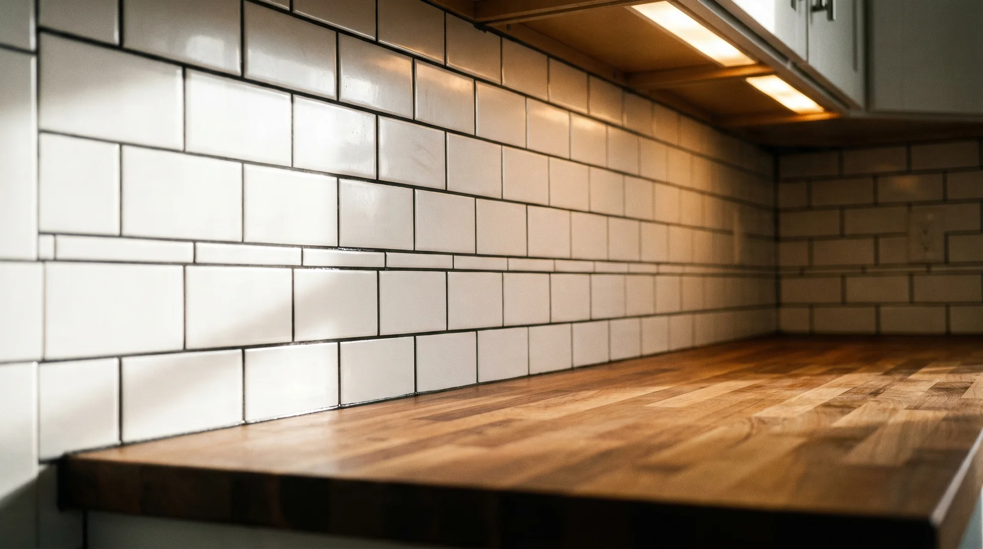
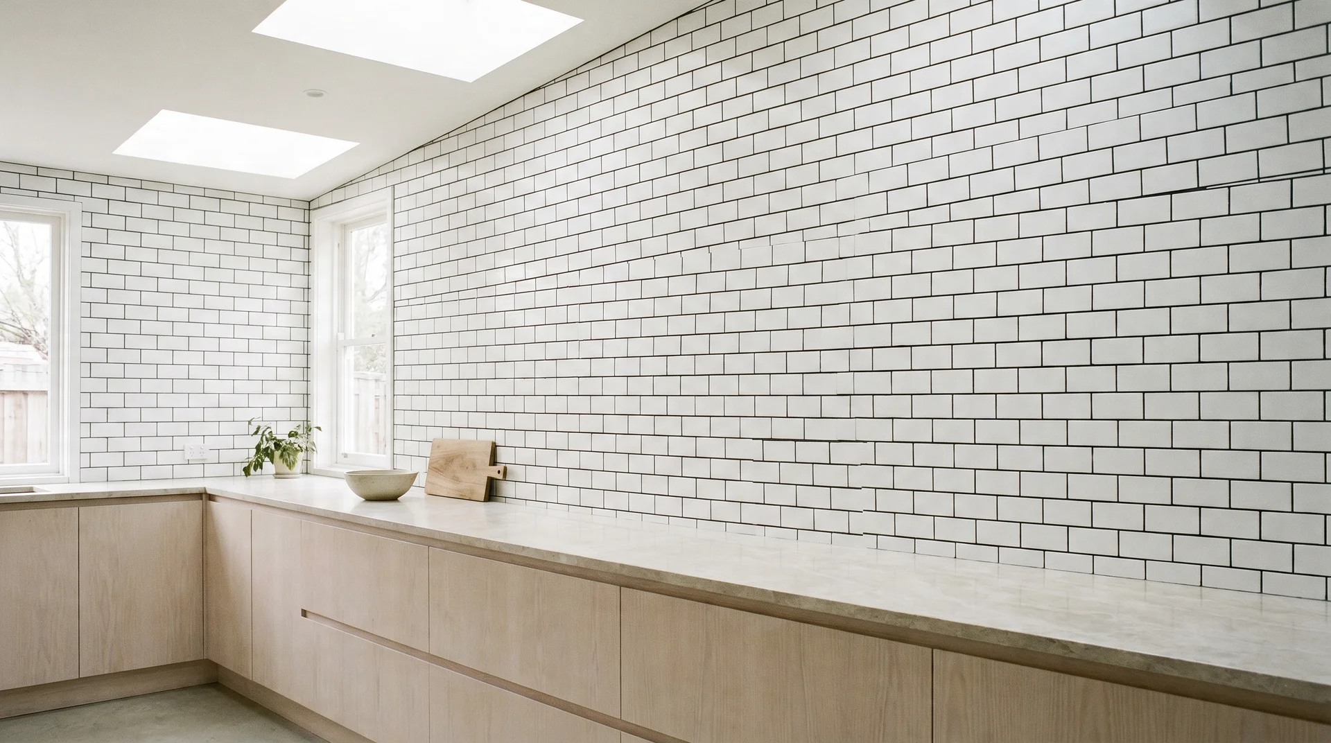
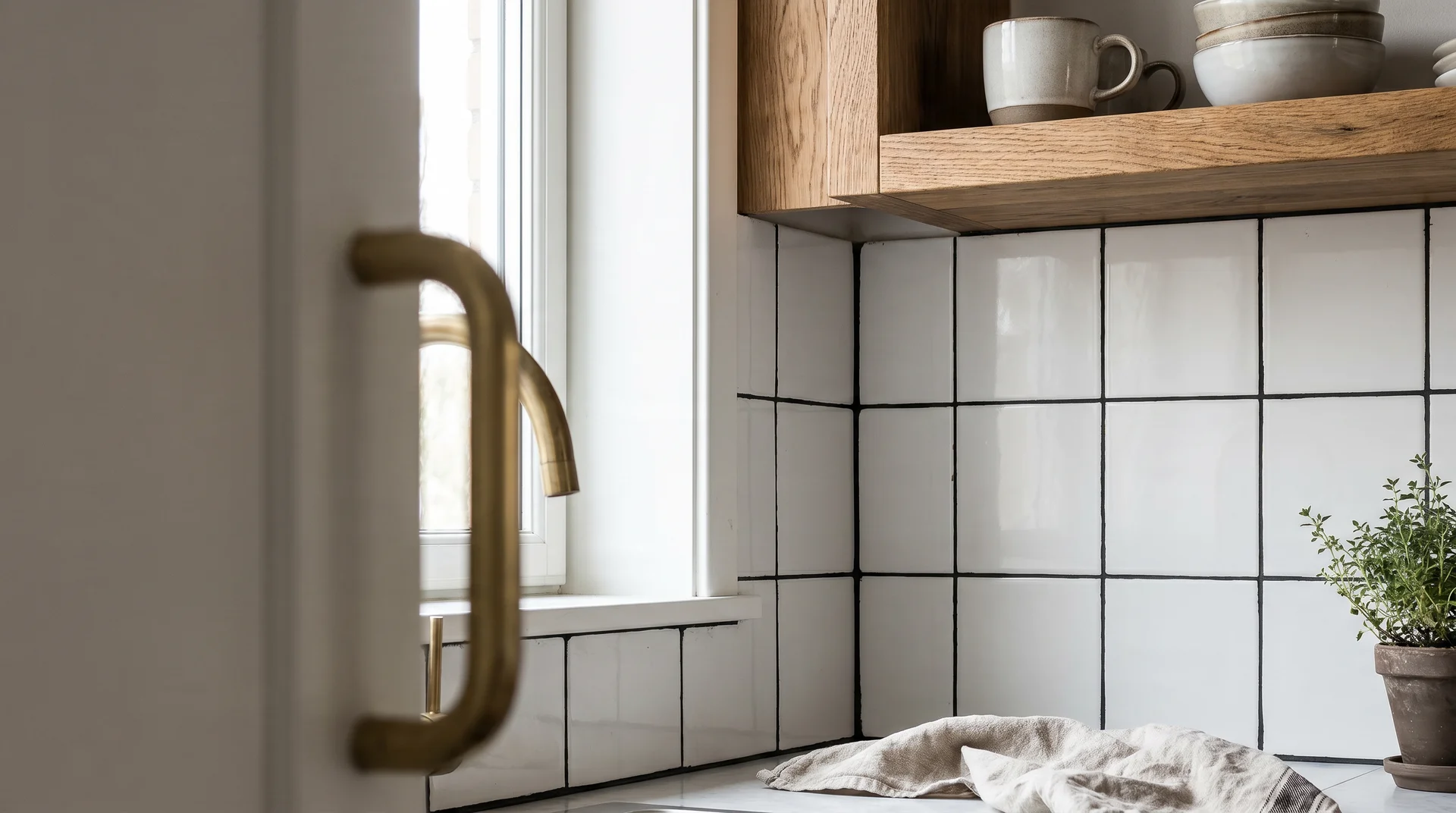
1. White Offset Subway, Pale Quartz Countertop, White Shaker Cabinets
The clean classic, and the context in which black grout does its best work.
The countertop is light and pattern-free. The cabinets are white. The backsplash is the only element generating visual interest, which makes it a legitimate hero. The black grout reads as sharp and intentional.
Add one warm metal element like brushed brass or unlacquered bronze hardware, and the room settles into something that feels considered rather than stark.
2. Herringbone White Tile, Black Grout, Open Oak Shelving
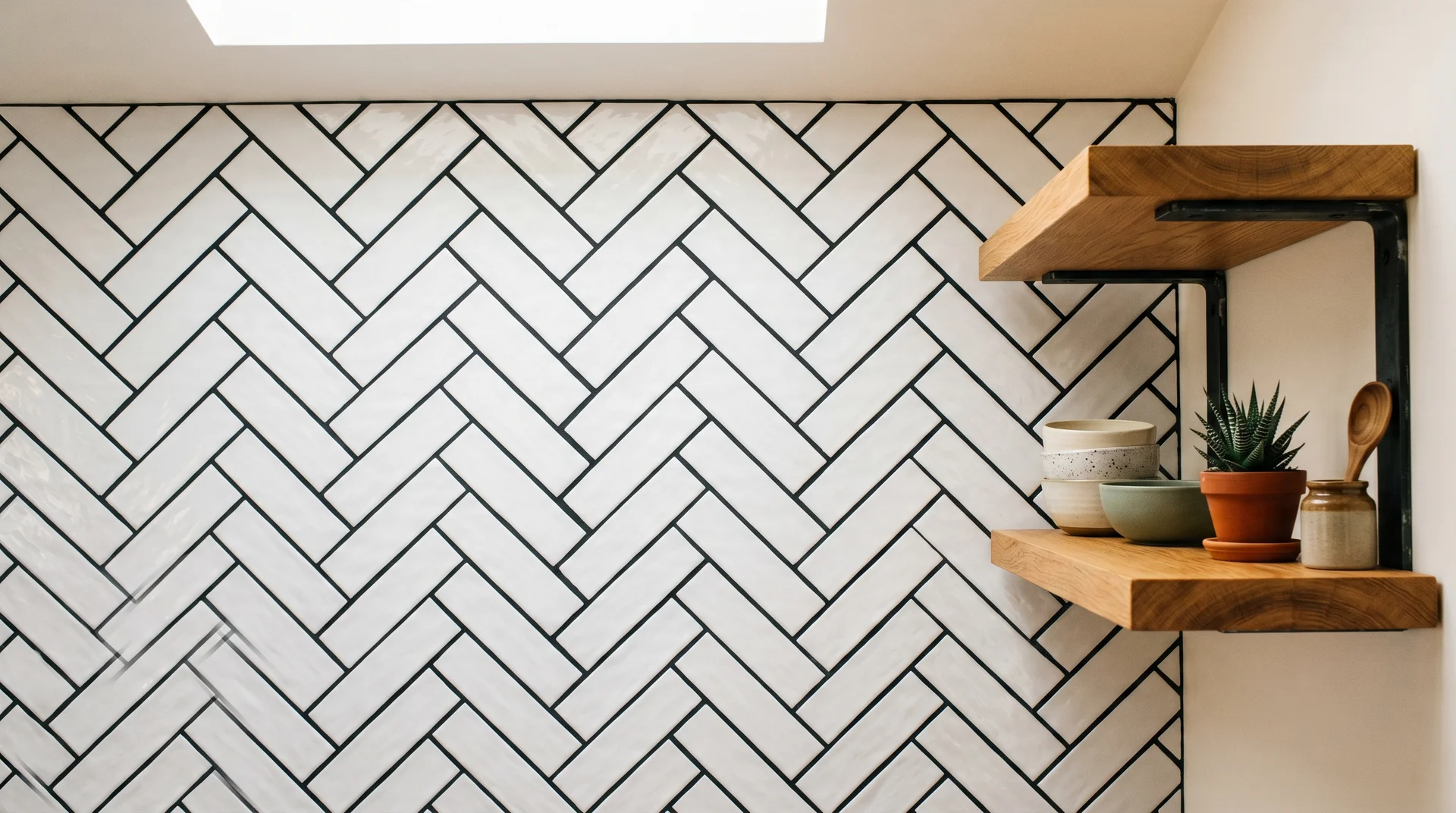
The herringbone pattern with black grout is the room’s dominant visual statement.
The warm wood of the open shelving cuts the starkness and prevents the combination from reading as industrial. The shelving needs to sit directly adjacent to the backsplash, in the same line of sight.
That physical relationship is what makes the warmth functional rather than decorative.
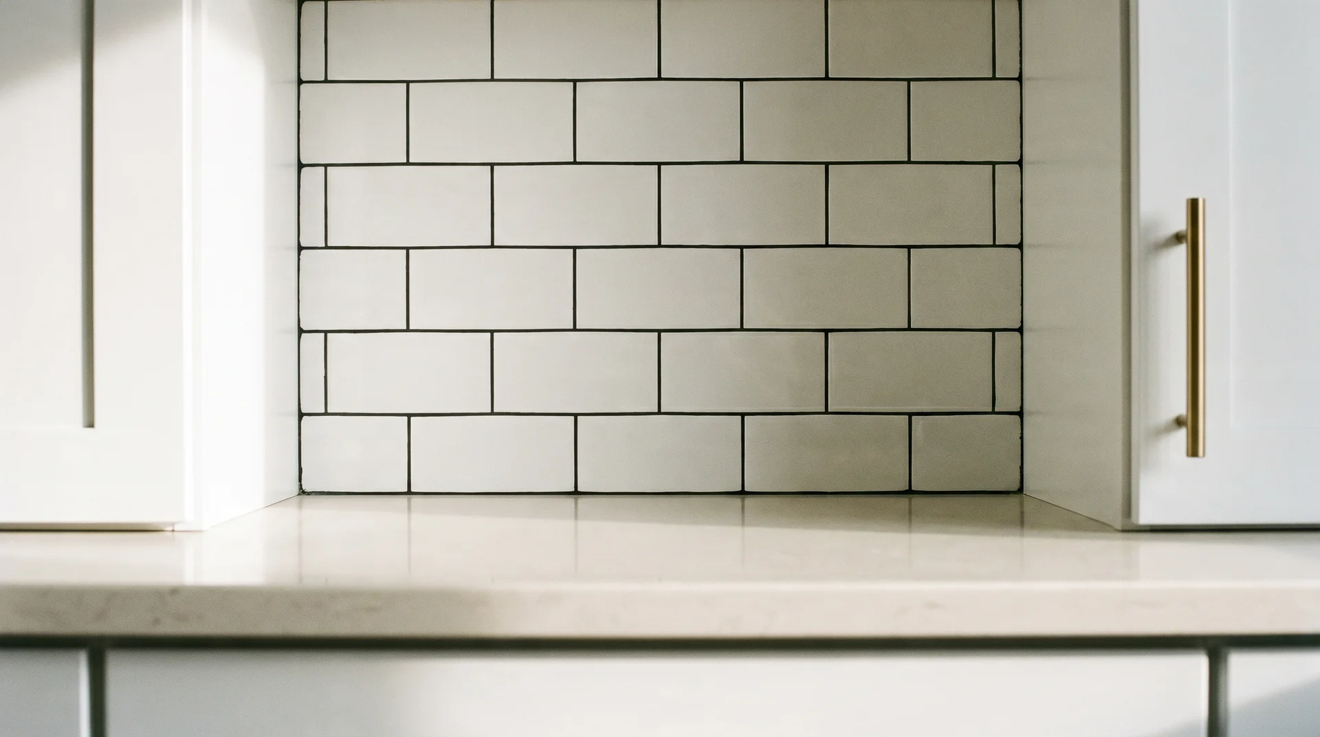
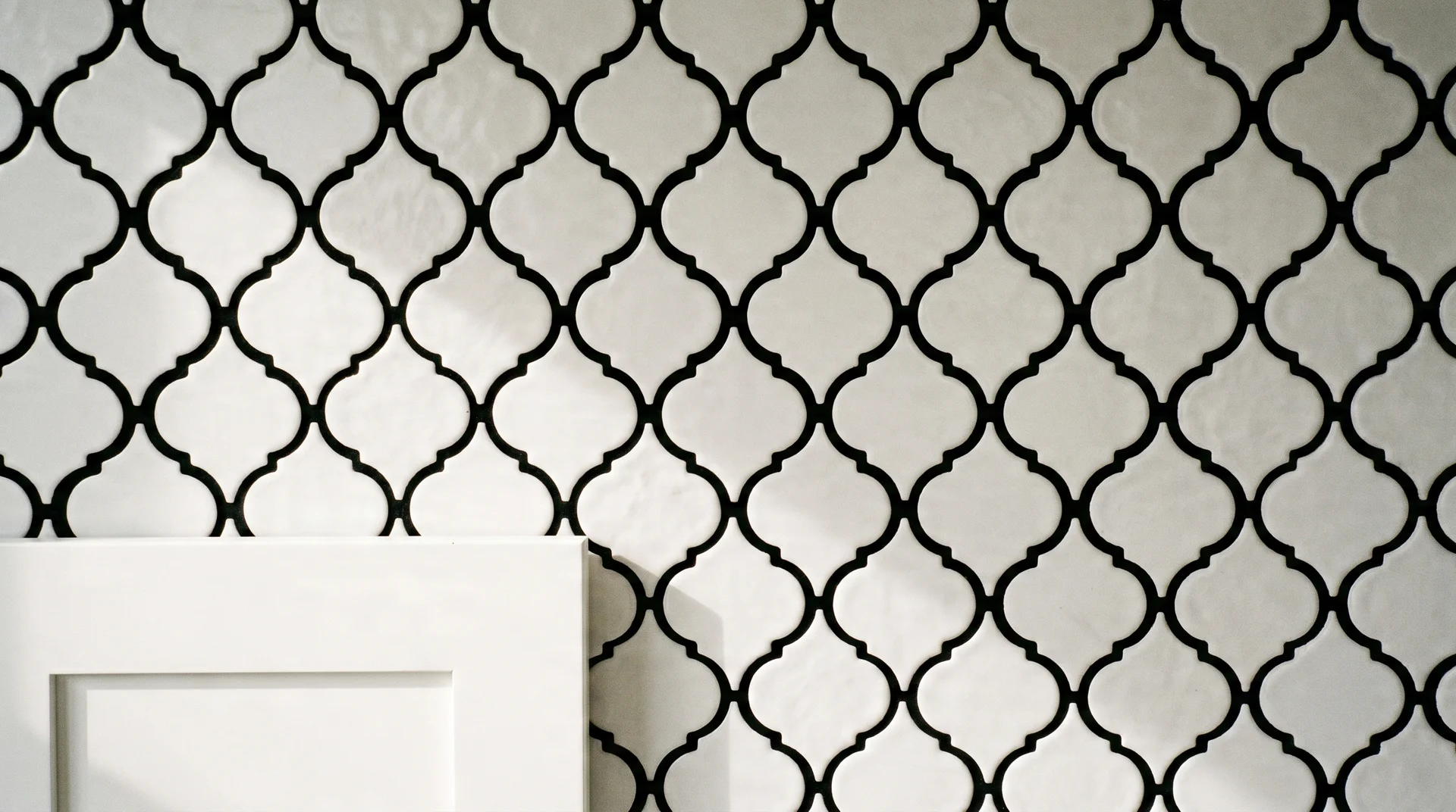
3. Stacked Grid, White Tile, Black Grout, Slab-Front Cabinets
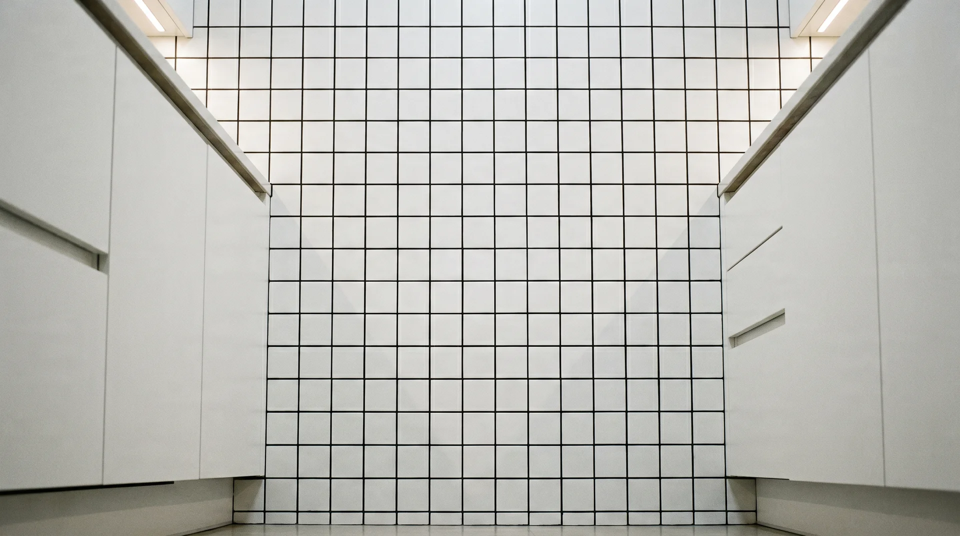
Perfectly aligned tiles in a grid pattern with true black grout read as deliberate and architectural.
It pairs with flat-panel or slab-front cabinet doors. Keep the countertop pale and the hardware either matte black or brushed nickel.
There is no room in this configuration for competing visual elements.
4. White Penny Round, Black Grout, Galley Kitchen Under 100 Square Feet
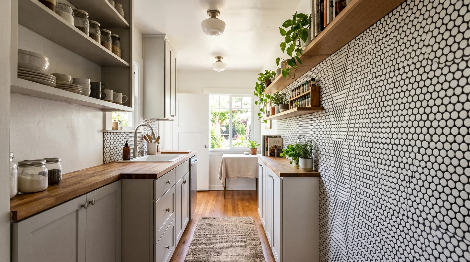
Penny tile reads as surface texture at room scale rather than as a grid of individual grout lines.
The eye reads the overall pattern rather than tracking each tile boundary.
The combination adds character without visual weight. Use thin grout lines to keep the texture feeling soft rather than graphic.
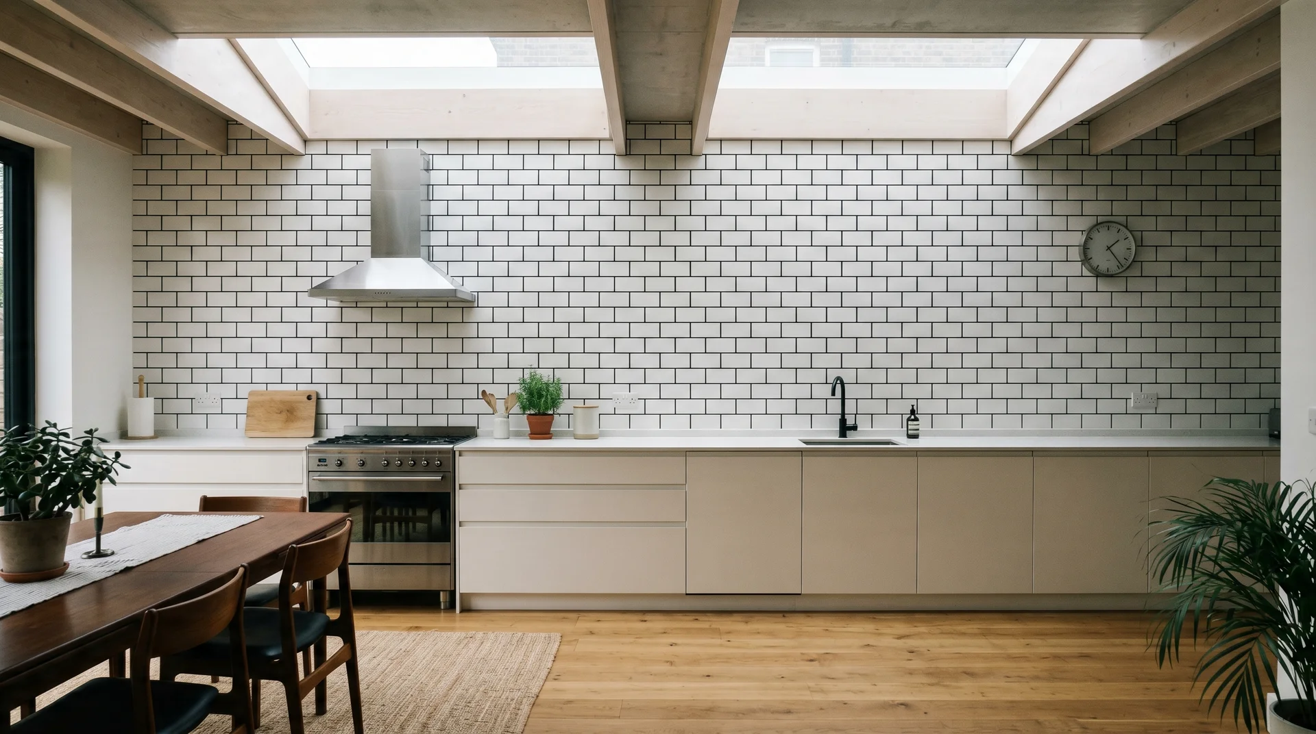
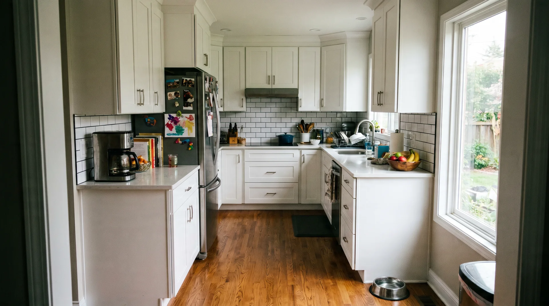
5. White 3×6 Subway, Standard Offset, Black Hardware, Farmhouse Kitchen
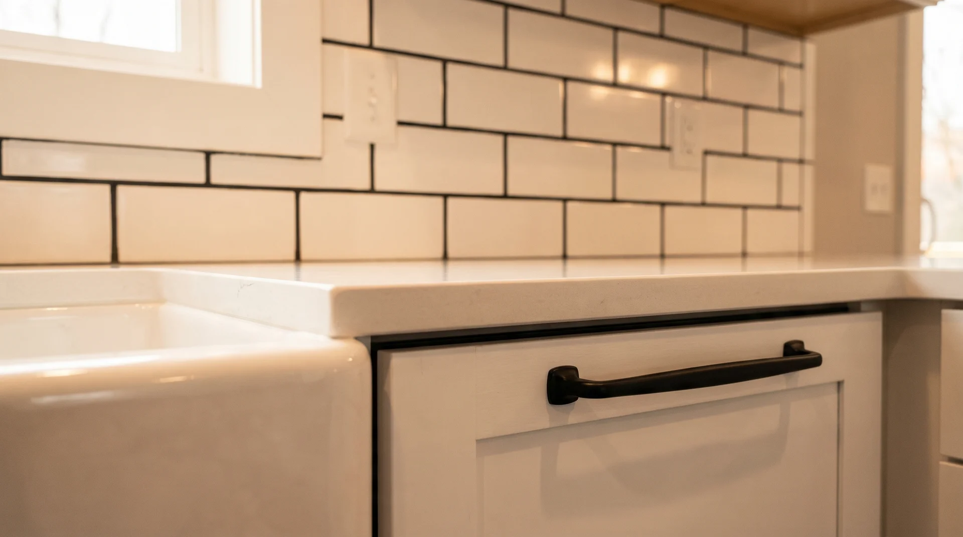
Standard white subway tile in a running bond is inexpensive. Choosing black grout over white or gray costs almost nothing extra at purchase and changes the reading of the tile entirely.
The black hardware echoes the grout color without adding a new competing dark element.
The constraint here is the design problem itself. The solution costs almost nothing.
6. White 3×12 Elongated Subway, Vertical Layout, Black Grout, Low-Ceiling Kitchen
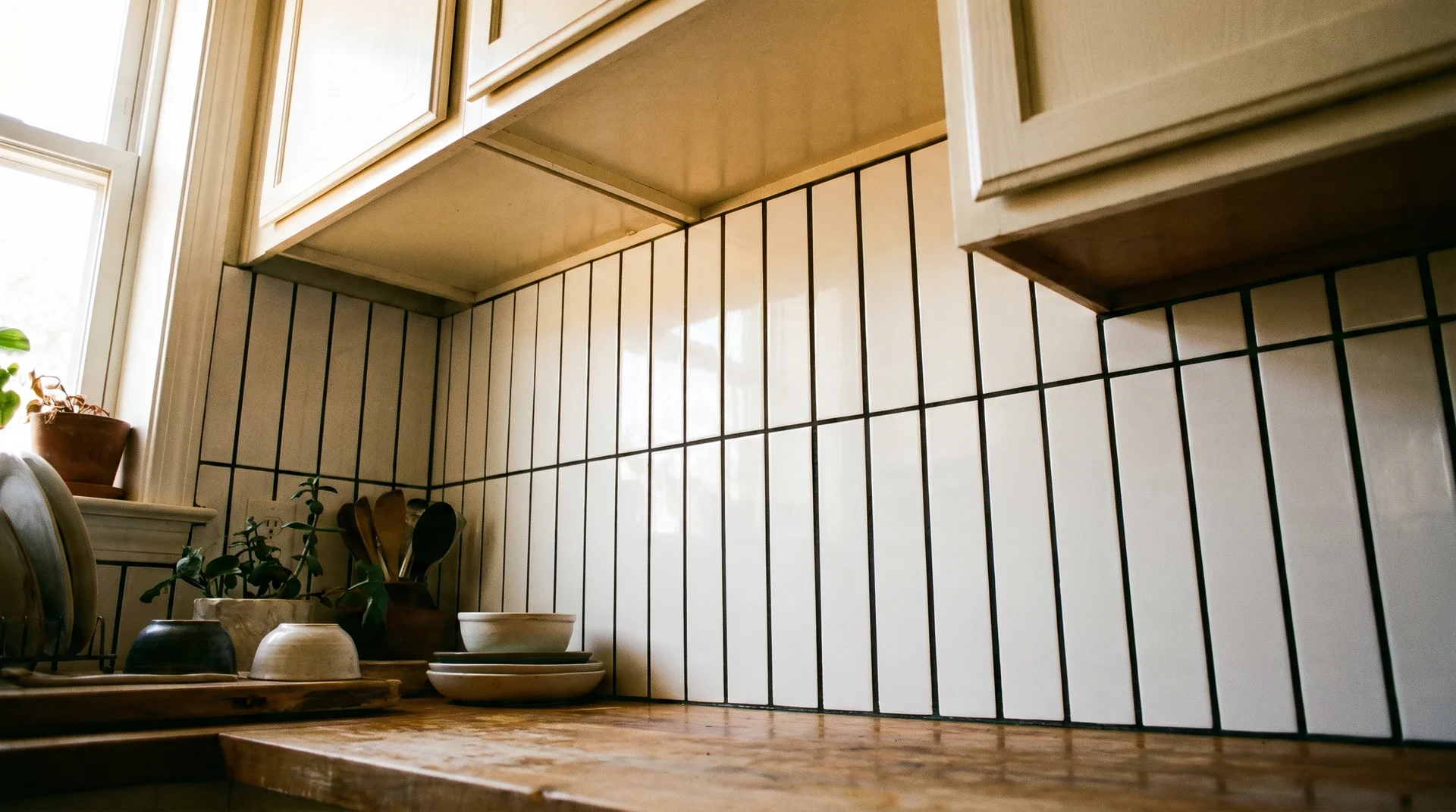
Elongated tiles running vertically with black grout create strong vertical lines that pull the eye upward. The black grout emphasizes the column pattern.
This works especially well in kitchens with nine-foot ceilings or under, where the visual stretch is a practical benefit rather than just a style choice.
7. Zellige-Style White Tile, Black Grout, Wide Joints, Brushed Brass Fixtures
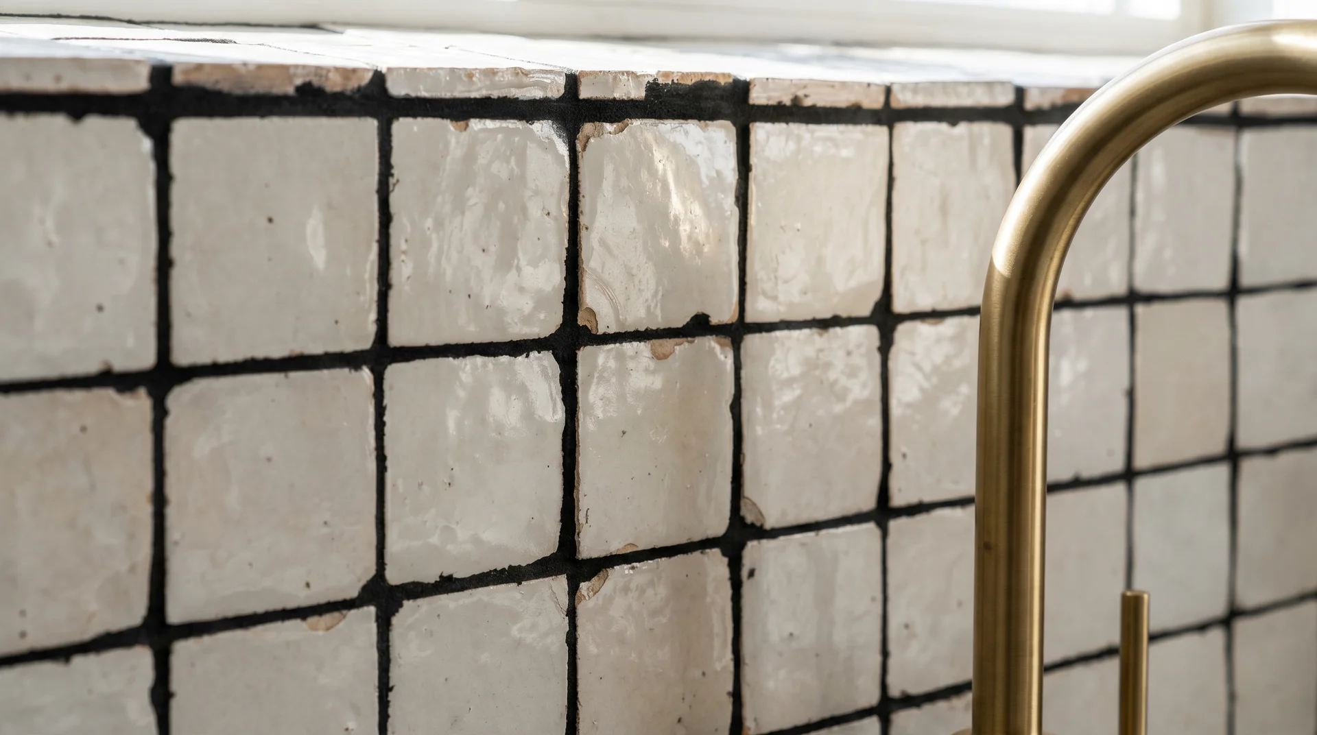
Zellige tile has irregular edges and surface variation between pieces. With black grout and wide joints, the grout becomes part of the artisanal texture rather than a graphic statement.
The brass fixtures maintain warmth. Pair this with simple cabinet fronts in a neutral tone. The tile carries significant visual interest on its own. Let it.
8. White Tile, Black Grout, Two-Tone Cabinets: Upper White, Lower Navy
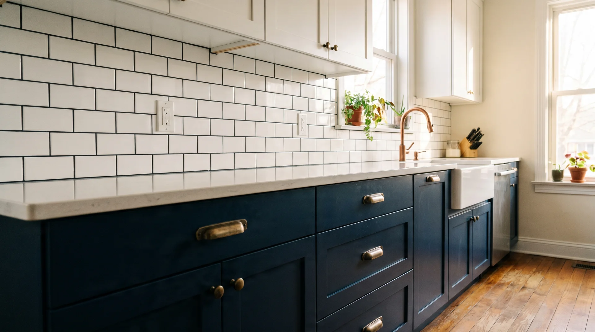
In a two-tone kitchen with navy lower cabinets and white uppers, the black grout on the white tile picks up the dark tone of the lower cabinets without competing with the navy.
The backsplash becomes a visual connector between the two cabinet tones rather than a third competing element.
This only works when the countertop is light. A dark countertop here tips the room into heaviness.
9. White Subway, Black Grout, Full Slab Floor to Ceiling, Open-Plan Kitchen
A floor-to-ceiling backsplash covering a full kitchen wall is a significant visual commitment.
In an open-plan kitchen visible from a living area, this approach works when everything else, the island, the cabinets, and the countertop, is restrained.
If anything else is generating significant visual weight, the large-scale backsplash tips the balance.
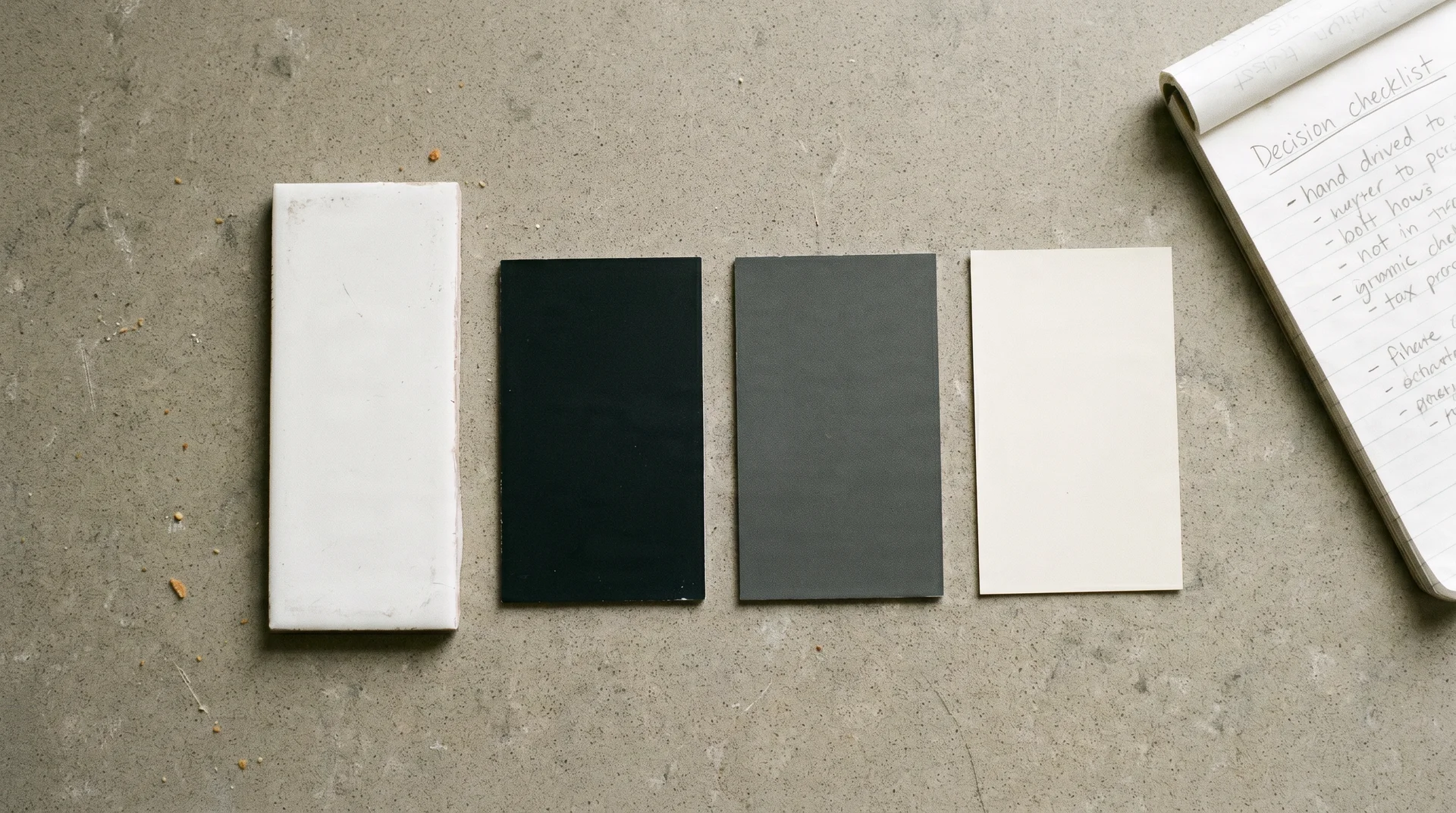
10. White Matte Tile, Charcoal Grout — Not True Black
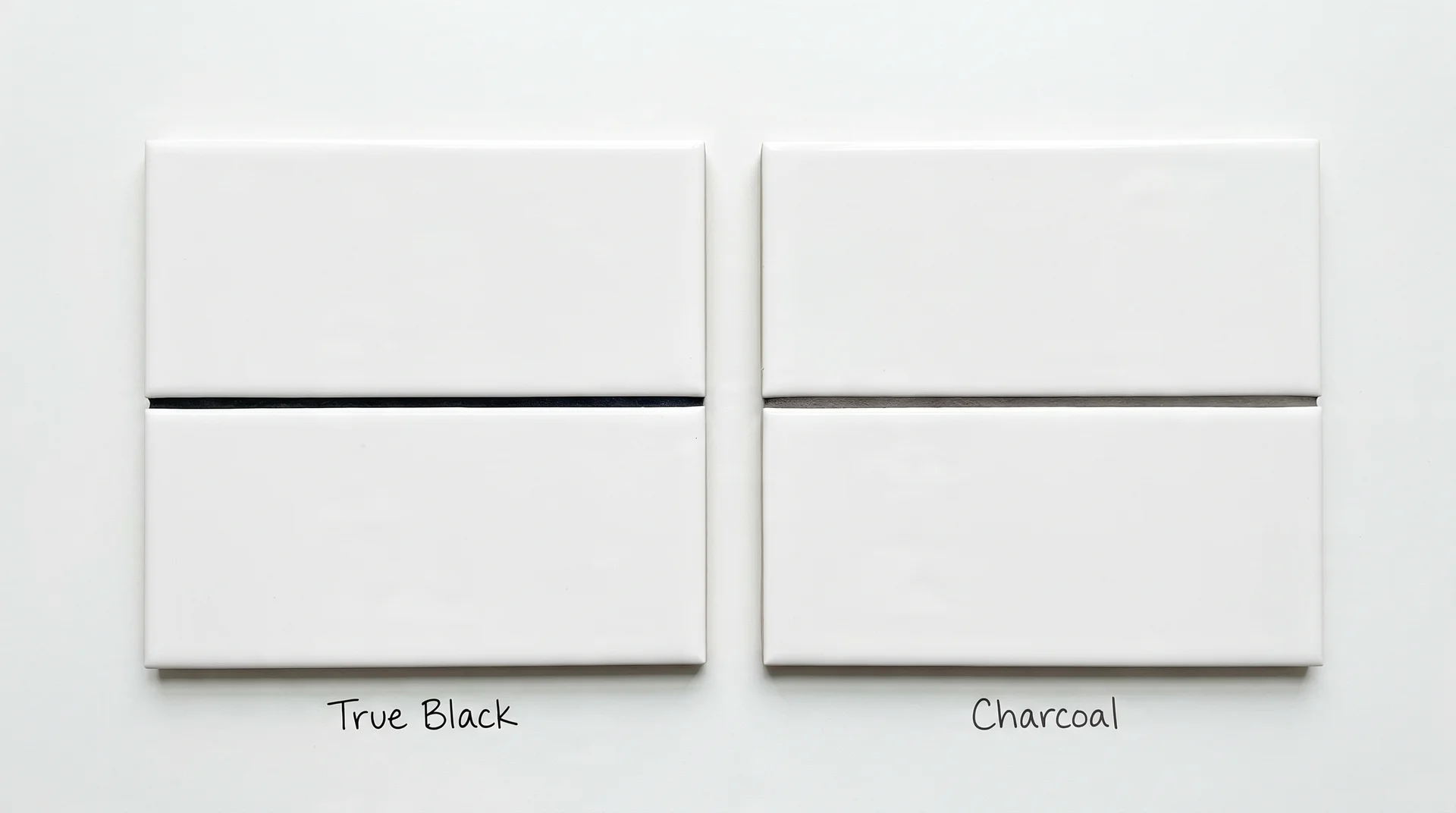
A warm dark gray or something closer to Mapei Delorean Gray or a similar formulation looks as dark and deliberate without the full graphic punch of true black.
In north-facing kitchens or rooms with warm-toned cabinetry, charcoal gives you clear tile definition without the starkness.
This is genuinely a different result. Not a watered-down version of the same thing.
11. White Arabesque Tile, Black Grout, Simple Shaker Cabinets
Arabesque tiles have an ornate silhouette that needs clear definition to read well at room scale. White grout blurs individual tile shapes into a surface.
Black grout outlines each piece and makes the pattern the room’s hero. Pair with simple shaker cabinet fronts in a neutral tone. The tile is already carrying significant visual interest.
12. White Tile, Herringbone, Cream Cabinets, Warm Wood Island
Cream cabinets with black grout and white tile can read as cold. The warm wood island acts as the thermal break between the graphic backsplash and the pale cabinet tones.
Without the island, this kitchen reads as clinical. With it, the room has warmth that the tile combination alone could not produce.
13. White Penny Tile, Black Grout, Used Across Kitchen and Adjacent Utility Space
Penny tile with black grout used in both a visible utility area and the kitchen backsplash creates visual continuity. The small format reads as texture from a distance and as a pattern up close.
The continuity between spaces is what makes the choice feel deliberate. This approach requires planning both spaces simultaneously, which most articles on either topic don’t address.
14. White 4×4 Square Tile, Black Grout, Retro or Period Kitchen
Square tile with black grout appeared in early-twentieth-century kitchens before white subway tile became the dominant format. It has a period quality that reads as vintage rather than trendy.
Pair with chrome fixtures, shaker cabinets in a period-appropriate color, and a concrete or stone countertop.
The historical reference holds when the other elements support it. It falls apart when the surrounding room is all contemporary.
15. White Tile, Black Grout, Kitchen With No Upper Cabinets
Kitchens without upper cabinets expose more backsplash than any other configuration. The tiled wall becomes the room’s dominant surface. In this layout, black grout creates a large field of graphic pattern visible from every corner.
Everything else in the room, countertops, lower cabinets, and any open shelving, needs to be restrained. The backsplash is the statement. Let it be the only one.
That’s the one-hero rule, applied to its own logical conclusion. One surface leading, everything else following.
The rooms in this list that work best are all making the same decision, whether or not the people who built them named it that way.
Factors That Determine Whether This Works in Your Kitchen
Five factors in your existing kitchen determine whether this combination works. The questions below are the ones to answer before you look at tile samples.
Your Countertop Tone and Pattern
Your countertop tells you how much visual work your backsplash is allowed to do.
Heavily veined or patterned countertops, quartz with strong movement, marble, and dramatically figured stone are already generating visual noise.
A black-grout backsplash next to them puts two competing statements in the same room. One ends up losing clarity, and usually it’s the backsplash.
The pairing that works best is a clean white, pale gray, or simple light stone countertop. These give the backsplash clear visual authority without fighting for it.
A butcher block section or solid warm-neutral surface also works, because it adds warmth rather than pattern.
Solid dark countertops, black granite, and charcoal quartz create a different problem. The dark countertop and the black grout lines read as two separate darks competing at different heights in the room.
The result is heaviness that’s difficult to diagnose until you’re already living with it.
Your Cabinet Color and Finish
Cabinet color determines whether the black grout reads as intentional or as conflict.
| Cabinet Color | Works With Black Grout? | What to Watch |
|---|---|---|
| Bright white | Yes, clearly | Add one warm element to prevent a clinical feel |
| Off-white or cream | Yes, with care | Warm wood somewhere in the sightline is not optional |
| Light or medium gray | Yes | Watch for mid-tones that compete with the grout color |
| Sage green or dusty blue | Yes – strong pairing | The color absorbs the contrast, and the room settles |
| Navy or forest green | Proceed carefully | Dark cabinet plus dark grout can make the backsplash disappear |
| Saturated warm color – terracotta, rust | Risky | A warm, saturated cabinet alongside a graphic backsplash usually competes |
| Natural wood or warm brown tone | Risky | Black grout reads cold against warm wood; it needs specific mediation |
The Light Your Kitchen Actually Gets
Light direction changes how black grout reads on the wall more than most people expect.
In a north-facing kitchen with limited natural light, black grout adds graphic definition but strips warmth. The room reads as designed but not welcoming, unless there is strong supplemental task lighting and at least one warm-toned surface nearby.
In a south or west-facing kitchen, natural light softens the contrast, and the starkness largely disappears. The finish of the tile, glossy versus matte, mediates this more than most sources acknowledge.
I’ll be honest about what I can’t fully predict here. The effect genuinely depends on your specific exposure, the reflectivity of your surfaces, and how your task and ambient lighting interact with the grout color.
I’ve seen north-facing kitchens where black grout worked beautifully, and well-lit ones where it still felt too harsh.
Hold a large grout sample against your tile in your actual kitchen at different times of day. That is the only reliable test before you commit.
How Much Backsplash Is Showing
The size of the tiled field affects what “bold” means in your specific kitchen.
- A floor-to-ceiling backsplash across an entire wall is a major visual commitment.
- A standard counter-to-upper-cabinet strip concentrates the same contrast in a narrower band, which usually reads as intentional rather than overwhelming.
Measure your backsplash area before you make this call. Forty square feet of high-contrast pattern is a different decision than eight square feet of it.
What Else in the Room Is Already Dark
Each dark element you add reduces the impact of the black grout and increases visual weight.
Dark appliances, matte black hardware, a dark island, dark flooring, each shifts the room’s balance toward heaviness. Black grout on a white tile kitchen backsplash lands best when it’s the primary dark element in the room, not the fourth one.
If you’re working with significant existing black or near-black in the space already, charcoal grout will give you contrast without tipping the room’s balance.
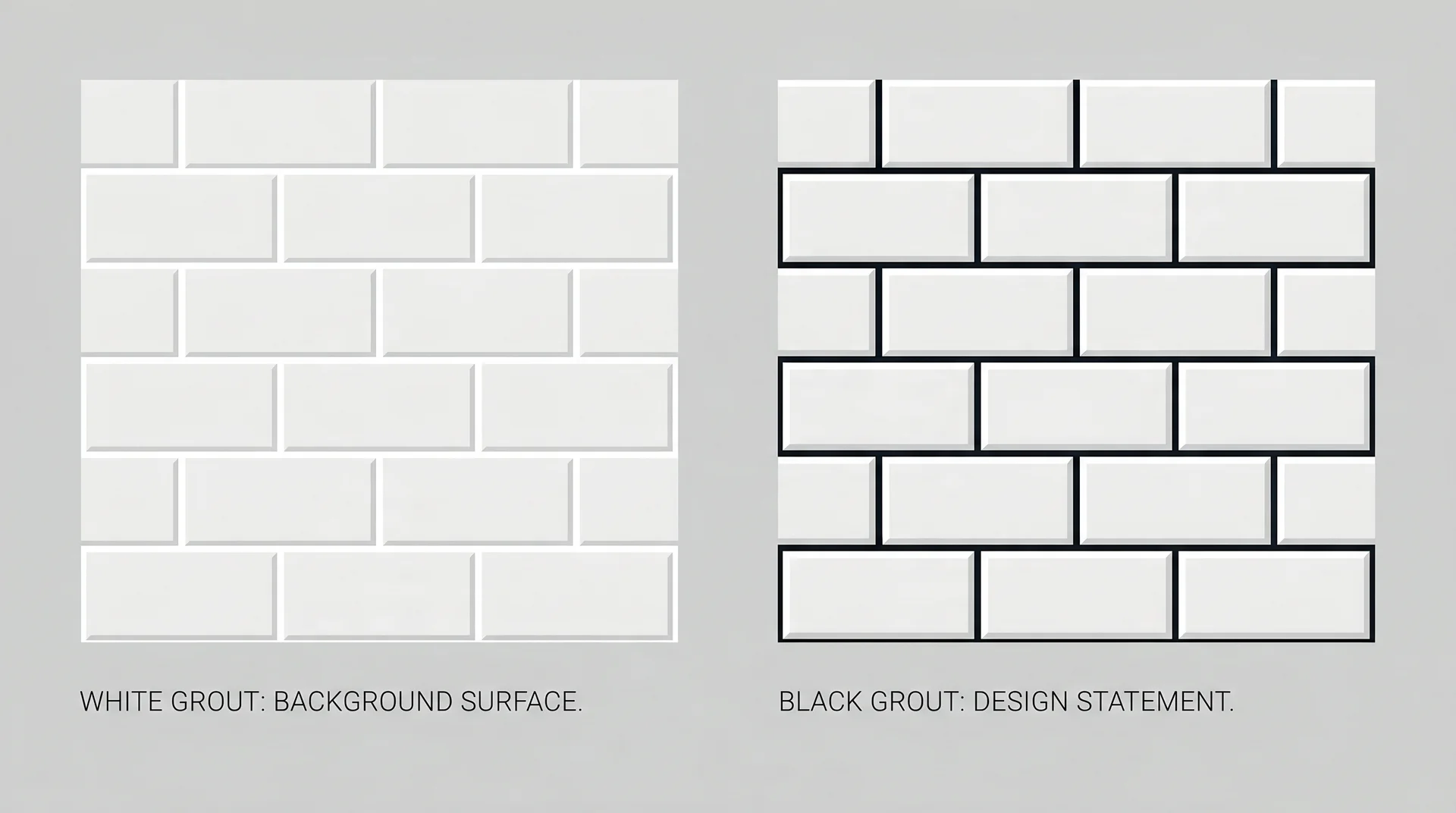
Grout Width: The Decision Nobody Talks About
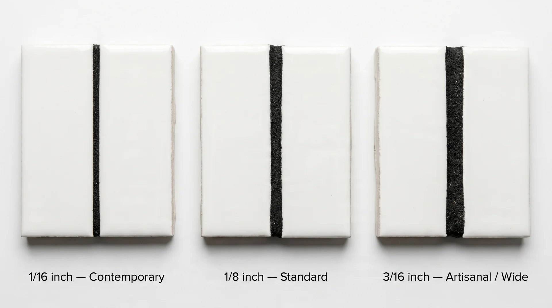
Once you’ve confirmed black grout is right for your kitchen’s visual hierarchy, grout width is the next decision. It changes the final effect as much as the color does.
Most articles on this combination ignore this entirely. They show a photograph and call the result bold or graphic without noting that the same tile with a thin line looks contemporary and restrained, while the same tile with a wide line looks farmhouse-adjacent and busy.
- Thin joint (1/16 inch): The contrast is present but quiet. The tile reads as the primary element, and the grout supports it. This is the right choice for a contemporary kitchen that wants definition without a graphic effect.
- Standard joint (1/8 inch): The most common default. The grout line is visible and deliberate. This is the look most people have in mind when they search for black grout white tile. It reads naturally in farmhouse and transitional kitchens.
- Wide joint (3/16 inch or more): The grout line becomes a visual equal partner with the tile. This works on irregular or handmade tile where variation between pieces is intentional. On perfectly uniform factory tile, a wide black joint can read as an installation error rather than a design choice.
The technical question of minimum grout width by tile type and sanded versus unsanded grout for your specific application belongs in an installation guide. What matters here is that width and color together define the result.
Tile Patterns and What Black Grout Does to Each of Them

Black grout amplifies whatever pattern you choose.
The eye is unforgiving when dark lines frame imprecision.
This is useful in two directions. You can use the same white tile in a different layout and get a dramatically different result. And complex patterns with black grout are significantly more demanding to install, because the dark lines make any imprecision immediately visible.
Choose your pattern with both things in mind: how you want it to look, and how much installation precision you’re prepared to pay for.
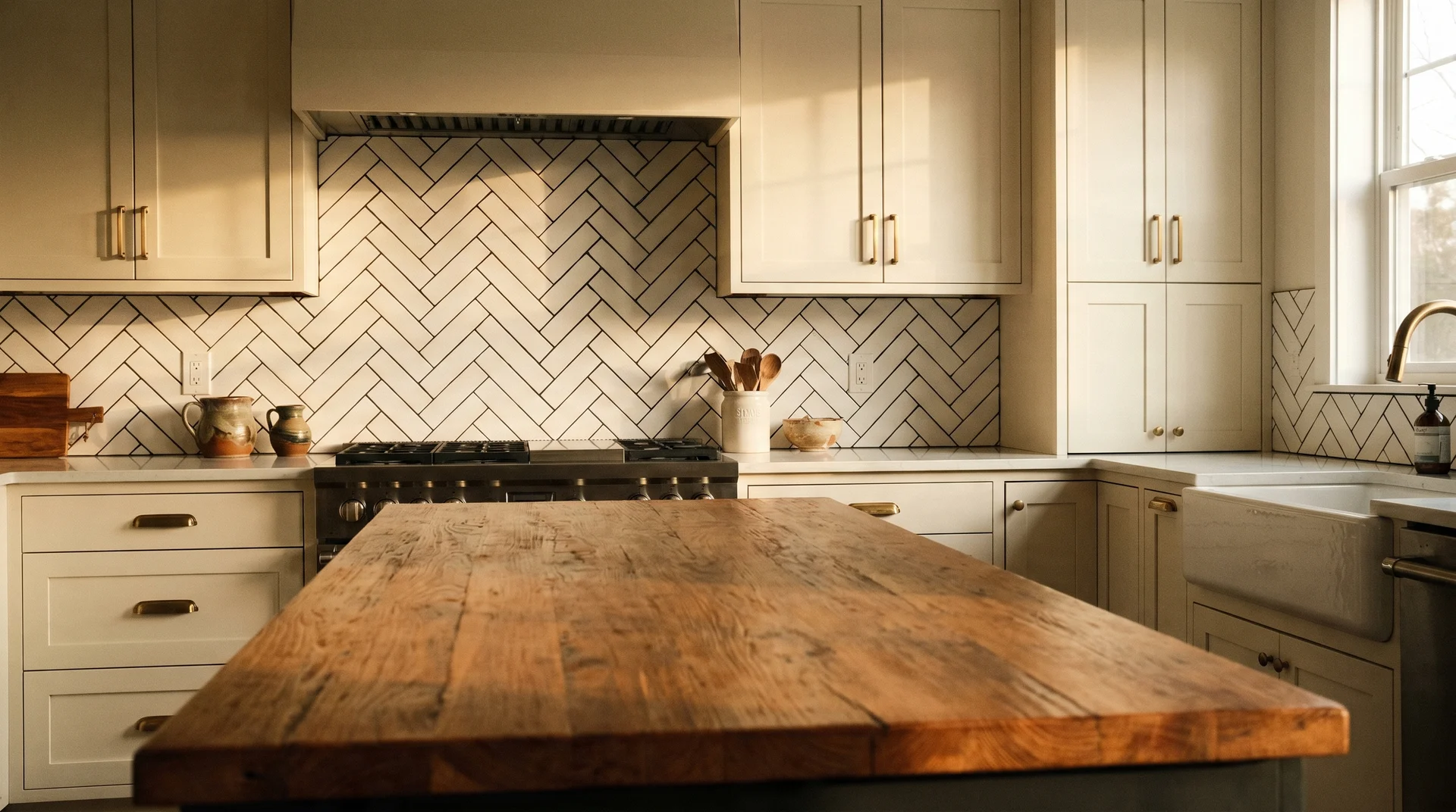
Running Bond (Offset) Pattern
This is the most common layout for a reason: it looks intentional without being demanding.
White subway tile in an offset layout with black grout creates a clear horizontal rhythm. The brick pattern reads cleanly and works across farmhouse, transitional, and modern kitchens without requiring exceptional installation precision.
For first-time renovations and DIY-leaning projects, this is the right starting point.
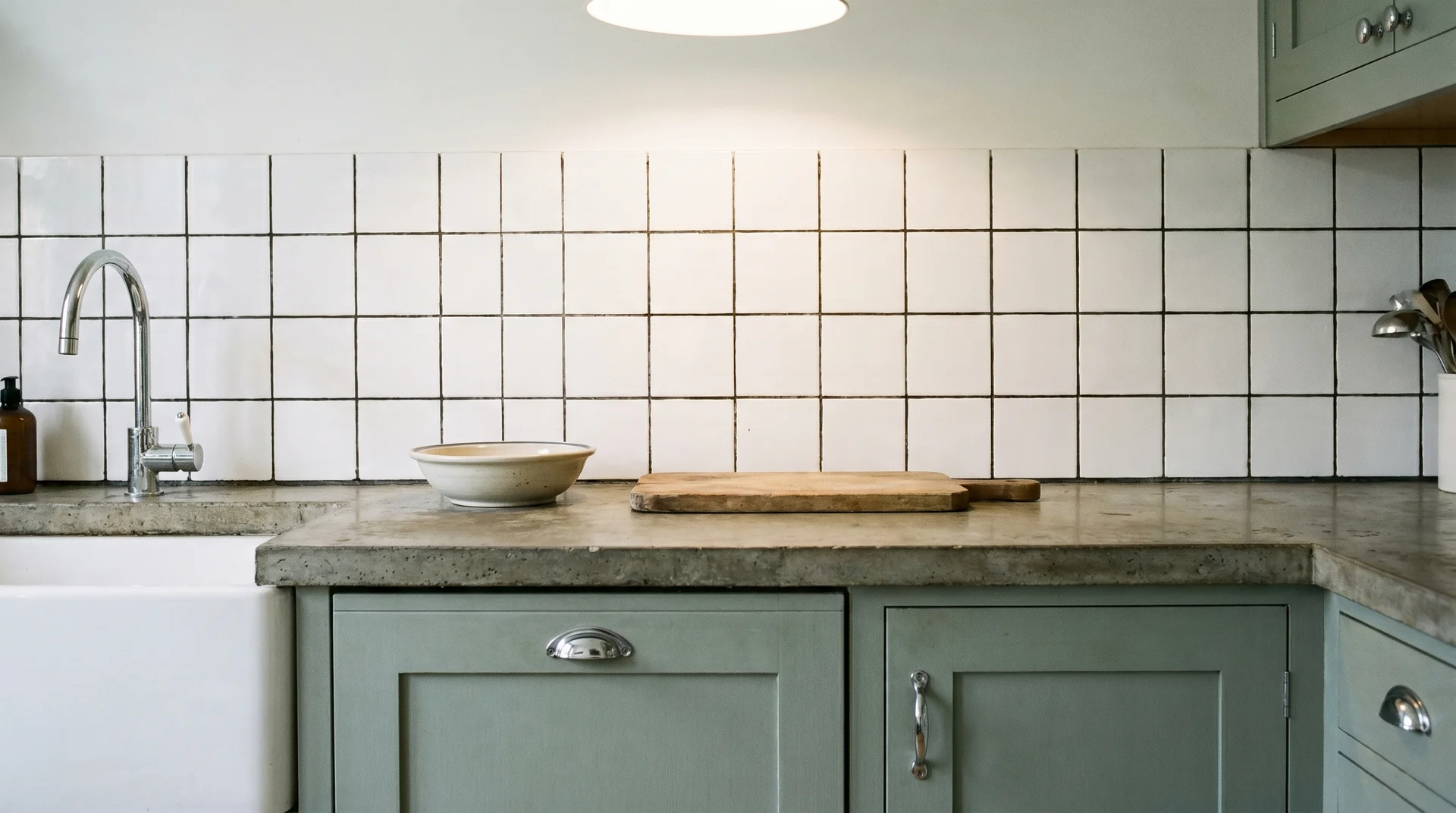
Stacked (Grid) Pattern
Stacked tiles with black grout read as modern and deliberately architectural.
Perfectly aligned tiles in a grid create a graphic, almost industrial effect. This pairing suits slab-front cabinets and minimal kitchens.
It requires more precision than running bond. Any tile slightly out of alignment is easy to spot when the grout lines are supposed to be perfectly vertical and horizontal throughout the installation.
Herringbone Pattern
Herringbone with black grout turns a backsplash into the room’s primary architectural feature.
The diagonal V-arrangement creates a repeating pattern that black grout lines emphasize with strong clarity. This is the most striking version of this combination. It is also the most demanding to install correctly.
The angles need to be precise. The grout lines need to be consistent. If they aren’t, the pattern reads as chaotic rather than intentional.
My opinion is that herringbone is the layout where black grout fully earns its boldness. It’s also the layout I see botched most often in the kitchens I walk through.
Check your installer’s portfolio specifically for herringbone work before you commit. A general tile installer and an experienced herringbone installer are not the same thing.
Vertical Subway
Running subway tile vertically with black grout adds apparent ceiling height.
Rotating the tiles creates a column pattern. The black grout emphasizes those vertical lines and pulls the eye upward.
This is a practical choice in kitchens with lower ceilings or in narrow galley kitchens where horizontal movement is already limited.
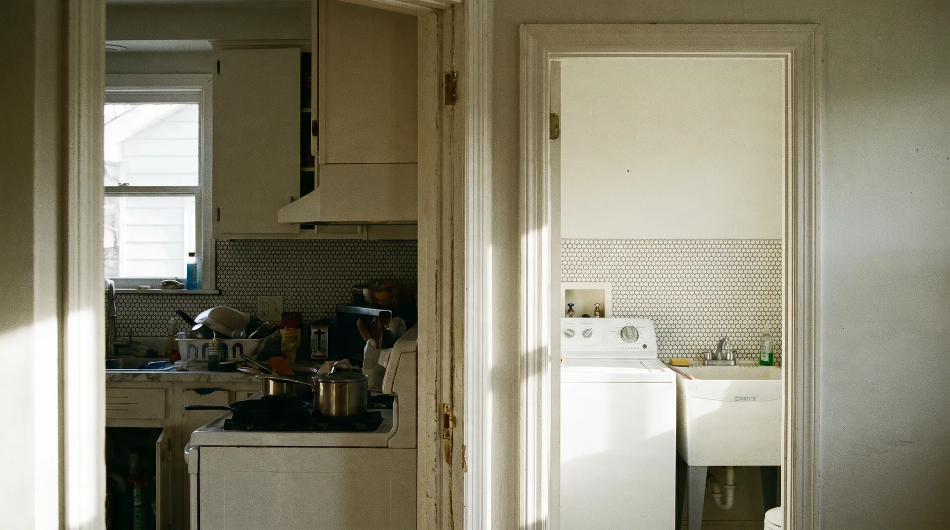
Penny Round and Small-Format Mosaic
Small-format tiles are the exception to the advice about avoiding black grout in small kitchens.
Penny round tile with black grout reads as texture rather than grid. The eye doesn’t track individual grout lines. It reads the surface overall as a pattern.
This works in compact kitchens and galley spaces where larger tiles with high-contrast grout would feel heavy. If you have a small kitchen and you want this combination, small-format tile is the format to look at.
What Actually Causes Black Grout to Go Gray?
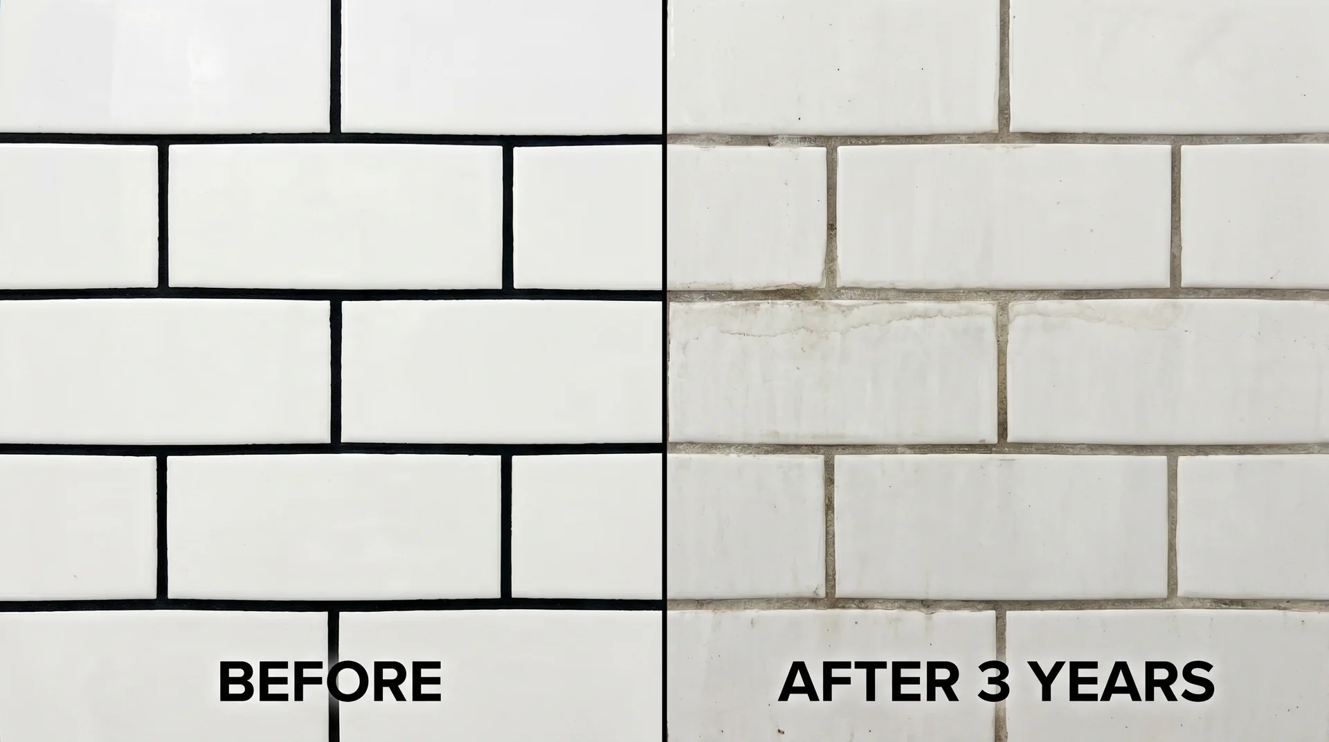
Black grout fades. How quickly it depends almost entirely on decisions made at installation.
Most articles treat fading as an inherent characteristic of dark grout, as if it’s something to accept and manage. It’s more accurate to say that fading has specific causes, and most of them are preventable.
I keep a professional archive of photographs of real kitchen choices I’ve watched fail in real rooms, not staged spaces, actual kitchens I’ve walked into.
Of the black grout installations that looked washed-out within a year, every single one had the same combination: standard cementitious grout, sealed once at installation, then cleaned regularly with an all-purpose spray containing bleach.
That’s a predictable outcome, not bad luck.
The specific causes:
- Grout type: Standard cementitious grout relies on pigment suspended in a porous material. That pigment can migrate, especially under repeated contact with water and cleaning products. Epoxy grout and pre-pigmented formulas hold their color significantly better. Products like Laticrete Permacolor and Mapei Ultracolor Plus are worth the additional cost for this application. Both cost more per bag. Both require more skill to apply. The color retention difference is material enough to justify the expense.
- Cleaning products: Bleach, ammonia-based cleaners, and strongly acidic products strip grout pigment over time. This is the most common cause of premature fading, and the one homeowners are least likely to suspect. Your cleaning routine matters more than your initial sealing for long-term color retention.
- Sealing frequency: Most homeowners seal once at installation and consider it done. Grout sealant degrades with use and time. In a kitchen, resealing annually is the correct maintenance interval for protecting color.
How to Seal Black Grout in a Kitchen
Seal before the grout is exposed to any moisture, and reseal every twelve months after that.
- Allow the grout to cure fully before sealing.
- Clean the grout surface with a pH-neutral cleaner before the first sealant application. Do not use bleach or any acidic product on new grout before sealing.
- Apply a penetrating grout sealer, not a surface sealer. Penetrating sealers protect the grout from the inside out. Surface sealers peel over time and can trap moisture beneath them.
- Work in small sections and wipe excess sealer from tile faces promptly. Black grout requires extra attention here because sealer haze is visible against a dark surface.
- Test the seal annually by placing a few drops of water on the grout. If it beads on the surface, the seal is intact. If it absorbs quickly, reseal before the next season of heavy kitchen use.
For everyday cleaning, pH-neutral dish soap diluted in warm water is the correct product. Avoid anything containing bleach.
A soft brush cleans the grout surface without abrading it over time.
Should You Even Choose Black Grout on White Tile?
None of the above is an argument against choosing black grout on white tile. It is an argument for choosing it with clear eyes.
Installation becomes unforgiving. With white grout, a tile that’s slightly uneven is effectively invisible. With black grout, it isn’t. Every imperfection in alignment and every variation in grout-line width becomes visible.
The tile looks fine during installation, but looks wrong after grouting. This is the most consistent complaint from homeowners who installed this combination themselves. The solution is either an experienced installer or a simpler pattern with larger tiles where alignment is easier to control.
The small-kitchen rule is more specific than just “avoid it.” Black grout in a small kitchen doesn’t automatically make the room feel smaller. The tile format and pattern determine that far more than the room size does.
- A small-scale tile with thin grout lines can make a small kitchen feel well-designed and intentional.
- A large-format tile with wide black grout lines in the same space will feel heavy. The format decision is more important than the room-size decision.
I have never believed the blanket advice about avoiding dark grout in small kitchens. I’ve seen it work beautifully in galley kitchens under a hundred square feet.
High contrast can tire over time. This is a real consideration worth naming. High-contrast combinations are more visually demanding than tonal ones. Some people find them energizing.
Others find them exhausting after a few years of daily exposure. If you tend to tire of bold design choices, charcoal grout, a warm dark gray, not a cool mid-gray, gives you most of the visual definition with a fraction of the contrast.
This is not a compromise. It’s a genuinely different result.
Resale is worth one sentence. A black-and-white backsplash is broadly appealing rather than polarizing, unlike some bold design choices. It’s unlikely to cost you at resale.
But a badly faded or imprecisely installed version will. The installation quality matters more than the color choice for how a future buyer reads it.
Knowing the trade-offs, here’s what you can do to make the combination work on your terms.
Making the Grout on White Tile Work Effortlessly
Black grout and white tile read as cold in some kitchens and sharp in others.
The difference is almost always one of the four elements below. You need at least one present to keep the combination from feeling clinical. Think of these as structural requirements, not optional styling touches.
The backsplash combination only works within a room that provides the right context.
- Warm wood: Open shelving in oak or walnut, a butcher block section, wooden stools, or a wood-toned floor. Even a single warm-toned surface cuts the starkness of black-on-white significantly. The wood needs to be in the direct sightline of the backsplash — not hidden behind base cabinets. Warmth needs to be adjacent and visible from the point where the backsplash is the focal point.
- Brushed brass or warm metal hardware: Matte black hardware reinforces the graphic quality of black grout and can push the room toward feeling stark rather than designed. Brushed brass, unlacquered brass, or warm bronze introduces a color-temperature break between the cool contrast of the tile and the rest of the room. Replace hardware before finalizing your grout decision, because it changes how the whole combination reads.
- Matte tile finish: Glossy white tile with black grout creates maximum contrast. The glossy surface reflects light and intensifies the dark-line graphic quality. Matte white tile with black grout softens the effect, because the matte surface absorbs light rather than bouncing it. This decision is made at the tile-selection stage and cannot be changed after installation.
- Adjacent wall color: The wall flanking the backsplash matters as much as the backsplash itself. A warm off-white or soft warm gray on adjacent walls reduces the contrast between the tile and the surrounding room. Stark white walls adjacent to a black-grout backsplash amplify the graphic quality. Paint adjacent walls before making your final grout color call.
The warm wood element is the most important of the four, in my opinion. Even a butcher block cutting board sitting on the counter does more work than you’d expect.
I’ve seen it turn a kitchen that felt like a design statement into one that felt like a home. Those are different things, and the distance between them is smaller than people think.
Final Thoughts
These eight decisions follow directly from the conditions and trade-offs covered in this article. Most people make them backwards; they choose the tile and grout, then try to fit the room around that choice. The sequence below is the right order.
If you cannot answer one of the early steps clearly, the later steps cannot be completed well. That’s the hero rule, which came up in the first section, doing its job again here.
- Identify your kitchen’s current dominant visual element. What does the eye catch first when you walk in? That’s your existing hero. Name it before you move on.
- Decide whether your backsplash should be the hero or a supporting element. If the backsplash should be the dominant visual, black grout is appropriate. If your countertop, cabinetry color, or range hood is already doing that job, use a tonal or lighter grout color.
- Check your countertop tone and pattern. Heavily patterned or veined countertops need a quieter backsplash. Clean, light countertops give the backsplash room to lead.
- Check your cabinet color against the table above. Warm saturated cabinet tones need careful evaluation before committing to high contrast on the backsplash.
- Assess your light. Hold a large grout sample against your tile in your actual kitchen at multiple times of day. This is the only reliable test before you commit.
- Choose your tile format and layout. Herringbone and stacked patterns are more visually striking and more demanding to install. Running bond and small-format tile are more forgiving of real-world installation variation.
- Choose your grout width. Thin for contemporary. Standard for farmhouse and transitional. Wide only for irregular or handmade tile with natural variation between pieces.
- Identify your mediating warmth element before installation begins. Know where the warm wood or warm metal is coming from before the tile goes up. Retrofitting warmth after installation is harder and more expensive than planning it in advance.
The constraint most people don’t name is finality. Ripping out a backsplash costs substantially more than installing one. The grout color decision is effectively irreversible once the tile is set.
The budget for making this decision correctly is whatever it takes to be certain before the work begins. That is the actual design problem here, and it’s worth naming it directly.