

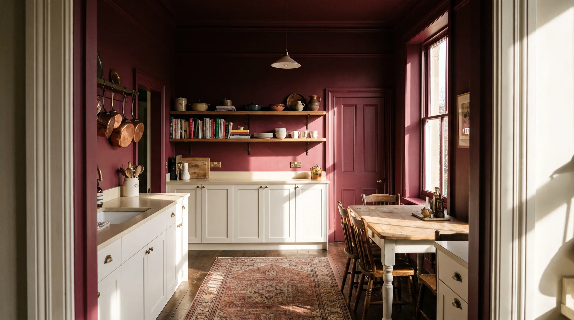
Burgundy is a good color for a kitchen.
It works on cabinets, walls, backsplashes, and even the ceiling. The light requirements, costs, and conditions for success differ for each application.
The condition for success is the same in every case. One surface carries the color, and everything else in the room answers to that decision.
These 26 ideas show how to make it work inside an existing kitchen. This piece covers which surface gets the color and how to make that work with what you already have.
A full gut renovation where every surface starts fresh is a different brief with different criteria, and it belongs in a different article.
Before You Pick a Burgundy Kitchen Color
Burgundy is a hero color.
Every idea below depends on how you answer these three questions about your specific kitchen. Skip them, and you’re picking from photographs of rooms that aren’t yours.
The One Rule
When burgundy enters the room, burgundy is the hero. The backsplash, the countertop, the hardware, and the light fixture all exist in service of that single decision.
The moment one of them tries to make its own statement, the room pulls apart.
Every idea below is built around this rule. When an idea says to keep the backsplash simple, that’s the one-hero rule applied to a surface decision.
How Much Natural Light Does Your Kitchen Actually Get?
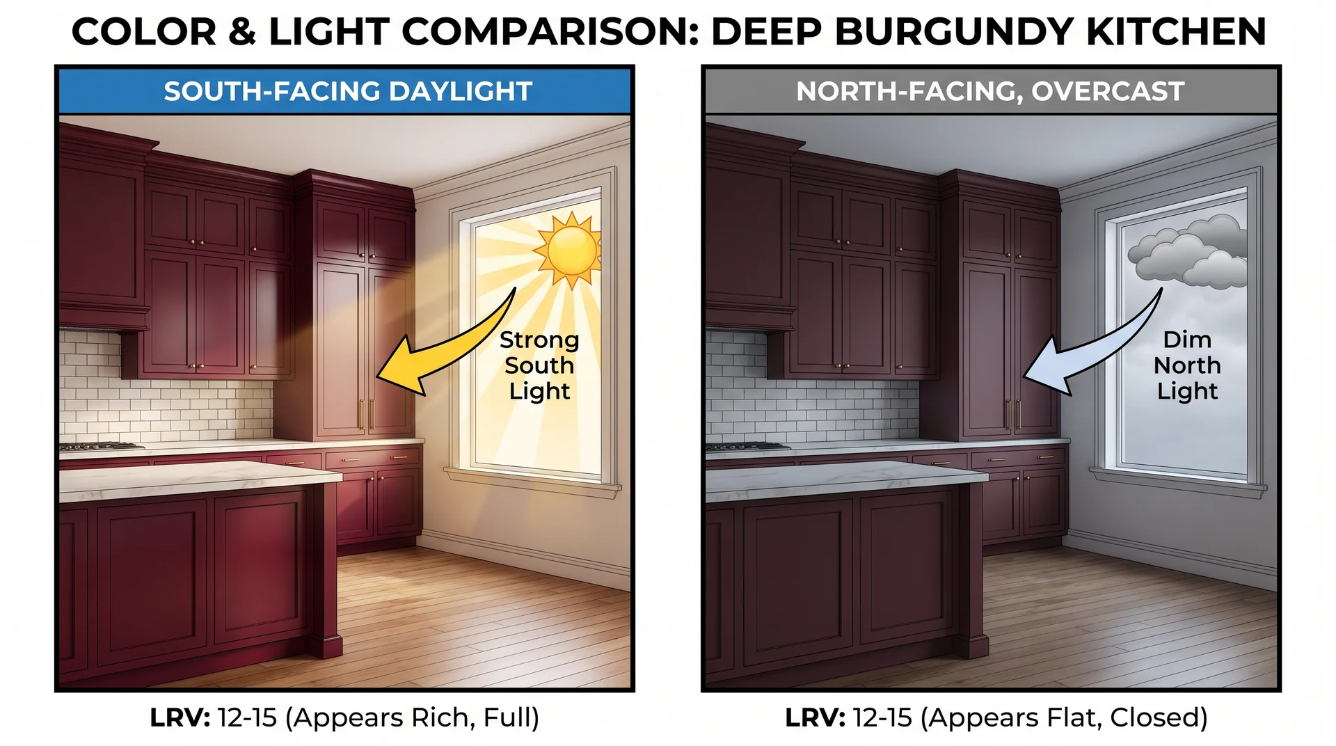
Burgundy absorbs light and returns very little of it to the room.
Most deep burgundy shades carry an LRV between 5 and 12. LRV stands for light reflectance value. It measures how much light a surface sends back into the room, on a scale from 0 to 100.
| Surface Color | Approximate LRV Range |
|---|---|
| White | 80–85 |
| Cream or off-white | 65–75 |
| Sage green | 30–45 |
| Deep burgundy | 5–12 |
Within the burgundy spectrum, wine red sits at the lighter end, true burgundy in the middle, and dark plum or damson at the lower end. All of them absorb significantly more light than any other common kitchen color family.
Every surface you paint burgundy makes the room measurably darker.
- In a south-facing kitchen with two good windows, that reads as richness and depth.
- In a north-facing kitchen with limited daylight, the same shade closes the room down.
Stand in your kitchen at midday on an overcast day. That’s the most honest read of your light condition. If the room already feels dim, keep burgundy to contained applications: the island, the lower cabinets, or one backsplash zone.
If the room reads genuinely bright, the denser ideas in this article become realistic.
What You Can Change vs. What You’re Already Working Around
Most readers can’t change their floors, countertops, or window placement.
The images you’ve been saving on Pinterest show kitchens designed from scratch. Most people are working with two or three elements that they can’t move. The constraint is where the real design problem lives.
Take stock of your fixed elements before choosing any idea. Here’s how the most common ones affect which applications are available to you.
- Warm oak or pine floors: A cooler, deeper wine red sits comfortably over warm wood. A red-orange burgundy fights the floor. Look at undertones in your specific light before committing.
- White or cream countertops: The most flexible fixed element. Almost any burgundy application pairs well here.
- Beige or builder-grade countertops: Beige has a yellow undertone that can make burgundy read muddier than it should. Test a large paint chip in your actual light before ordering.
- Existing patterned or colored tile: It now competes with your burgundy hero. Neutralize or replace it, or choose a burgundy application on a different surface entirely.
- Low ceilings (under 9 feet): Full color drenching and ceiling applications can make a low-ceiling kitchen feel compressed. Stick to cabinets or a single, contained accent.
The ideas below are organized by application type. Match each one to what you’re working around.
Burgundy Cabinet Ideas
Cabinets are the right starting point for most kitchens.
They’re the largest painted surface in the room, and a kitchen can hold exactly one dominant visual statement, so whichever cabinet idea you choose becomes the hero.
The countertop, backsplash, and hardware all answer to it from that point forward.
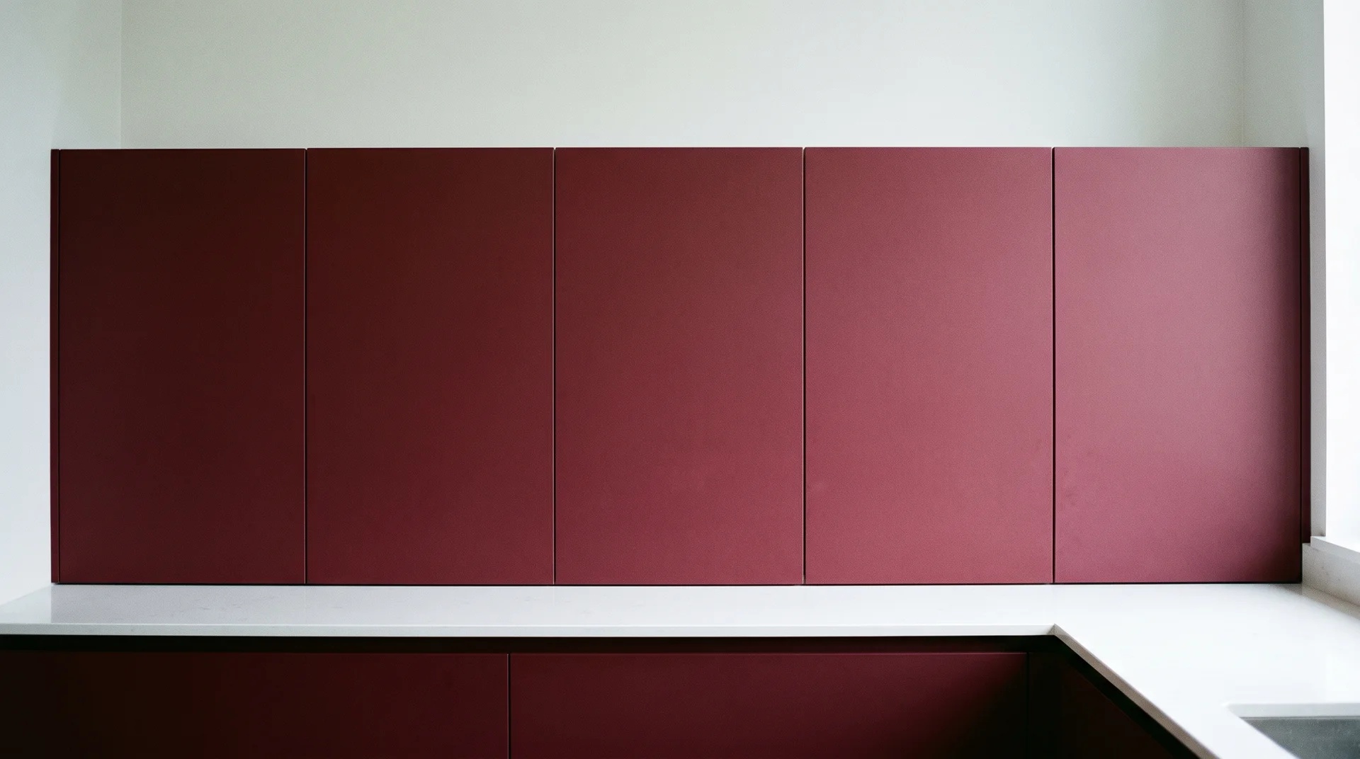
Full Burgundy Cabinets from Top to Bottom
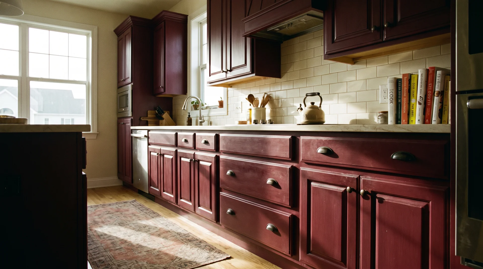
This is the most committed cabinet application, with the most specific light requirement of any idea here.
Full coverage looks exactly right in a kitchen with strong natural light. Upper and lower cabinets painted the same deep shade create a room that reads as a complete, deliberate environment, the kind of moody kitchen that earns the photographs people save.
In a kitchen without that light, the room closes down. Go back to the midday overcast test from the section above. If the room feels dim, this isn’t the idea for your kitchen.
Two specific paint colors worth testing at this shade depth:
- Benjamin Moore Moroccan Spice (2088-20): sits at the deeper red-purple end of the burgundy range and holds its color on a full cabinet face without going flat in real light
- Sherwin-Williams Merlot (SW 0081): slightly warmer tone, works well in kitchens with warm-toned floors or cream countertops
Pull large chips of both and live with them for a week. A chip taped to your actual cabinet face tells more than any digital swatch.
Keep the backsplash completely neutral: white subway tile, a plain painted wall, or simple cream stone. A patterned backsplash here is a second hero. That’s one too many.
To execute this, professional spray painting runs $2,500 to $5,000 for a typical kitchen, depending on cabinet count and surface prep. DIY with a brush and foam roller is achievable. Use a foam roller on flat panels and a small detail brush on Shaker insets.
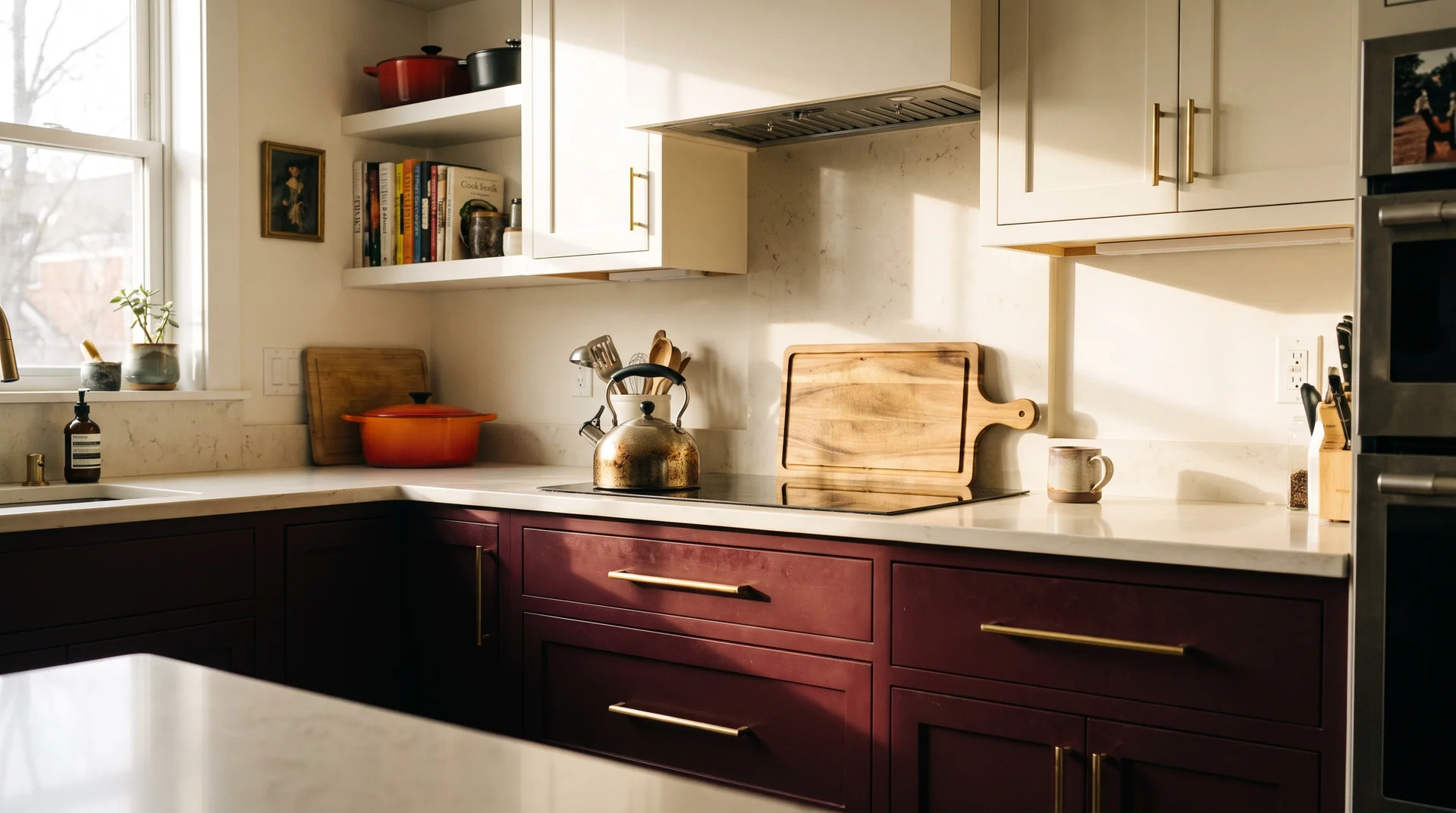
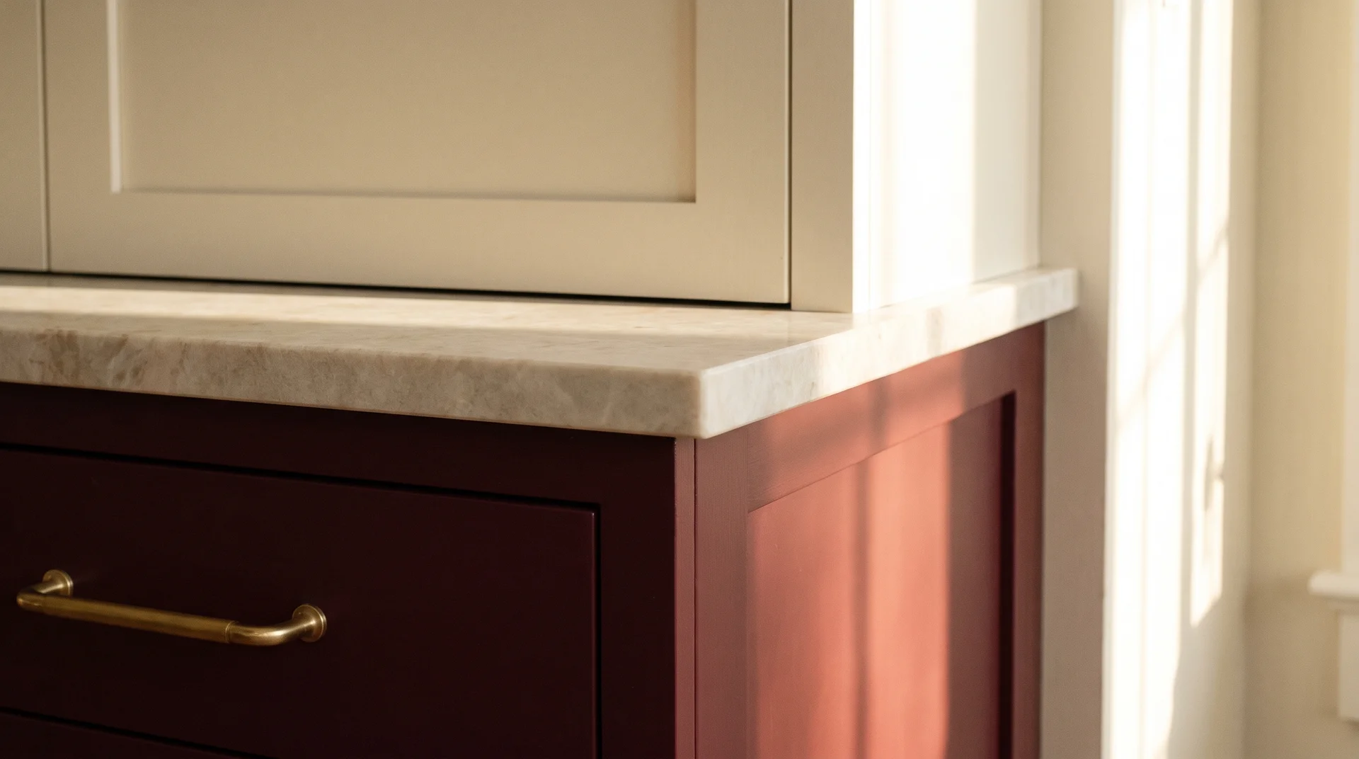
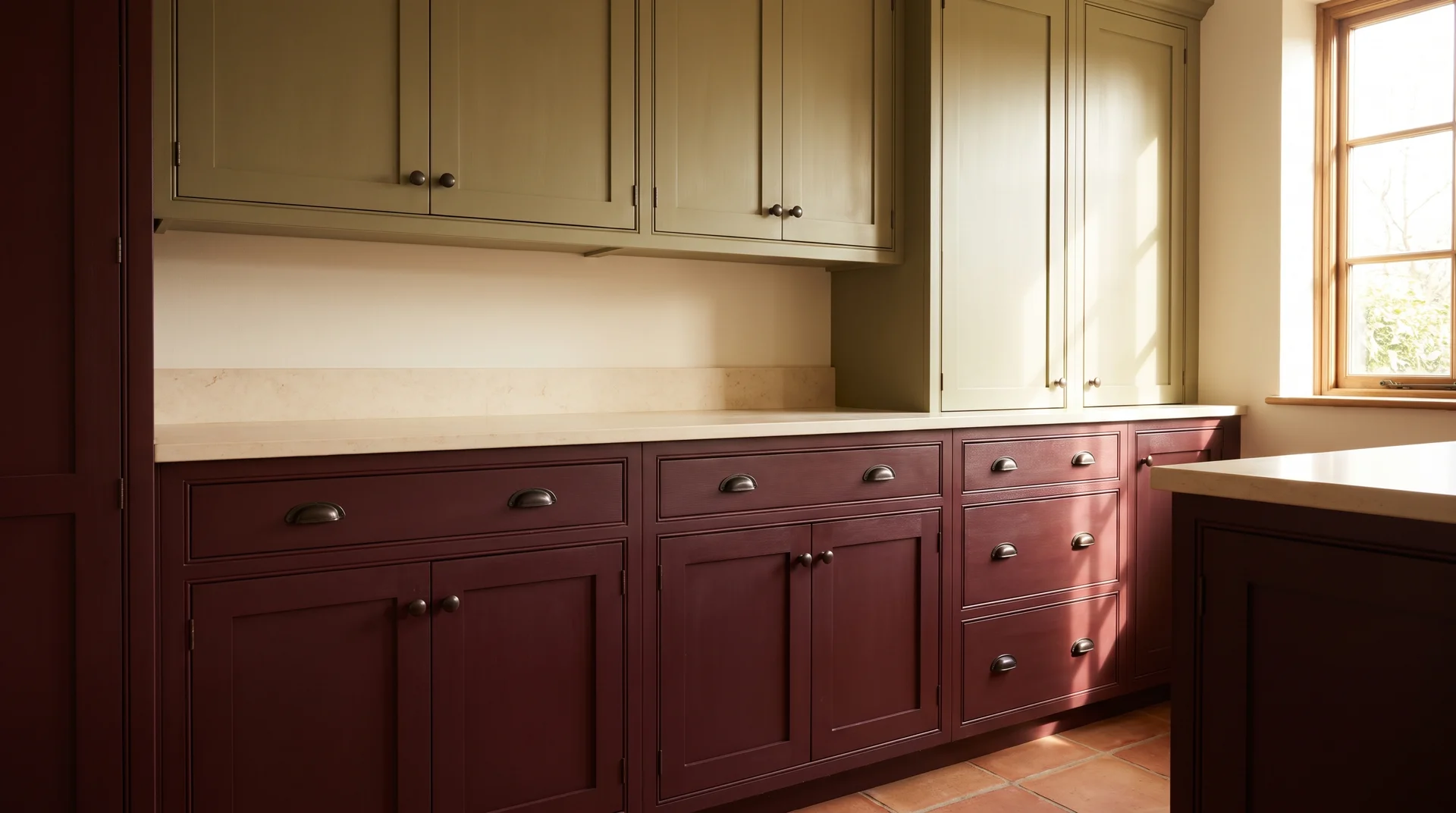
Burgundy Lower Cabinets With Warm White Uppers
This is the most practical starting point, and it works in more kitchens than any other cabinet application here.
The lower cabinets take the color. The uppers stay light and keep the room visually open. This arrangement works in smaller kitchens, darker kitchens, and anywhere you want depth without the room closing in.
The white matters.
- Cool white, which carries a blue or gray undertone, reads harsh next to burgundy. You want a white with a slight cream or ivory lean.
- Benjamin Moore White Dove (OC-17) and Sherwin-Williams Alabaster (SW 7008) are the two I reach for first when pairing with deep warm colors.
Test both against your burgundy chip before ordering.
If you’re drawn to this approach but want to explore more color combinations for uppers versus lowers, the two-tone cabinet ideas piece on this site covers a much wider range of pairings.
To execute this, do this the same as a full cabinet repaint, but with two colors managed as a coordinated project. Choose the colors as a pair, test them on adjacent surfaces, and execute both in the same painting window.
A Burgundy Kitchen Island in a Neutral Kitchen
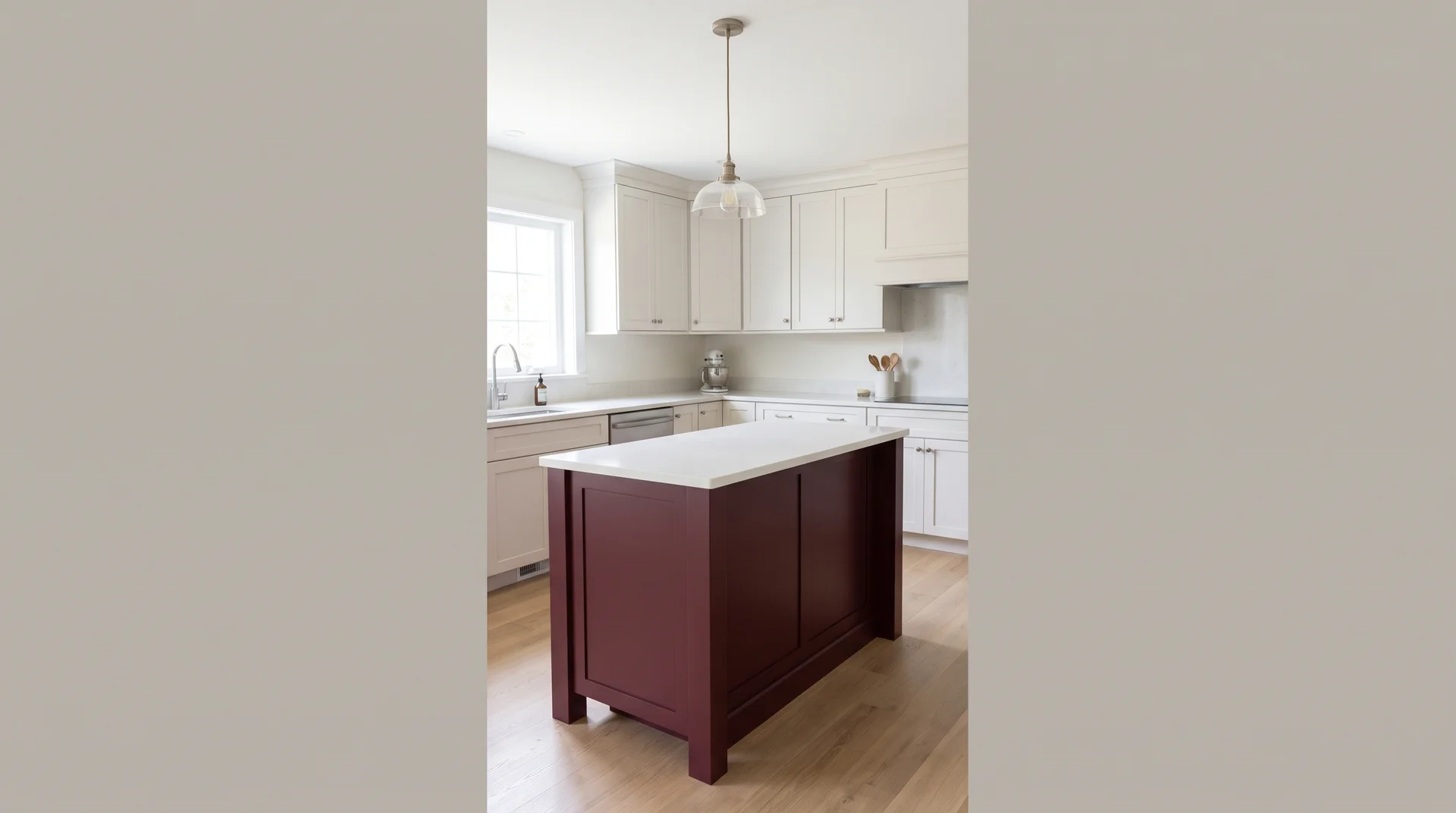
The island, as the sole burgundy element, is a complete design decision on its own.
One freestanding surface carries all the color. The perimeter cabinets stay neutral: cream, white, or natural wood. The island does the work. It reads as intentional precisely because it’s contained.
The most common mistake with this application is the pendant light. A statement pendant over a burgundy island creates two heroes competing for the same eye. Choose a simple fixture above the island and save all the visual interest for the island itself.
Execution: an island repaint runs $800 to $2,000, depending on size and whether you’re refinishing the existing surface or replacing the doors. A new freestanding island unit in a quality finish costs $1,500 to $4,000.
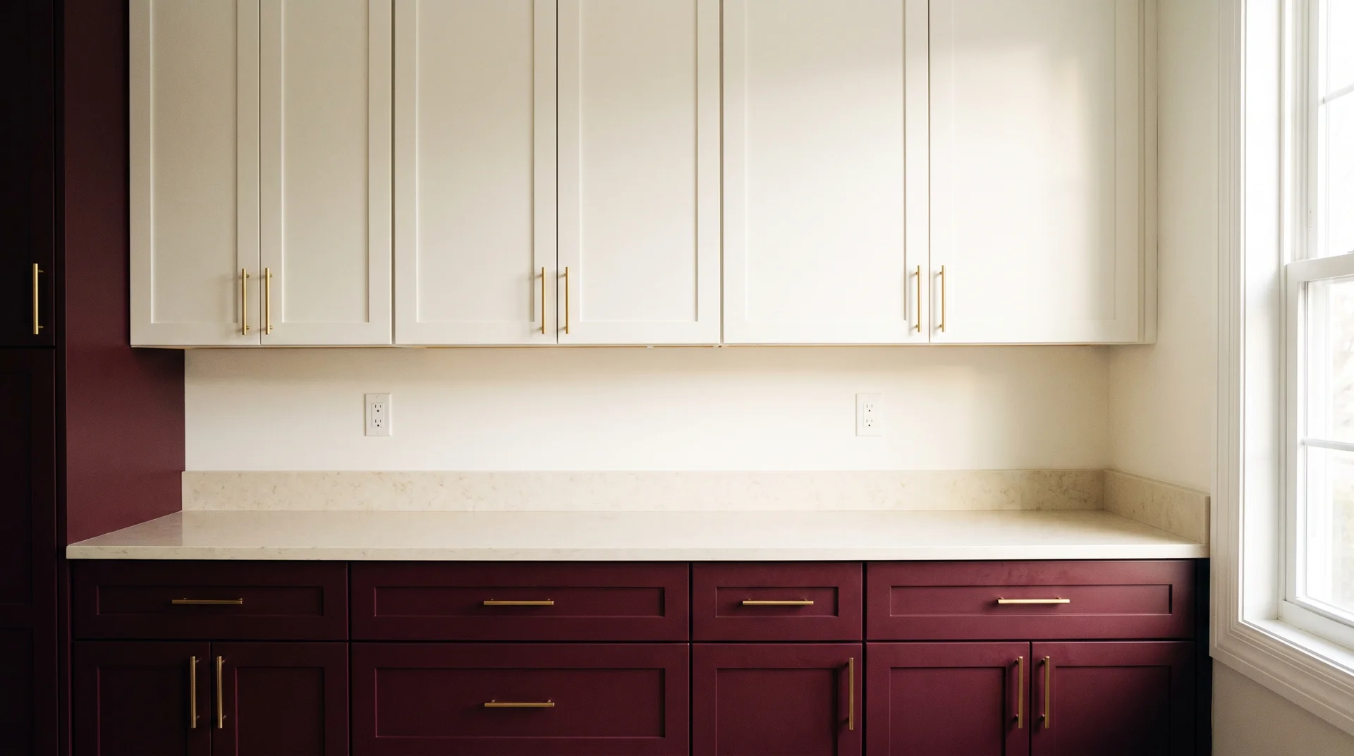
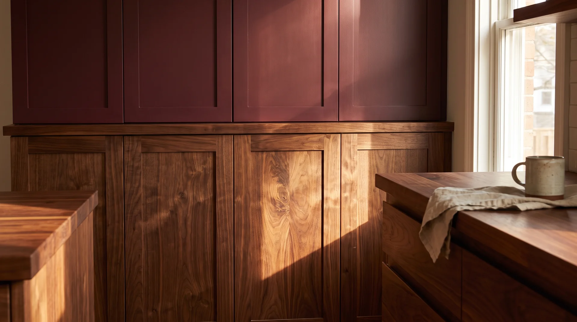
Burgundy Upper Cabinets With Natural Wood or Light Oak Below
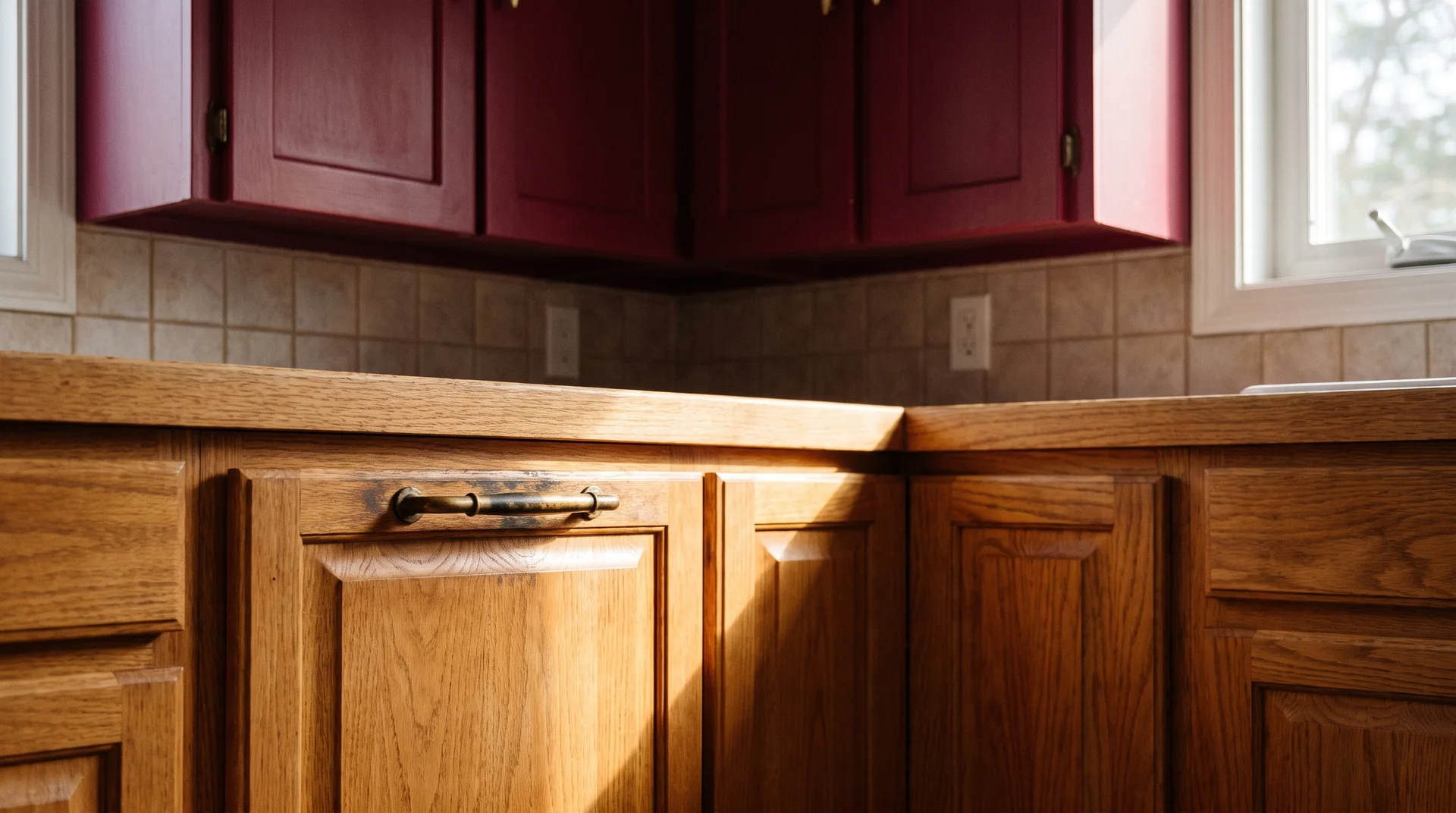
This arrangement puts the color at eye level and grounds the room in warm wood below.
The upper cabinets carry the burgundy. The lower cabinets are natural wood: real oak, walnut, or warm-toned maple. The wood reads as material rather than color. That’s why it doesn’t compete with the burgundy above it.
One condition: the wood has to be genuinely warm-toned. Orange-red oak fights burgundy. Medium or dark walnut works better still. Verify the undertone of your existing lower cabinets in natural light before committing to burgundy above.
Hardware matters here. A genuinely aged brass pull, the kind with uneven patina that decades of use produce, reads as part of the room’s character. I’ve sourced pieces like this at weekend flea markets for years.
Shaker-Style Burgundy Cabinets in a Traditional Kitchen
Shaker door profiles work well with burgundy because the inset center panel creates shadow lines that the color picks up.
A flat cabinet face shows burgundy as a solid field of color. A Shaker door adds a recessed panel that catches light differently from the frame surrounding it. The color reads richer and more dimensional as a result.
This combination pairs naturally with unlacquered brass hardware or ceramic pulls. Ceramic works well here if you want to move away from metal entirely. The matte surface of a well-made ceramic pull sits quietly against a Shaker front without introducing a competing finish.
Execution: Shaker profiles are standard for most professional painters. The inset panel corners require careful cut-in work. A small angled brush at those corners and a foam roller on the flat sections get a clean result on a DIY project.
Flat-Front Burgundy Cabinets in a Modern Kitchen
Flat-front doors put all the visual weight on the color itself.
No inset panel, no shadow line, no ornamental detail. The door is one flat face of burgundy. It reads as bold and contemporary. It also shows every imperfection in the paint application, so surface preparation isn’t optional here.
Hardware on a flat-front door: integrated bar pulls, recessed aluminum channels, or push-to-open mechanisms.
Ornate knobs fight the simplicity this style requires. Choose the simplest possible version.
Execution: sand lightly between coats. Any roller texture or uneven coverage is immediately visible on a flat surface in a way it isn’t on a profile door. Prepare more than you think you need to.
Painting Existing Cabinets Burgundy Without Replacing Them
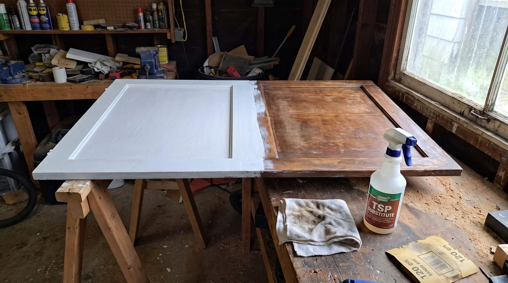
You can paint existing cabinets burgundy, and the result depends almost entirely on surface preparation.
Most cabinet painting projects that fail do so within 18 months. The paint peels at door edges, chips on corners, or shows brush texture that worsens with every cleaning.
Almost none of these failures trace back to the paint itself. They’re preparation failures: inadequate degreasing, skipped sanding, wrong primer, or paint applied over invisible grease that kitchen use deposits on every cabinet face.
I keep a professional archive of real kitchen photographs from twelve years of projects. Badly painted dark-colored cabinets appear in that archive more than any other single failure type. Dark paint makes surface defects visible in a way that white or cream never does.
A chip on a cream cabinet is easy to miss. The same chip on a full burgundy face is a visible scar in every light condition.
These are the preparation steps that can’t be skipped:
- Degrease every cabinet face with a TSP substitute. Kitchen surfaces carry invisible grease that prevents paint adhesion regardless of how clean they look. Work with windows open. TSP substitute products produce fumes in enclosed spaces.
- Sand lightly with 120-grit sandpaper to scuff the existing finish. This gives the primer something to grip.
- Apply a bonding primer formulated specifically for cabinets. Zinsser BIN shellac-based primer is the one I see professionals reach for most. Cabinet primer specifically and not wall or ceiling primer.
- Apply two coats of cabinet-formula paint in your chosen color. Let each coat cure completely before the next. Dry and cured are different things. Check the manufacturer’s guidance.
- Rehang the hardware only after the final coat is fully cured.
Budget for a DIY cabinet painting project: $150 to $400 in materials for an average kitchen. Professional cabinet painting runs $2,500 to $5,000. The gap is real, and so is the difference in preparation work.
Whether this is a DIY project or a professional one genuinely depends on your patience for prep and your tolerance for imperfection. What I’d say: if you’re spending real money on a paint color, spend it first on preparation.
For a full walkthrough of the process, the full guide to painting kitchen cabinets covers every stage in detail.
Burgundy Wall and Ceiling Ideas
Walls and ceilings are the most reversible way to add burgundy to a kitchen.
Paint comes off with another coat of paint. When the cabinets are staying neutral, a wall or ceiling application gives the color a surface to work from without committing to the larger project.
If you want to live with burgundy before investing in cabinets or tile, start here.
Color-Drenching All Four Walls in Burgundy
Color drenching means painting walls, ceiling, and trim in the same shade.
The result is a kitchen that reads as a complete, deliberate environment rather than a room with a feature wall. Done well in a room with adequate light and ceiling height, it’s the most coherent wall application in this article.
I’ve seen this go right and I’ve seen it go wrong. The difference is almost always ceiling height and natural light.
- An 8-foot ceiling with one small window and full burgundy drenching reads as a sealed box.
- A 10-foot ceiling with south-facing light and the same color reads as a moody, intentional choice.
The room has to earn this application.
Color drenching also has better longevity than a single accent wall. Accent walls date as soon as the style moment that produced them moves on. Full drenching reads as an architectural decision rather than a trend response. That matters for anyone weighing burgundy as a five-year choice versus a fifteen-year one.
Execution: a full wall and ceiling repaint by a professional runs $800 to $2,000, depending on room size and trim complexity. DIY with a roller is achievable. The ceiling cut-in at the top of the cabinet crown requires a steady hand and a quality angled brush.
A Burgundy Ceiling With White or Cream Cabinets Below
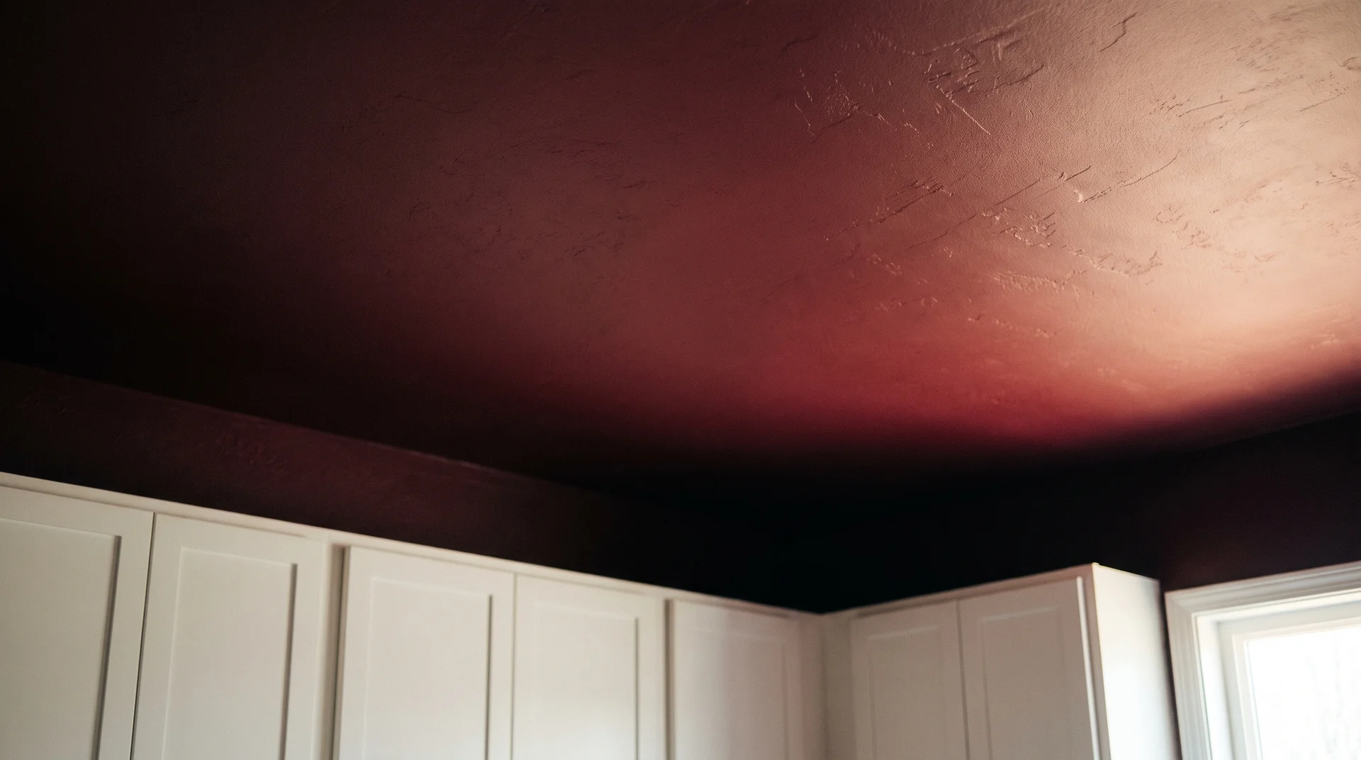
The ceiling, as the sole burgundy surface, is the least expected idea in this article.
You’re standing in a kitchen where everything below your eye level is light: white or cream cabinets, pale countertops, simple hardware.
Then you look up.
The room becomes intimate without becoming compressed. The color sits above the sightline rather than around it. The kitchen stays visually open at eye level, and the drama arrives only when you notice the ceiling.
Execution: Ceiling painting is a manageable weekend project. The cut-in at the top of the wall or the cabinet crown is the technically demanding part. Use a quality angled brush, take it slowly, and budget for two full coats. Let the first cure be completely before the second.
Burgundy Limewash on a Single Kitchen Wall
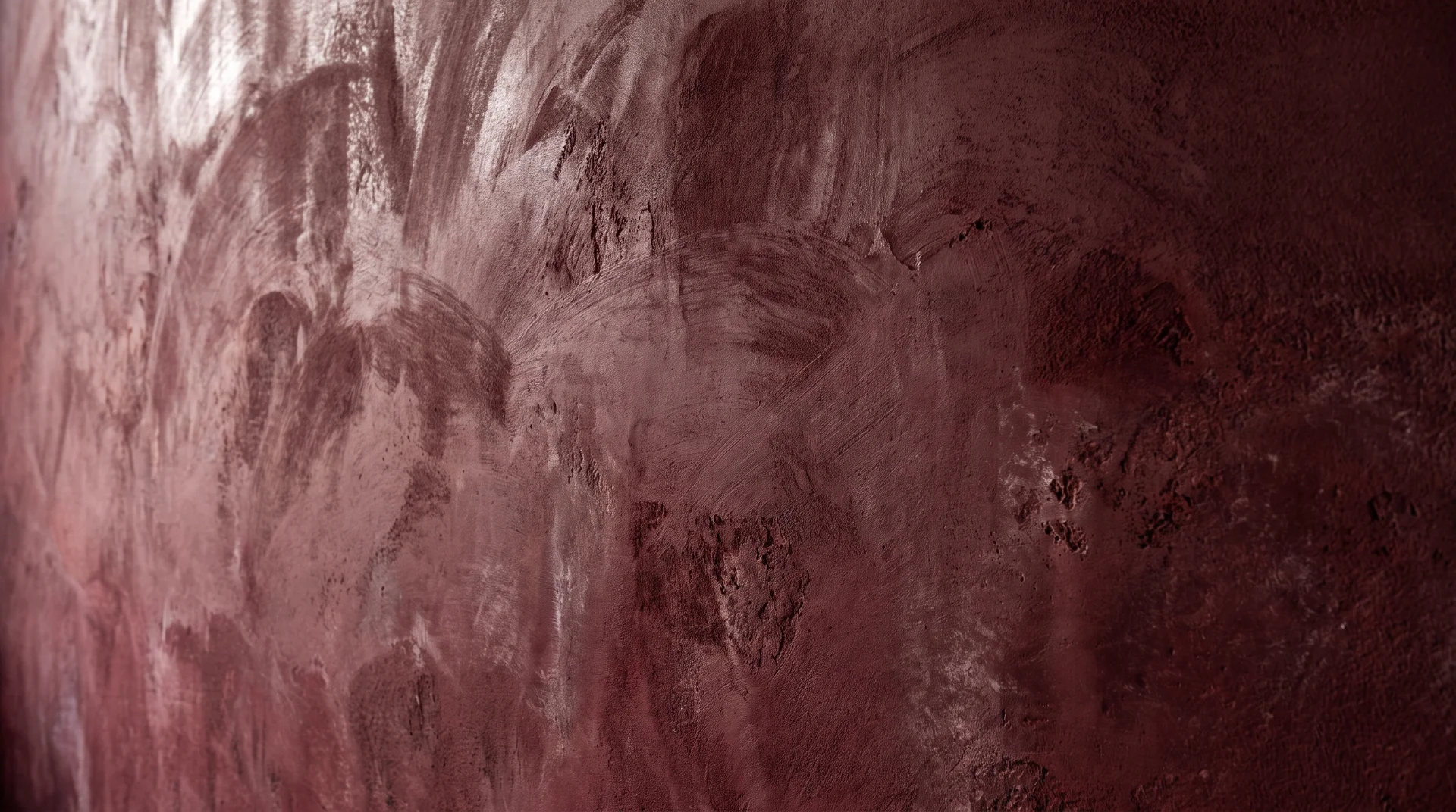
Limewash gives burgundy a textured, aged quality that flat paint can’t produce.
The technique creates variation across the surface: lighter in some areas, deeper in others. The color shifts slightly with the angle of light throughout the day. On a flat wall, burgundy reads as a single tone. Limewashed, it reads as a surface with depth.
One practical requirement before committing: not all limewash products work in a kitchen environment.
A kitchen wall sees cooking moisture, grease vapor, and regular cleaning. You need a product formulated to be moisture-resistant once cured.
Ask the manufacturer directly before buying. Don’t assume a product marketed for interior walls is suitable for a kitchen specifically.
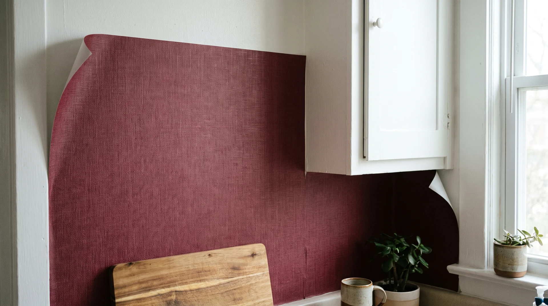
Burgundy Wallpaper Behind Open Shelving or a Breakfast Nook
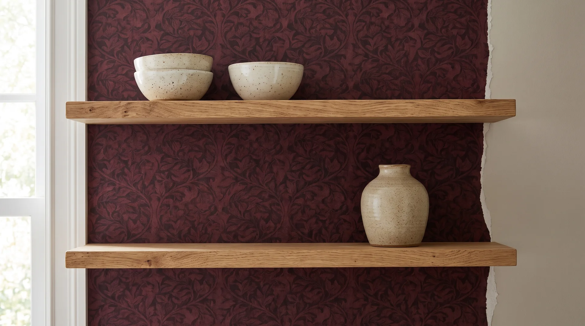
Wallpaper is the lowest-cost burgundy wall option, but the kitchen specification requirement is non-negotiable.
Standard paper wallpaper in a kitchen lifts, bubbles, and peels within one to two years due to cooking moisture. Vinyl-coated or solid vinyl wallpaper is the only suitable option. That specification is what determines whether the project lasts.
Behind open shelving or in a defined breakfast nook, a burgundy vinyl wallpaper creates a contained backdrop. A rich botanical or a deep geometric in wine tones works well in both locations. Keep the pattern scale in proportion to the wall area. A large pattern repeat on a small section looks cut off and unresolved.
Execution: vinyl wallpaper installation is a manageable DIY project for one straight wall. Seams on patterned paper require more care than seams on plain. Materials: $60 to $200, depending on paper quality and area.
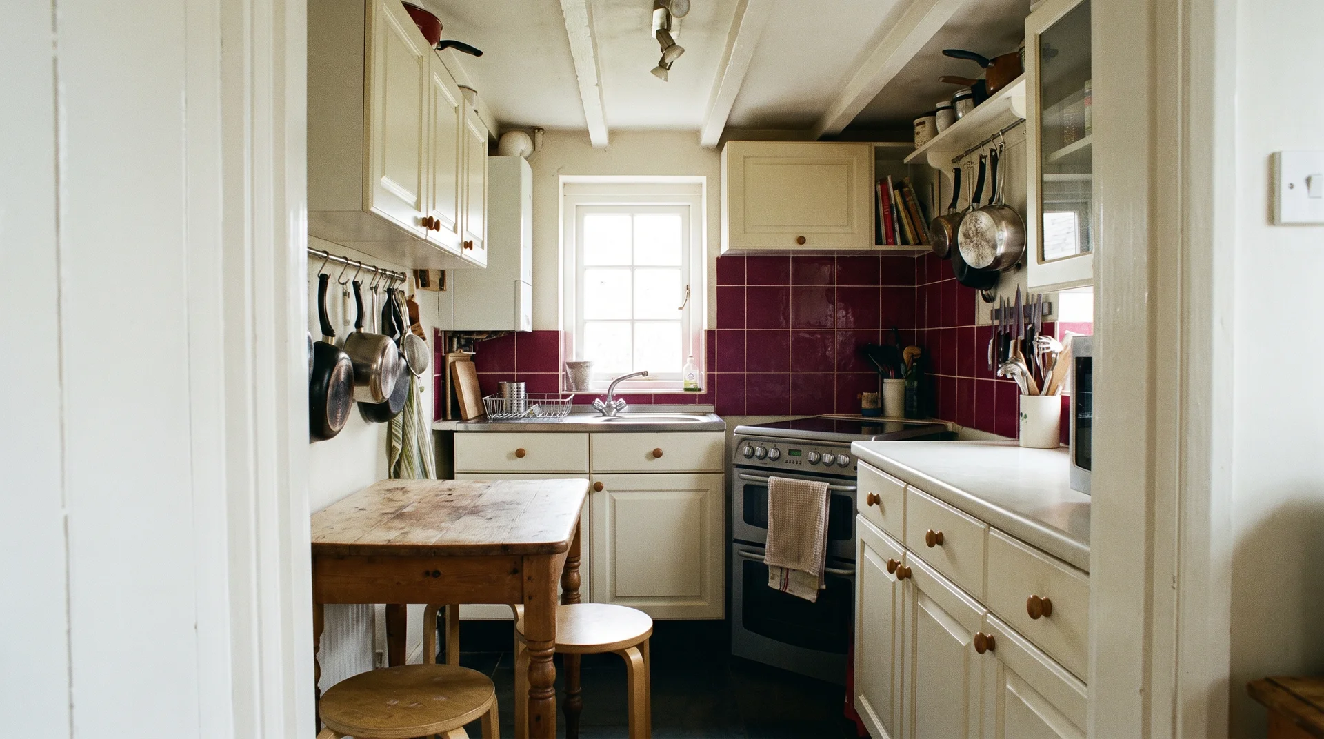
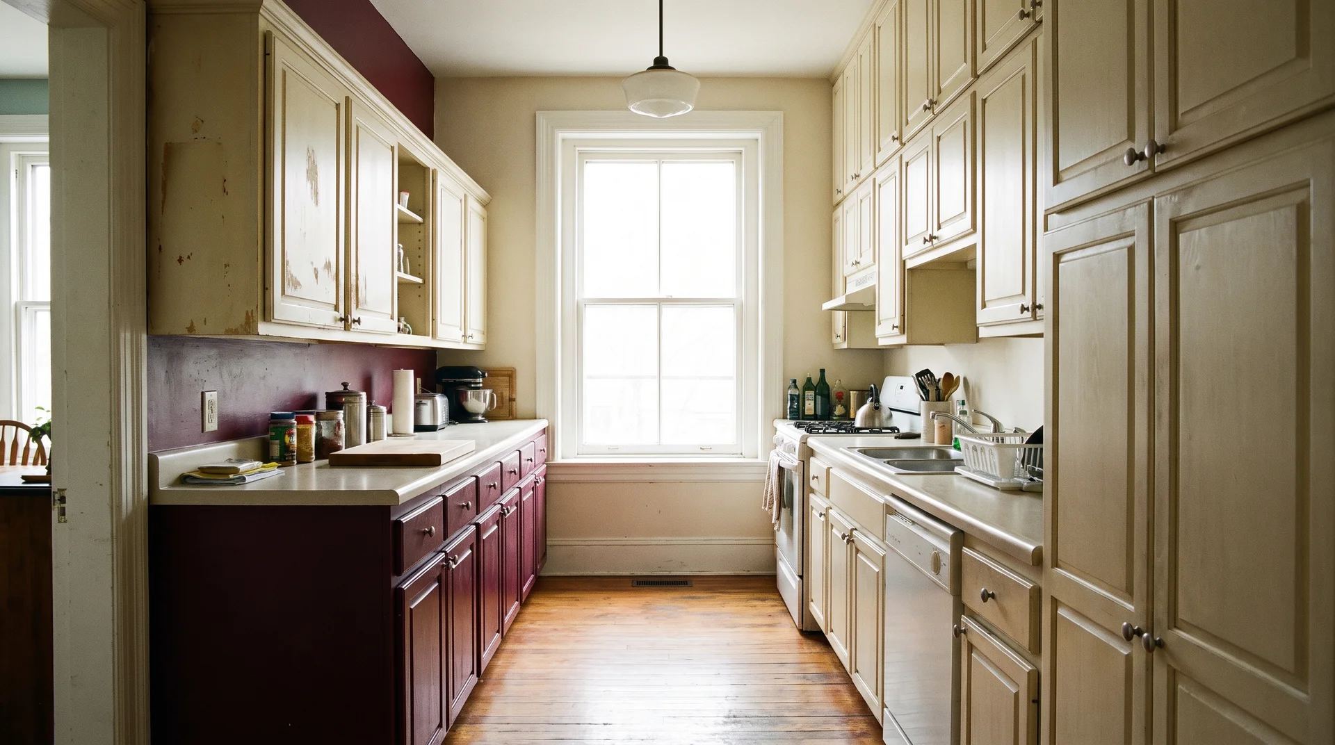
Burgundy Backsplash Ideas
A burgundy backsplash works when the cabinets are neutral.
Burgundy is a dominant color in a kitchen that already applies it to the cabinets; a burgundy backsplash puts two competing statements on adjacent surfaces. These four ideas assume neutral cabinets: white, cream, or light wood.
If your cabinets are already carrying the color, choose your backsplash from the plainest possible option instead.
Burgundy Zellige Tile Backsplash
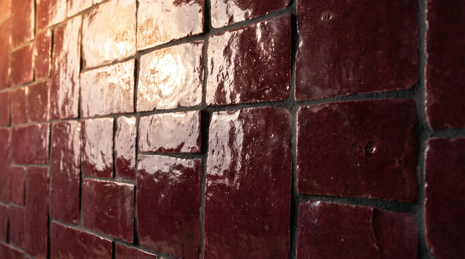
Zellige is the most popular current tile format for burgundy applications, and the irregular surface is why.
Zellige tiles are handmade. No two are identical. The slight variation in surface angle and thickness means the color reads as a material rather than a painted surface. In the kitchen light, the effect shifts as the light angle changes through the day.
This is also the most technically demanding tile option in this article.
Zellige is hand-cut and irregular. It requires an installer comfortable with variable tile dimensions and inconsistent grout joints. This is a job for a skilled tiler, not a first-time DIY project.
Cost: $15 to $45 per square foot for the tile, depending on origin and quality, plus professional installation. A standard kitchen backsplash area runs $800 to $2,500 total.
For anyone asking whether burgundy zellige looks dated in five years: real zellige has more aesthetic longevity than the trend around it. The applications that age poorly use cheap ceramic glazed to look like zellige. The material and the imitation are not the same thing.
Burgundy Subway Tile
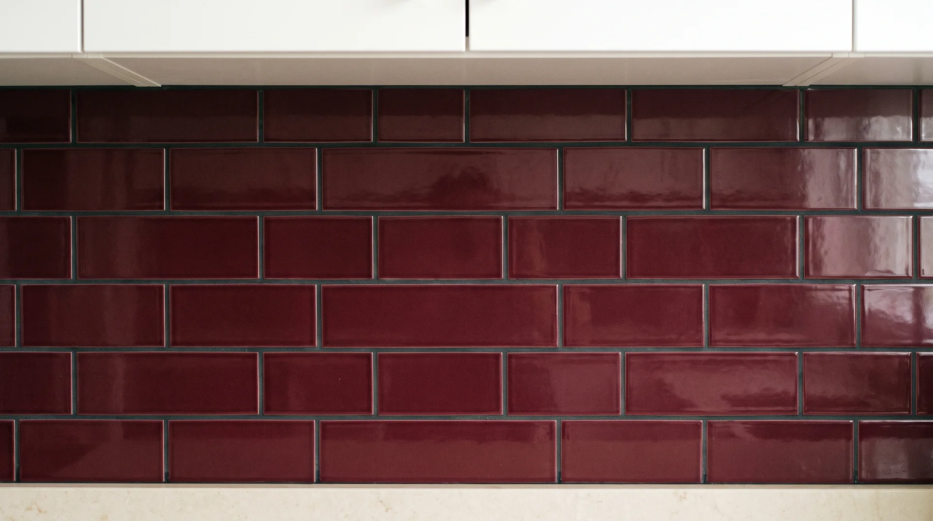
Subway tile in burgundy is the most accessible price point and the most forgiving installation for a first-time tiler.
Running bond (the standard brick offset) is more forgiving of small layout variations. Stacked (tiles aligned in straight columns) reads more contemporary. For a first tile project, running bond.
Grout color matters here. Dark grout on dark tile reads intentional. Light grout on burgundy tile draws a grid pattern across the entire backsplash. Choose a grout in the same color family as the tile, or go darker rather than lighter.
Execution: standard tile installation, achievable as a DIY project for a straightforward backsplash layout. Materials for a standard kitchen backsplash area: $200 to $600, depending on tile quality and size.
Burgundy Stone or Slab Behind the Range
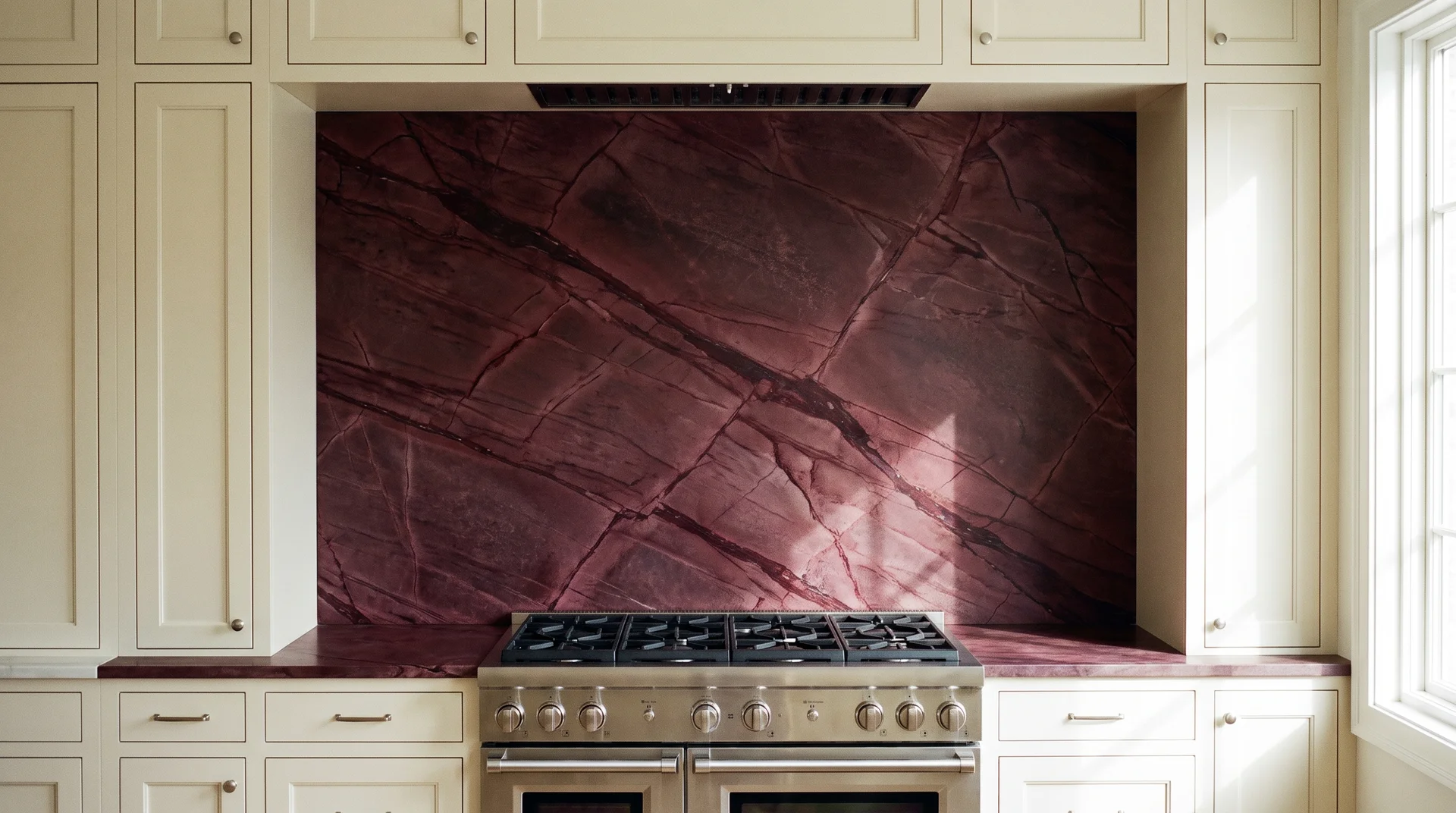
A single slab of burgundy-toned stone behind the range is one of the most resolved backsplash decisions at a mid-range budget.
Deep wine-toned quartzite, burgundy slate, or similar material in a large format reads as one coherent surface. The veining adds movement. It doesn’t compete with itself the way a field of individual tiles can.
This works best as a contained zone: the range alcove only. Extending it across the full backsplash pushes the material toward hero territory. If you do that, the cabinets need to be extremely quiet to match.
Execution: Stone slab backsplashes require professional measurement and fabrication. Budget $300 to $800 for materials before installation. Professional fitting adds $400 to $900. Total: $700 to $1,700, depending on stone choice and alcove dimensions.
Burgundy Penny Tile or Mosaic as a Focal Point
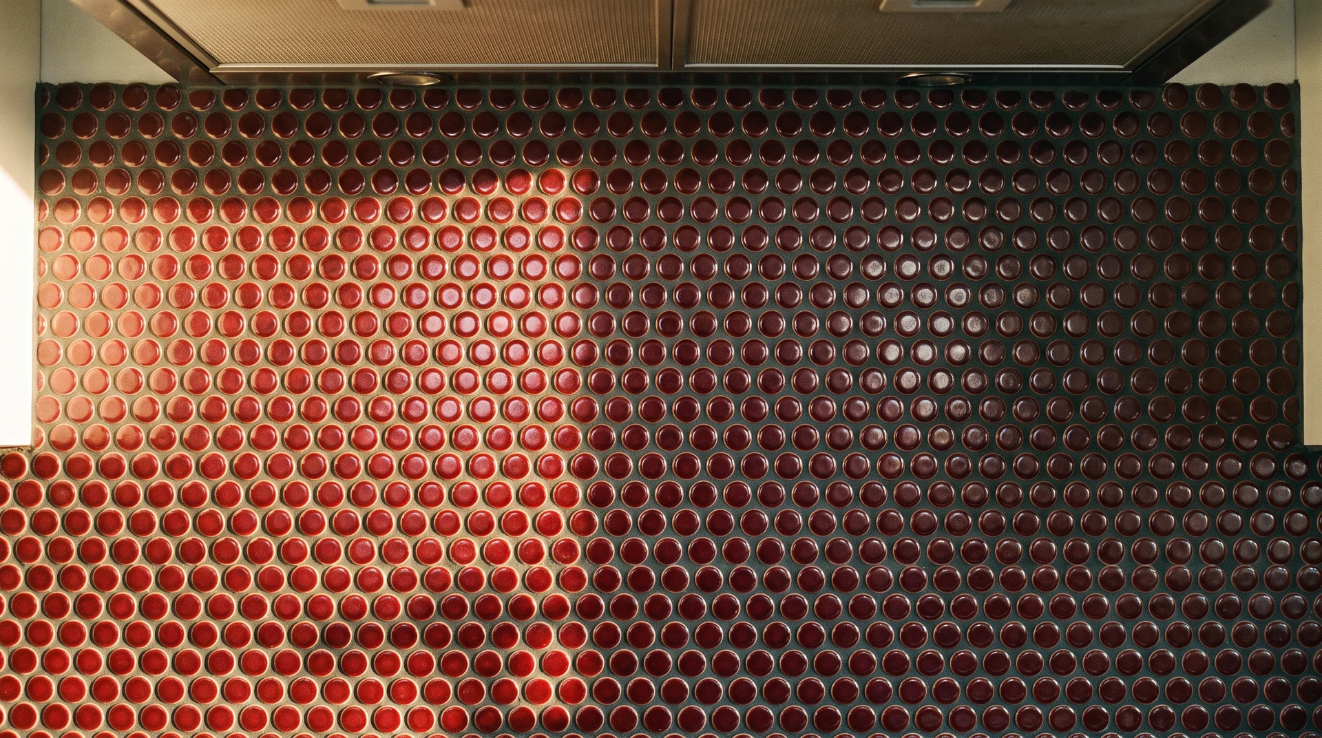
Small-format tile in a contained zone gives you the highest visual interest per square foot of any backsplash application here.
A range alcove in burgundy penny tile or mosaic creates a framed focal point without covering the full backsplash. At close range, the small tiles read as texture and depth. At a kitchen distance, they read as a rich color.
One maintenance note worth mentioning upfront: penny tile has more grout joints per square foot than any other format. Those joints need sealing at installation and re-sealing every one to two years. If that maintenance won’t happen in practice, choose a larger format tile.
Execution: a small-format mosaic is time-intensive to set. Plan for a full day of installation for a standard range alcove. Total material cost for a range zone: $150 to $500, depending on tile quality.
Burgundy Color Pairings That Work
Every pairing decision in a burgundy kitchen has the same question behind it.
Cool white, cool gray, and saturated cool green all pull against burgundy’s warm red-purple depth. They don’t complement the color — they fight it. Every pairing below is warm-biased for that reason.
Burgundy and Warm White
Warm white is the most reliable pairing with burgundy because it’s high-contrast without introducing a competing color temperature.
The white matters. Cool white, which carries a blue or gray undertone, reads harsh next to burgundy. A white with a slight cream or ivory lean sits quietly beside it.
Two specific starting points:
- Benjamin Moore White Dove (OC-17) has an LRV of 85 and sits in the warm-white range without reading yellow.
- Sherwin-Williams Alabaster (SW 7008) has an LRV of 82 with a slight warm lean that works well against deep warm colors.
Pull both chips and test them next to your burgundy sample before ordering. This pairing applies whether white is the upper cabinet, the countertop, or the wall. In any configuration, the warm white answers the burgundy rather than fighting it.
Burgundy and Walnut or Dark Wood
Burgundy and dark warm wood are one of the few dark-on-dark pairings that work consistently.
Burgundy is chromatic: it carries saturation and warmth. Walnut is a material: it reads as texture and grain. They occupy different visual registers. That’s why they complement rather than compete.
Open shelving in walnut above burgundy lower cabinets works well. A walnut countertop on a burgundy island also works. What goes wrong is walnut and burgundy in equal amounts, with no clear hierarchy between them. One has to be the supporting element, and usually that’s the wood.
Execution for butcher block or walnut countertops: $60 to $120 per square foot for quality hardwood, plus professional cut-to-size and installation. IKEA’s butcher block range offers an entry point at $20 to $40 per linear foot [VERIFY]. The grain depth and finish differ significantly from solid hardwood.
Burgundy and Brass or Aged Bronze Hardware
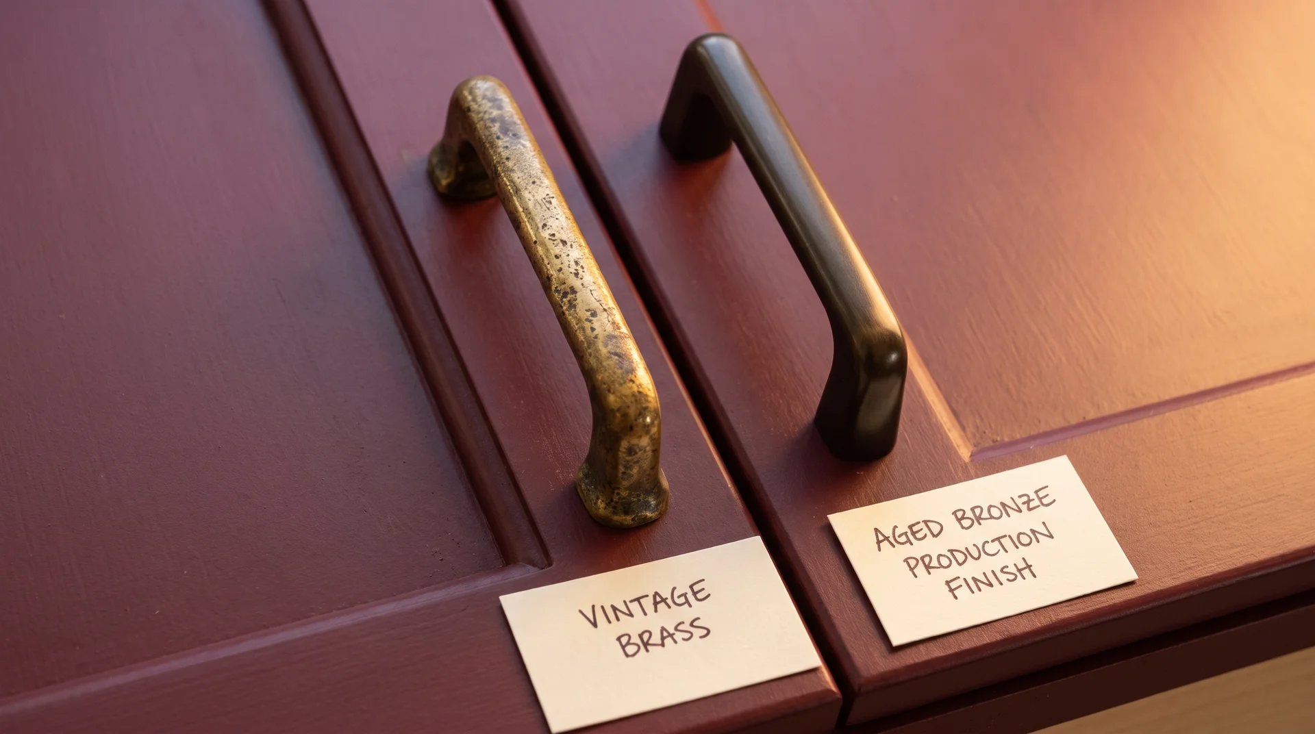
Hardware is where the one-hero rule gets tested hardest.
Unlacquered brass next to burgundy reads warm and intentional. The two tones share a warmth that makes them feel related. Polished chrome reads clinical against burgundy. Satin nickel reads cold. Matte black is the one exception, covered in Idea 21.
Production hardware labeled “aged bronze” is inconsistent. I’ve sourced kitchen hardware at weekend flea markets for years. Genuinely aged brass, the kind with uneven developing patina that decades of use produce, reads completely differently from a new pull with a factory-applied aged finish.
The production version is too uniform. It reads as a surface treatment rather than a material character.
If you can source authentic vintage brass hardware, it changes the pairing. If you can’t, unlacquered brass from suppliers such as Rejuvenation or House of Antique Hardware develops its own patina over time. That’s a different value from hardware bought solely for its finish.
Execution: Hardware replacement is the most achievable DIY project in a kitchen. Budget $8 to $40 per pull, depending on quality. A full kitchen of 20 pulls runs $160 to $800 in hardware costs. For a deeper look at selecting hardware finish and sizing, the guide to choosing kitchen cabinet hardware covers both in full.
Burgundy and Sage Green
Burgundy and sage green work together because the right sage carries a warm undertone of its own.
Sage with an earthy, warm lean, sometimes described as dried herb or dusty olive rather than true green, sits comfortably next to burgundy. Cool sage, which pulls toward blue-gray, fights it. The green has to be warm for the pairing to read as earthy rather than discordant.
A workable application: burgundy lower cabinets, sage upper cabinets, warm white countertop.
The sage is quieter than warm white but warmer than cool gray. It creates a layered quality. Test samples on adjacent surfaces in natural light before committing.
If the sage-upper approach fits your instinct but you’re also weighing a cooler base cabinet color, teal kitchen ideas covers how sage green uppers work against teal lowers specifically, the same two-tone structure applied to the blue-green side of the palette.
Read: 17 Teal Kitchen Ideas
Burgundy and Blush Pink
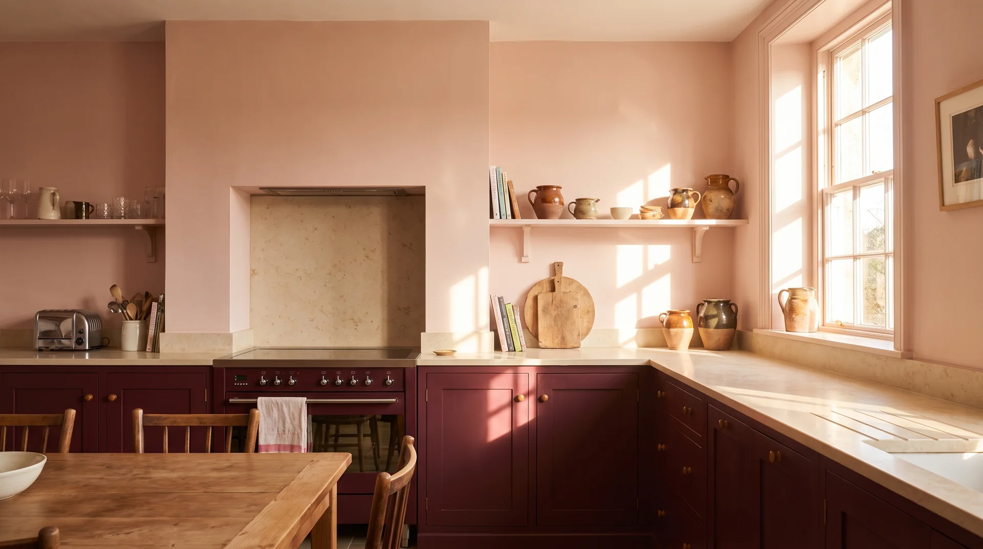
Burgundy and blush pink share a red base, which is why they sit together rather than conflict.
Blush as a wall color against burgundy lower cabinets is the most common version of this pairing. Both colors sit in the same red-pink family at different depths. They’re harmonious at a tonal level rather than contrasting.
This pairing needs natural light. A dark kitchen with burgundy and blush walls tips into dim quickly. Save it for rooms with south or west exposure and at least two good windows.
Burgundy and Matte Black
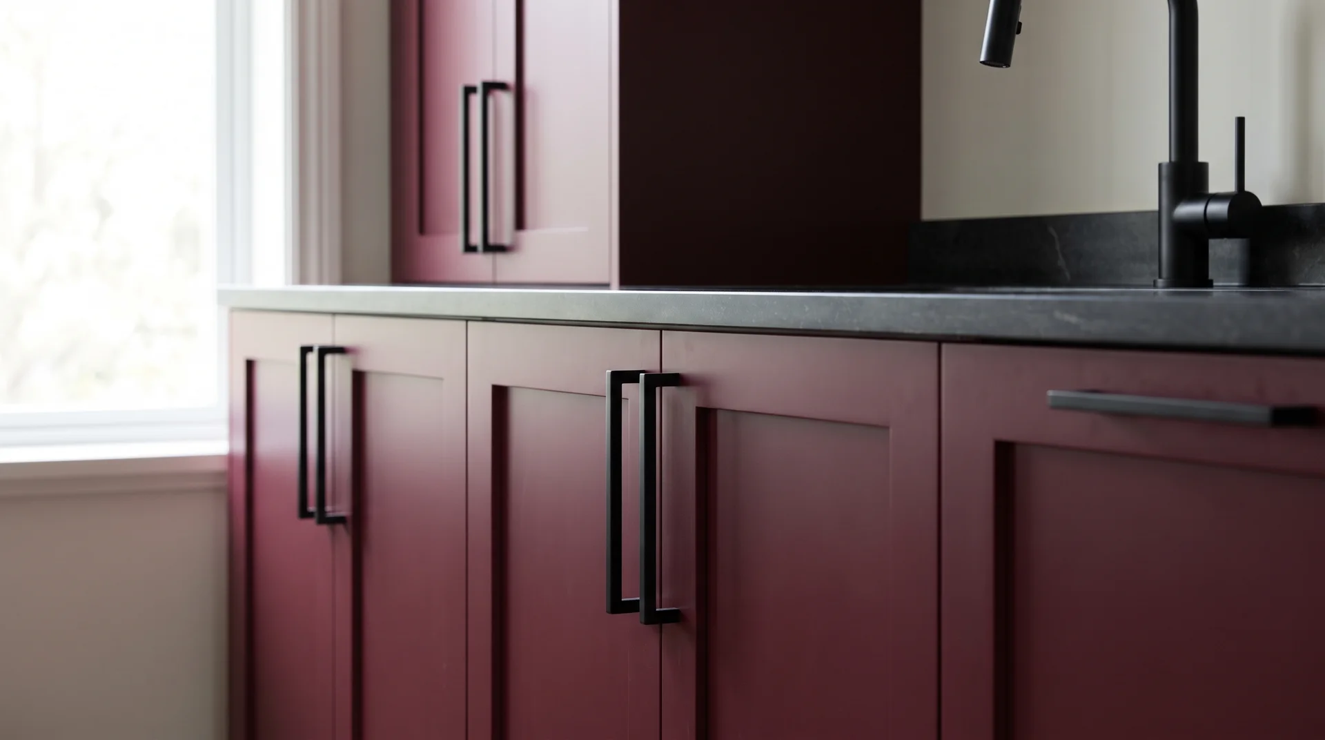
Matte black is the one cool hardware and fixture choice that doesn’t fight burgundy.
Black sits between warm and cool in a way that gray and chrome don’t. It reads as a graphic contrast. Burgundy cabinets with matte black hardware, a matte black faucet, and one simple matte black pendant light read bold and resolved.
The limit: two black elements maximum. A matte black range, faucet, pendant, and full hardware set at once adds too much visual weight. Pick two. Hardware is the easiest entry point because it’s the cheapest to change if you decide it’s too much.
Burgundy and Slate or Charcoal Gray Countertops
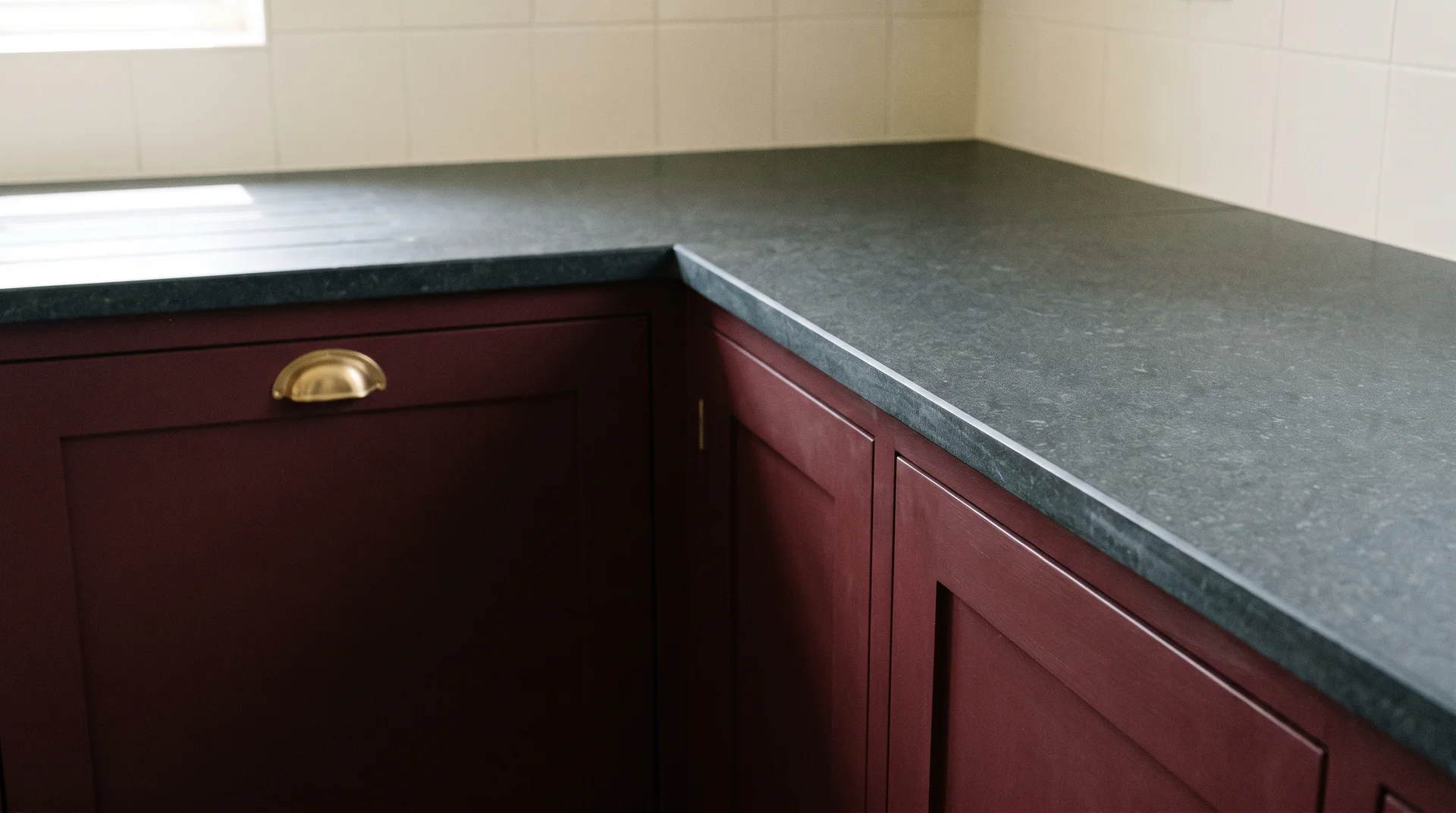
A honed charcoal or slate countertop against burgundy cabinets creates one of the most resolved moody kitchen looks at a mid-range budget.
Honed charcoal quartz avoids the shiny-surface problem that comes with polished dark countertops. The surface reads as material rather than gloss. Against burgundy, it grounds the kitchen without competing.
The warmth needs to live in the quartz undertone as well as in the cabinet.
Three charcoal quartz options with enough undertone warmth to sit next to burgundy: Silestone Eternal Serena, Caesarstone Turbine Grey, and Cambria Blackwood.
Pull samples next to your cabinet color before ordering. Quartz undertones are impossible to evaluate accurately from digital images.
Execution: countertop replacement runs $55 to $120 per square foot installed for engineered quartz, depending on edge complexity and cut count. Budget $1,500 to $5,000 for a typical kitchen.
Burgundy in Small and Specific Kitchens
Most images in search results show large, well-lit kitchens.
If yours is smaller, burgundy is still available to you. It just changes which application makes sense. These three ideas are specifically mapped to tighter conditions, not adapted from larger-room applications as an afterthought.
Burgundy as a Single Surface Accent in a Compact Kitchen
In a kitchen under 100 square feet, one burgundy surface is the ceiling of the idea.
The island, the lower cabinets, the range wall, or the backsplash: pick one. Everything else stays neutral. The one-hero rule applies in any kitchen, in a compact one, it’s not a preference. It’s what the space can hold.
In a small kitchen, the backsplash is often the best choice. It’s the smallest surface, and it adds the color without applying it to a large cabinet face that could feel heavy in a tight room. The island is the second-best option if you have one.
Burgundy in a Galley Kitchen Without Closing the Space
Full burgundy on both parallel runs of a galley kitchen is too much.
Stand at the far end of the galley and look toward the window or the far wall. Which wall does your eye go to first? That’s the wall that can carry the burgundy. The opposite wall stays light.
The eye travels down the lighter wall. The colored wall creates depth rather than compression. In a galley kitchen, which wall carries the color is often the only decision that matters.
A specific application that works: burgundy lower cabinets on one run with white or cream uppers, and fully neutral cabinets on the opposite run. This distributes the color asymmetrically. The space stays open.
Removable Burgundy Ideas for a Rental Kitchen
You can add burgundy to a rental kitchen without painting anything.
Three removable applications worth knowing:
- Peel-and-stick vinyl wallpaper in a deep wine or burgundy tone: applies to a clean, dry wall surface and removes without damaging paint. Look for a matte or linen texture. A shiny vinyl finish reads cheap at close range.
- Removable backsplash tile panels: peel-and-stick tile sheets in burgundy or dark red tones that apply to the existing backsplash and remove without grout residue. The tile profile is thinner than real tile, which shows at close inspection.
- Cabinet contact paper in a deep red or wine finish: applies to existing cabinet faces and removes without damage on a clean, well-prepared surface. Works for a 12-month situation. Edges near heat sources tend to lift over time.
None of these produces the same result as a proper repaint or tile installation. For a renter who wants to test the color before committing to it in a future home, these are real options worth knowing.
Burgundy Range Hoods, Appliances, and Statement Fixtures
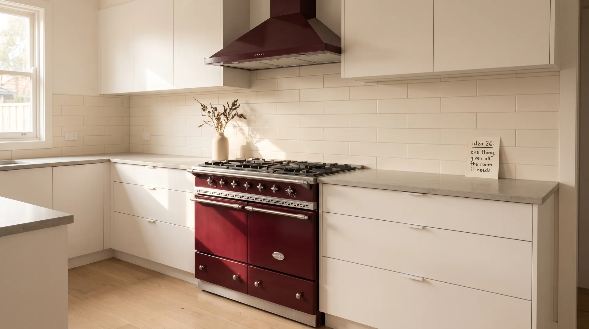
A single burgundy appliance in a neutral kitchen is a complete design decision — and one of the few ideas here that requires no painting, no tile work, and no contractor.
ILVE, Lacanche, and La Cornue all produce range and range hood configurations in deep red and burgundy finishes. Smeg’s retro range line includes dark wine tones in several models. These appliances arrive as the hero. The kitchen around them exists in service of that one piece.
The cost range is substantial: a quality range in a specialty color runs $3,500 to $20,000, depending on brand and configuration.
If budget is the real constraint, a custom-painted range hood in an otherwise white or cream kitchen achieves most of the same visual effect. A metal fabrication shop can spray a standard range hood in a burgundy finish for $600 to $1,500.
The constraint is where the real decision lives, and this option is worth knowing about.
I’d rather tell you about the $600 option than show you a $14,000 range you’re not buying.
End Note
Almost any of the 26 ideas above can work in your kitchen.
The single decision that determines whether it does: which surface gets the color, and whether everything else in the room has the discipline to let it work.
Choose one idea. Give it room. The readers who get this right are the ones who stop adding things after the first decision lands.